Same week, two very different rebrands.
Category: Branding
Topic: Branding
5 mins read
Rebrands are rarely just about making things look nicer. Or at least, they shouldn’t be.
This week, McLaren and Apple Music both revealed significant changes to their visual identities. On the surface, there’s little connecting them. One has looked backwards to move forwards, while the other appears to be doing almost the exact opposite.
But the interesting bit isn’t necessarily what they’ve changed. It’s why they’re changing now.
McLaren goes back to go forwards

McLaren’s new identity arrives at a fairly significant moment for the business. Racing and Automotive are being brought under a more unified brand, while McLaren Automotive has announced a £500m UK investment programme as it prepares to expand beyond two-seater supercars.
So, naturally, it’s gone back to a petrol station in New Zealand.
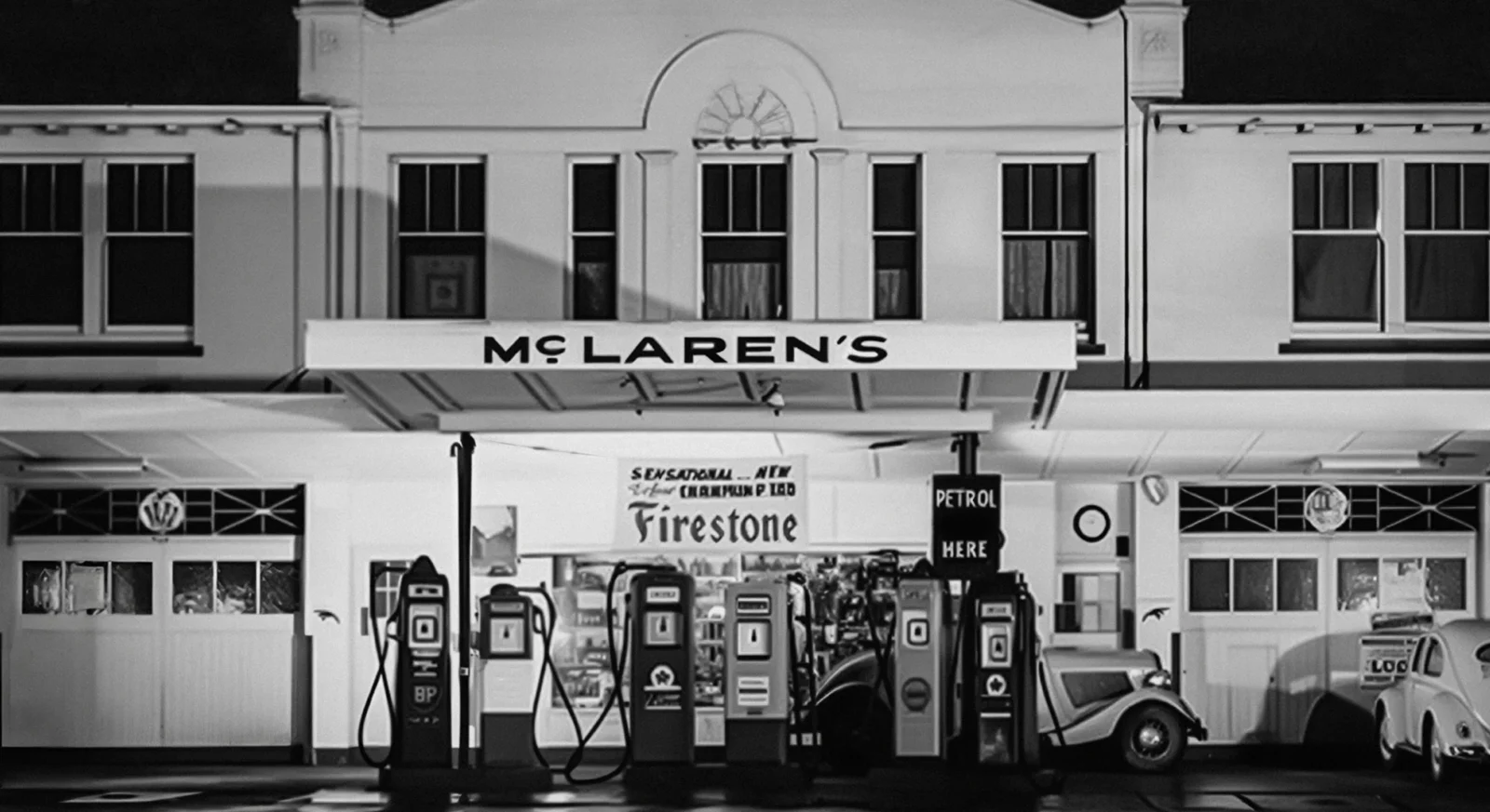
The new wordmark takes inspiration from the signage above the Remuera service station owned by Bruce McLaren’s parents, where Bruce built the car that took him to his first racing victory. The familiar Speedmark remains, but the new wordmark becomes the dominant asset across Racing and Automotive.
There’s a nice story there. But visually, McLaren has also moved into familiar luxury-brand territory: cleaner, simpler, uppercase and sans serif.
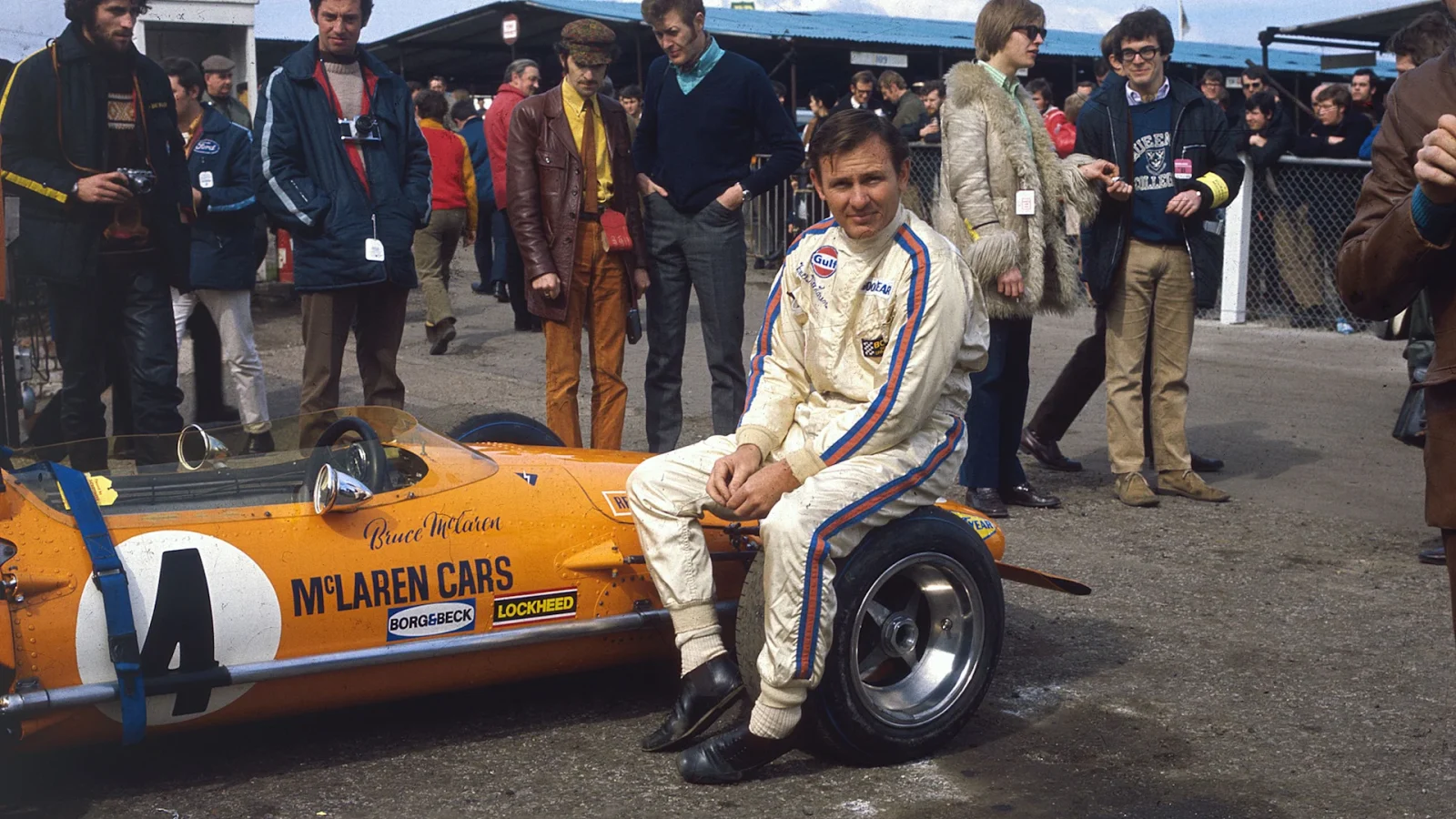
It’s a route fashion has travelled extensively. Burberry famously replaced its serif wordmark and Equestrian Knight with Peter Saville’s stripped-back sans serif identity in 2018, while Saint Laurent’s 2012 reset similarly looked into its archives while emerging with something markedly simpler.
McLaren’s reasoning makes sense. A simpler brand identity is easier to control across cars, clothing, digital platforms, merchandise and global partnerships. The danger, as luxury fashion has discovered, is that in trying to look timeless, everyone can start looking a little bit the same.
Apple turns the volume up
Then there’s Apple Music.
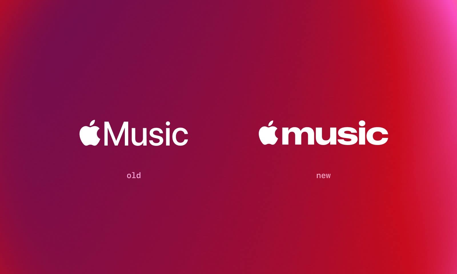
A chunky, tightly spaced, lowercase ‘music’ wordmark has appeared alongside the launch of Apple Music Hall, its new 600-capacity live venue at Battersea Power Station. It’s a surprisingly expressive move from a company whose visual language has spent years being meticulously clean and restrained.
Importantly, Apple hasn’t actually confirmed this as a full rebrand yet. The existing identity remains elsewhere, making this potentially more interesting as a glimpse of where the brand could be heading rather than a finished system.
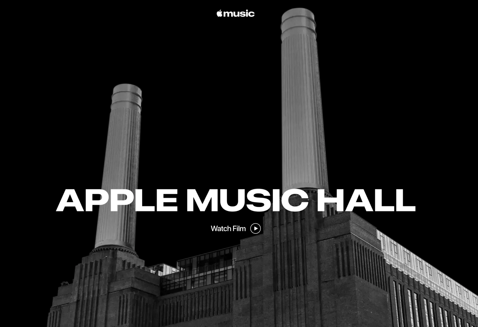
Apple Music Hall represents Apple pushing further beyond the streaming platform and into music culture itself: live performances, radio, Spatial Audio, recording and global broadcasts all under one roof.
The new typography feels more like a music brand than a technology product. Bigger, bolder and more characterful. There are even shades of Spotify’s increasingly expressive approach, where flexible typography and culture-led creative have become central to how the brand behaves beyond the app.
Two brands, two directions
Perhaps that’s what makes these two changes interesting side by side.
McLaren has decades of visual history and is using its past to create consistency for an expanding future. Apple Music is only eleven years old and appears to be testing how much personality it can build outside the wider Apple system. One is consolidating. The other is experimenting.
Whether either identity proves successful will depend on what comes next. Because a logo reveal is the easy bit. The real test of any rebrand is whether there’s enough of a brand world behind it to make the change worthwhile.