Heritage Great Britain
Encapsulating Heritage Great Britain’s offer online and in print.
Client
Heritage Great Britain
Industry
Leisure & Hospitality
Travel & Tourism
Services
Branding
Website
Heritage Great Britain is the operator and custodian of some of the UK’s most iconic landmark destinations and visitor attractions. Its vast portfolio literally stretches from Land’s End to John O’Groats, with each individual site having its own brand identity and story to tell. Separately, the destinations stand on their own two feet, but together they form an even more powerful proposition. Our job was to create a new group website and corporate brochure for Heritage Great Britain that encapsulated its entire offering.
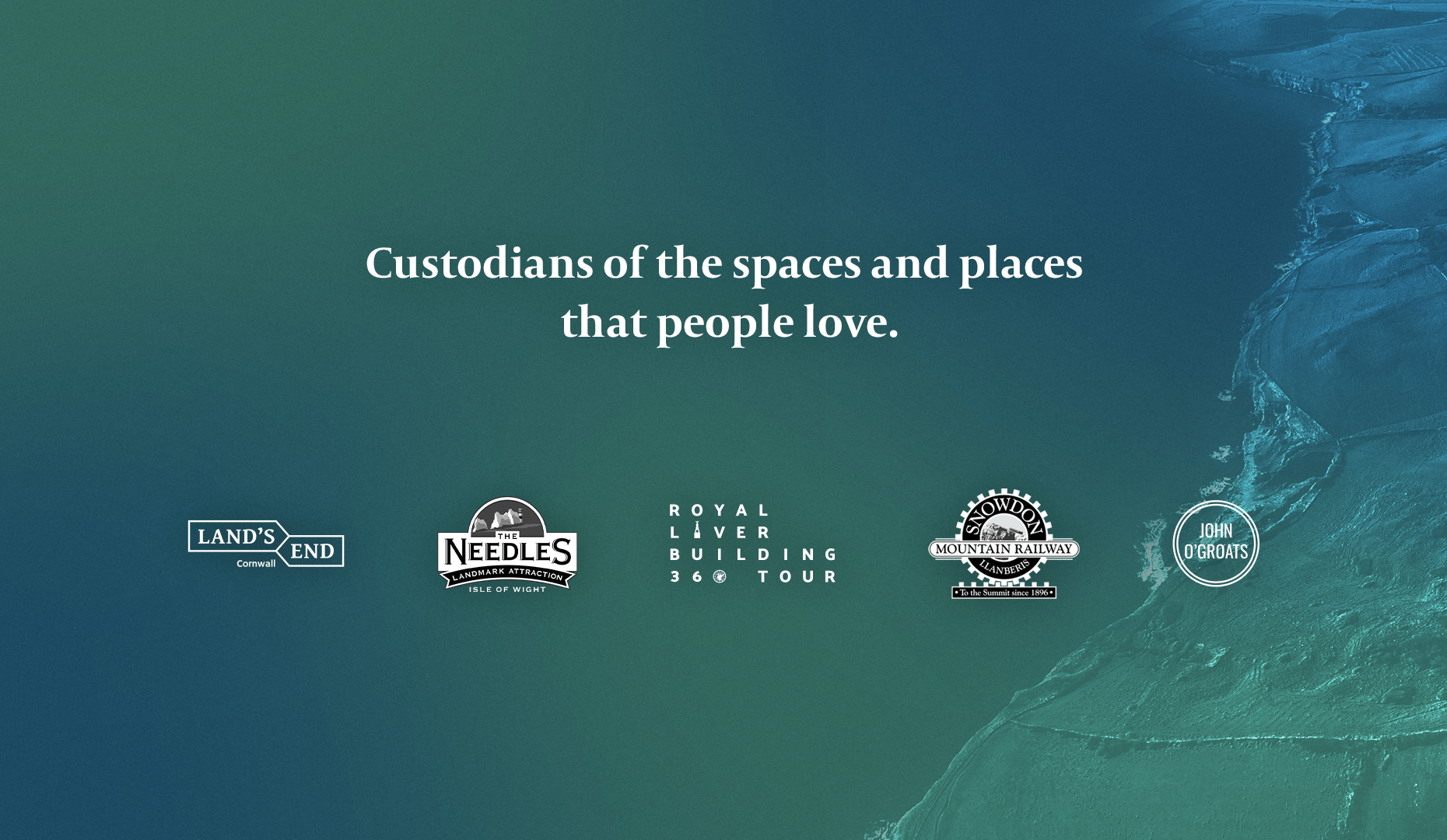
Whatever we produced had to imbue heritage and quality – both digitally and in print.
We knew the group website needed to establish and communicate a strong visual identity and online presence for Heritage Great Britain. Similarly, the corporate brochure would be a crucial supporting document during important meetings with key decision makers regarding site acquisitions and planning permissions. Most importantly, whatever we produced had to imbue heritage and quality – both digitally and in print – to provide the audience with the information they needed in the most attractive and engaging way.
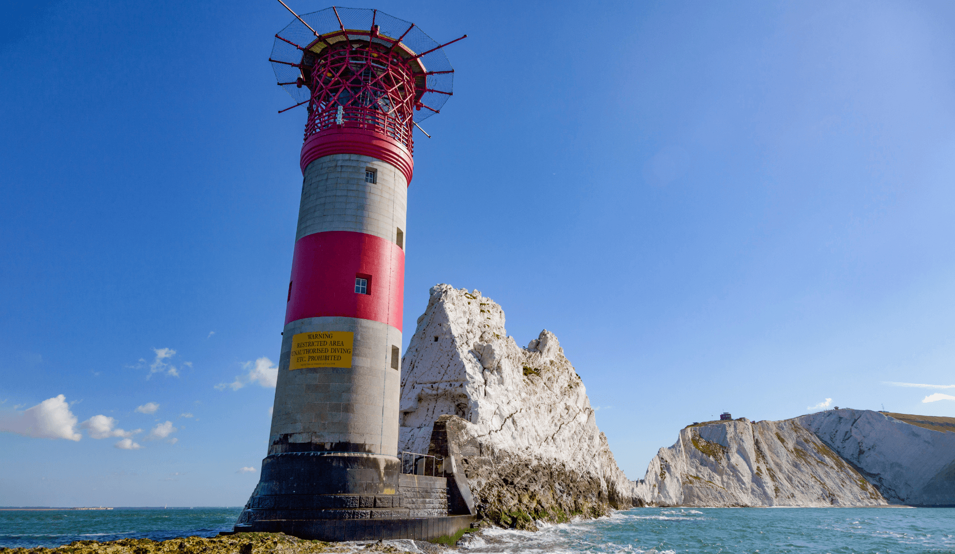
Together we agreed that the website and brochure should be photography-driven, presenting a suite of captivating hero images, both old and new, that showed off each of the locations and landmarks in all their glory. As part of this approach, we delved into the archives to uncover many vintage photos of the sites, adding a touch of history alongside the modern photography we’d captured on our various travels around the different locations.
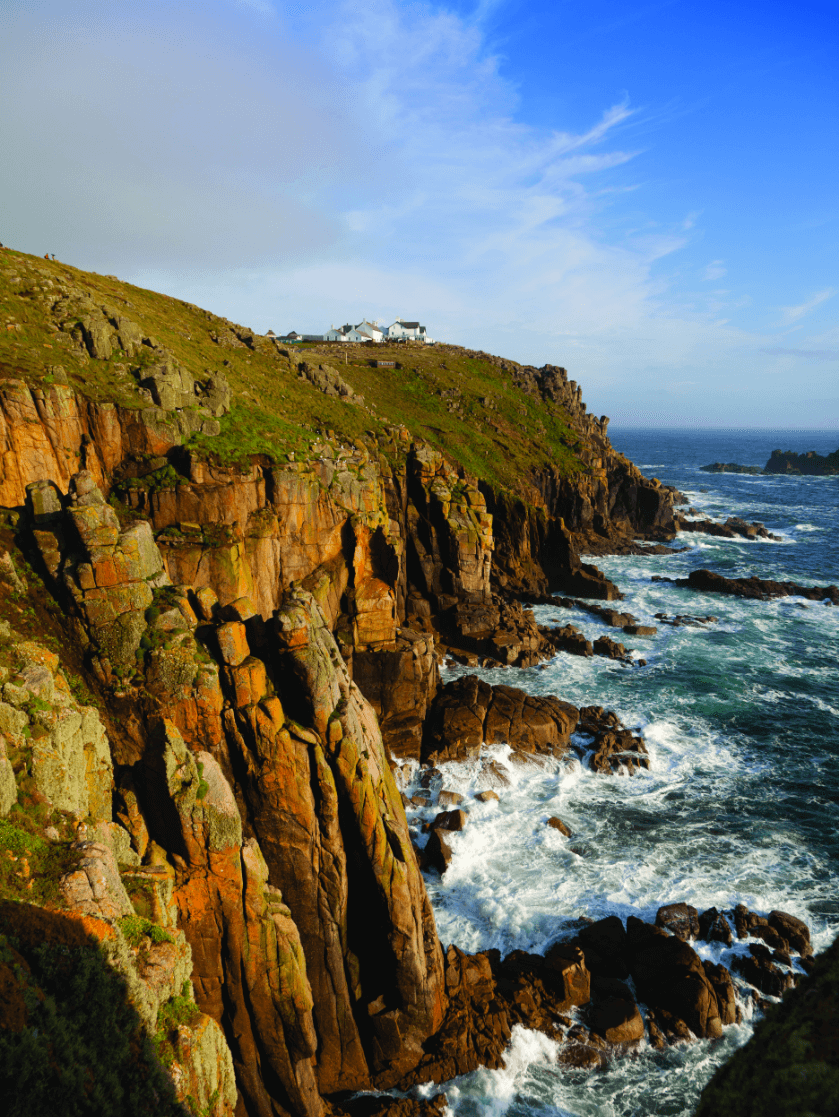

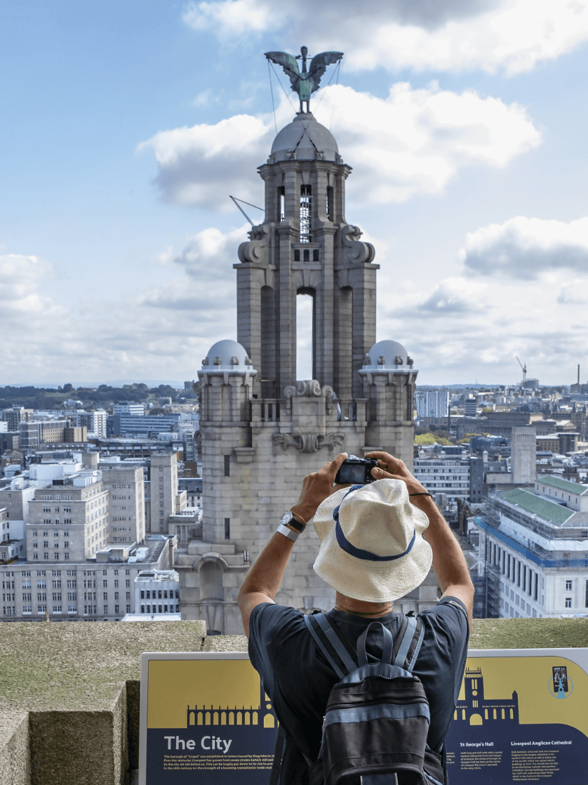

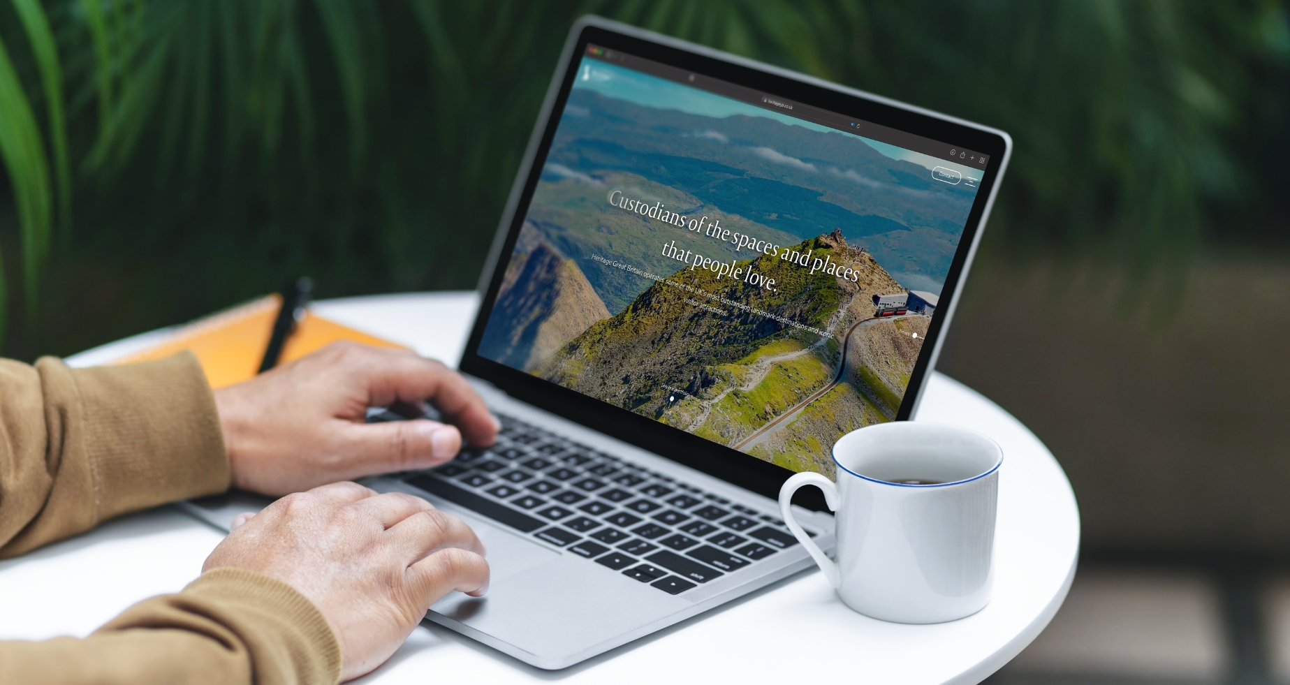
The new website implements a clutter-free, user-friendly structure and subtle, smooth functionality.
The new website implements a clutter-free, user-friendly structure and subtle, smooth functionality to give the user the impression of gliding through the site with ease while being simultaneously engulfed by beautiful imagery. After being met with a parallax video loop, a natural scroll function enables them to browse Heritage Great Britain’s entire portfolio of destinations where they then have the option to visit a designated page for each attraction to find out more.
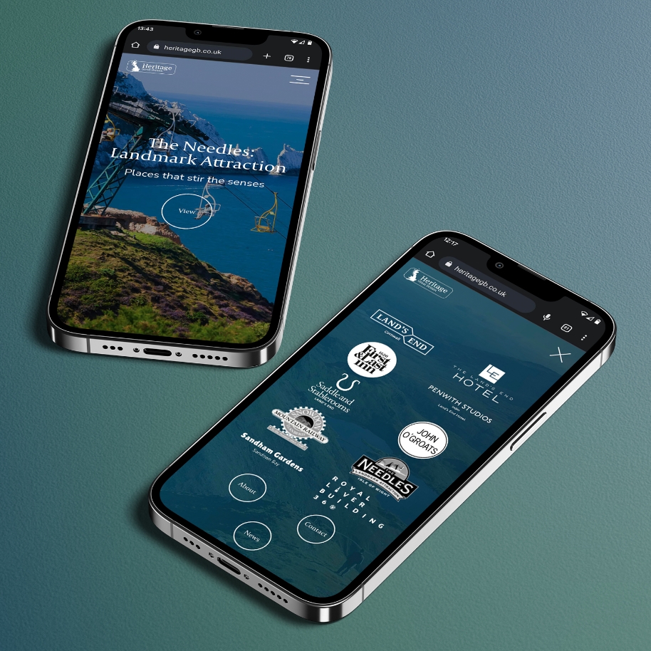

The brochure was printed and bound using the very highest quality paper and materials.
The use of sea green as a predominant colour throughout the site acts as the perfect backdrop to the captivating images used, exuding a feeling of heritage and tradition, while also being pleasant to look at and easy on the eye. Subtle and elegant fonts compliment and bring the new group brand tone of voice we developed to life, which helps to communicate Heritage Great Britain’s position as the guardians and custodians of the places and spaces people love.
In order to achieve the desired effect for the brochure and deliver that wow factor, we followed the same design and image-driven approach as the website but had the brochure printed and bound using the very highest quality paper and materials.
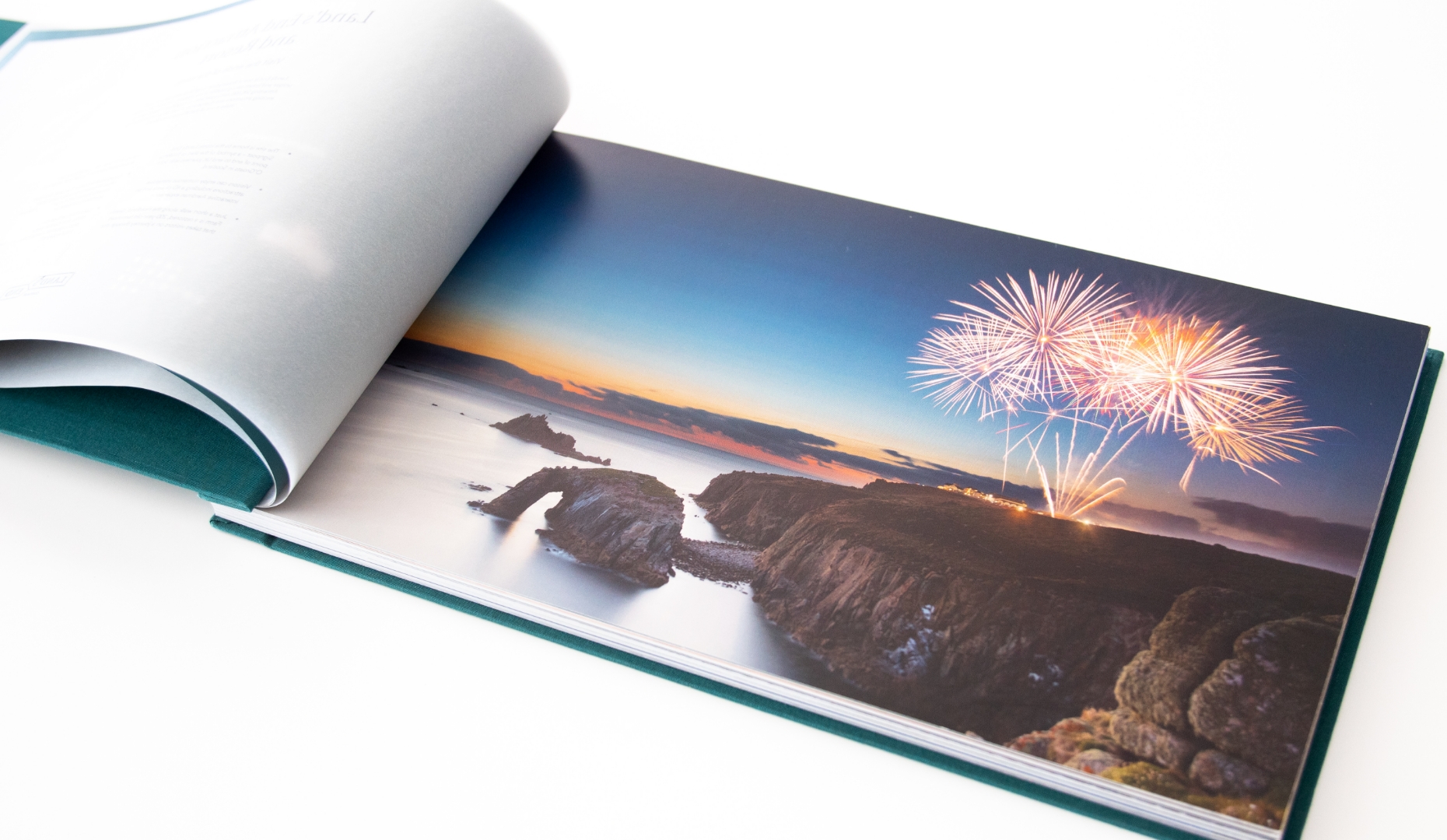
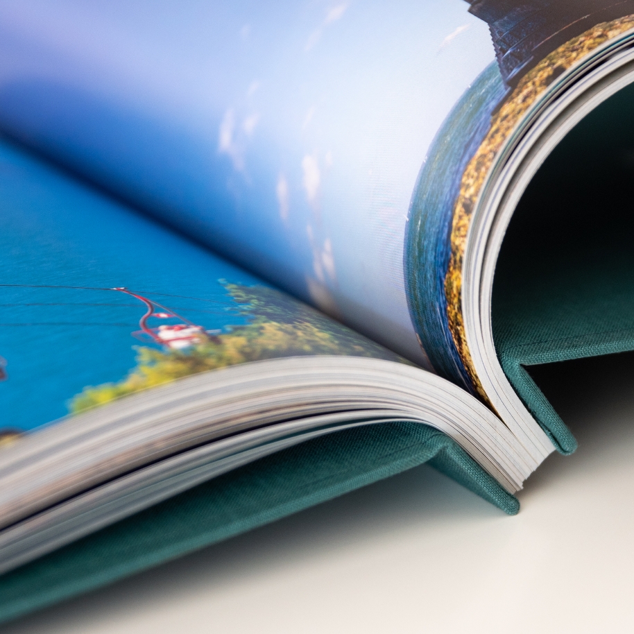
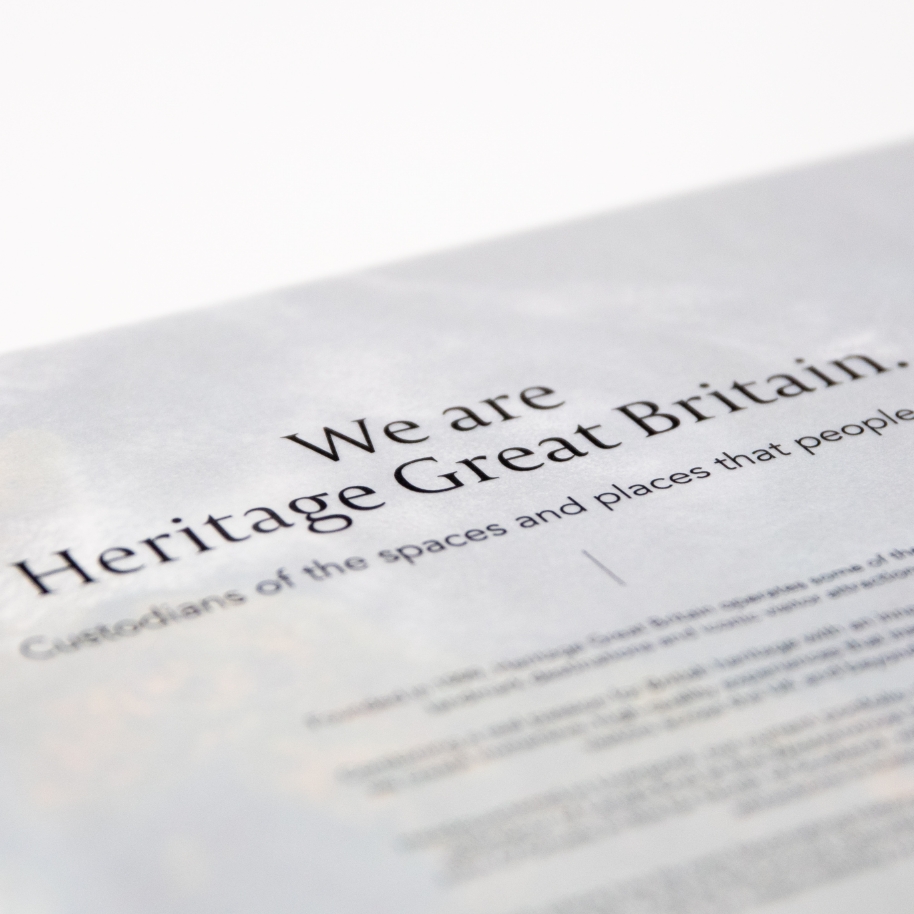

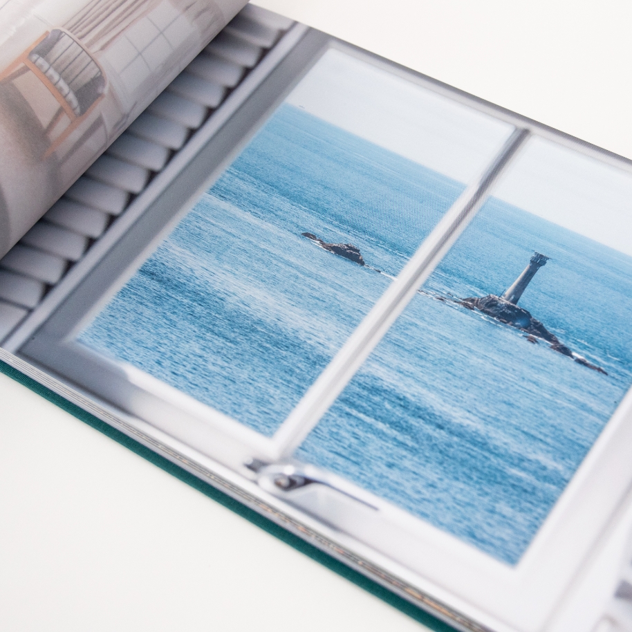
The brochure was segmented into different sections, each highlighting a different attraction or destination, and we chose a landscape format to ensure the hero images really came into their own. So as not to detract from the images, we added thick tracing paper between each section to present useful background information on each location and opted for 250gsm silk paper for the main pages to give the brochure a weighty feel.
To take the quality to the next level, the brochure was screw-bound with gold button-style screws between long, weighty covers, which were then wrapped in fabric of the same colour used for the website to complement the overall look and feel. On the front and the insides of the cover, we had the logo and main straplines hot-pressed into the fabric in a white laminate, offering a nice contrast to the sea green.
The brand now has the tools to impress and engage decision-makers at the very highest level.
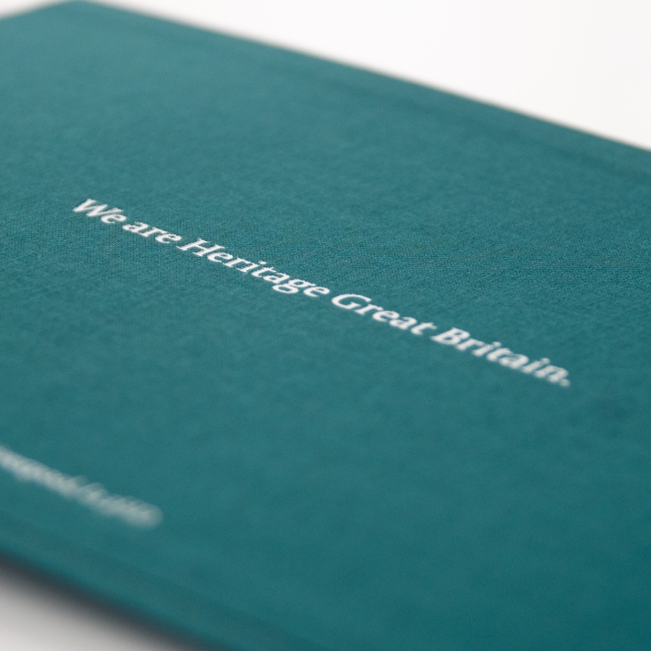
The end result is a new group website and corporate brochure that complement one another and act as platforms for a refreshed brand identity for Heritage Great Britain. With a website that offers a seamless and sophisticated digital experience and a brochure that feels like quality down to the finest detail, the brand now has everything it needs to impress and engage decision-makers at the very highest level.