The 55
Transforming fitness brand The 55, born on the battlefield.





Client
The 55
Industry
Fitness & Wellbeing
Services
Brand Strategy
Brand Identity
Brand Development
Brand Guidelines


The 55 is a start-up fitness brand that’s on a mission to make strength and conditioning training accessible to everyone with its versatile weighted bag. The founder and military veteran, Chris Leare, approached us to deliver a rebrand including a new name, brand positioning and brand identity.
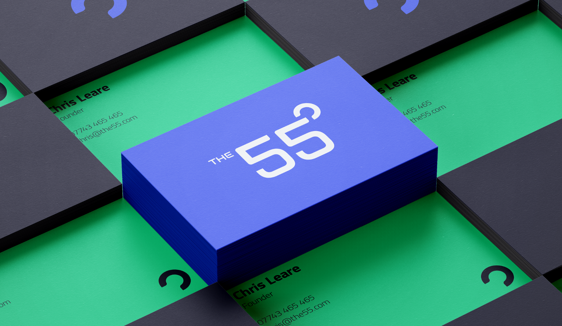
Our main challenge was to change that and make the brand universal to a broader audience.
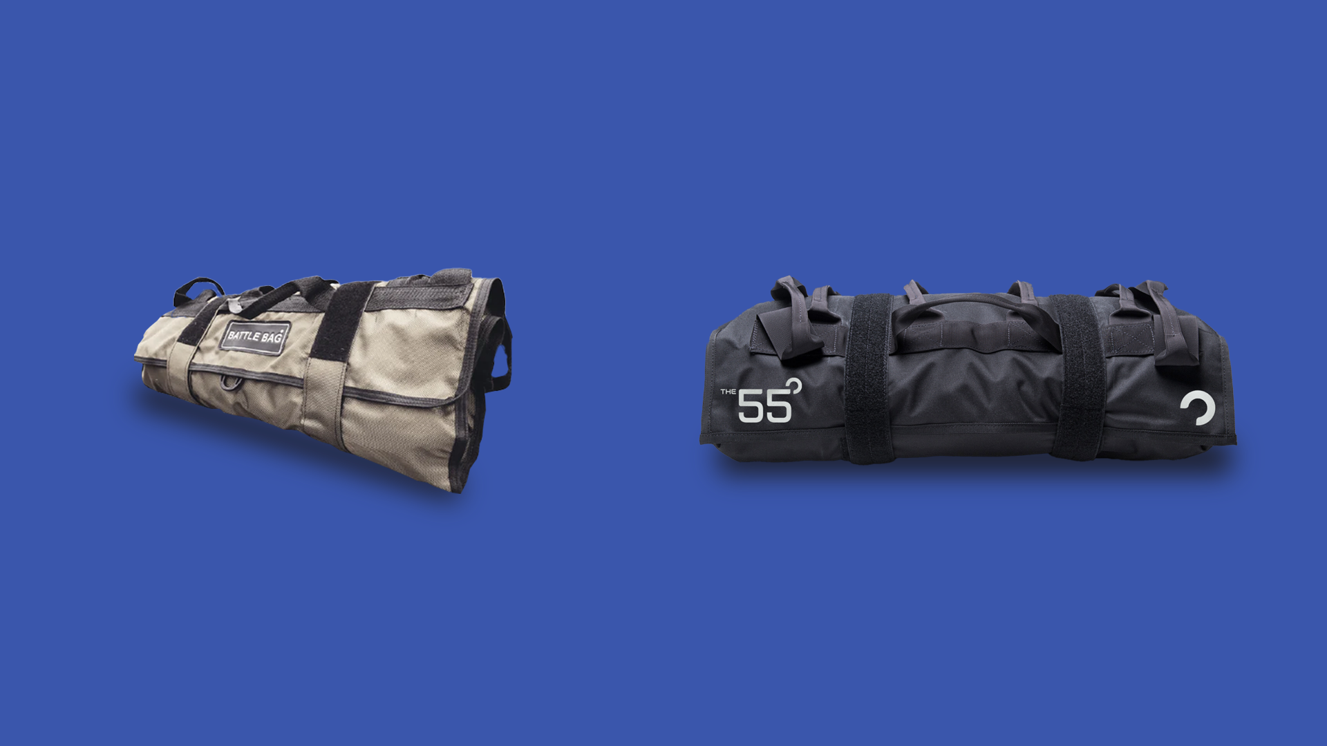
Chris’ business idea was born on the battlefield. While on tour, he wanted a way to stay fit when resources and equipment were hard to come by, developing a makeshift weighted bag to exercise with using sand from the desert. Upon his return, and after some years of testing the Battlebag was born.
While the Battlebag enjoyed some early success, the brand was largely limited to a male demographic using a strong tone of voice and dark colour palette. Our main challenge was to change that and make the brand universal to a broader audience
After getting to know Chris and the team, we kicked things off by holding a brand workshop to understand their ambitions for the rebrand and to get a better idea of what they wanted to achieve from it. With a clear vision of where they wanted to take the brand, we set to work on the renaming process.


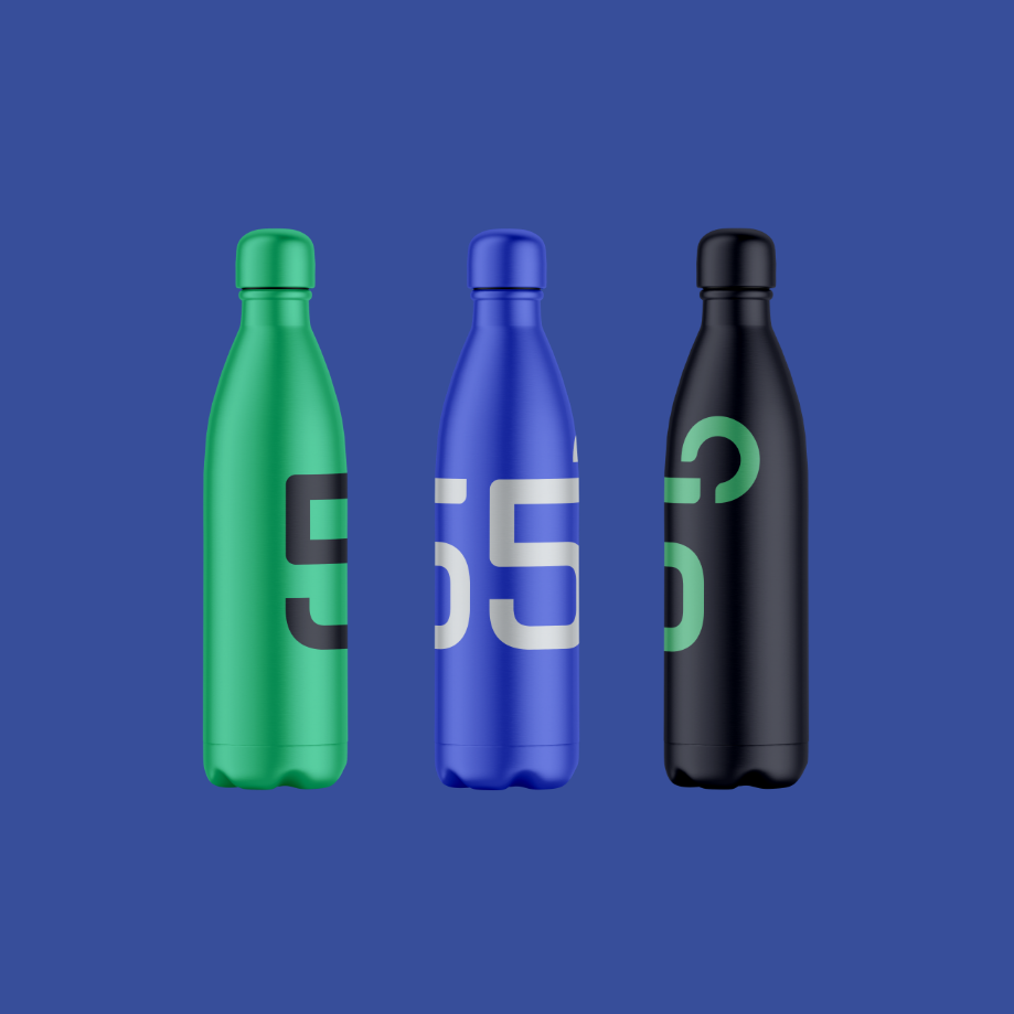

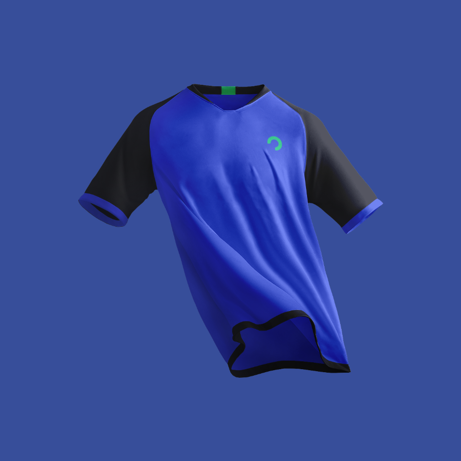



We transitioned The 55 into an all-encompassing brand using a brighter and more vibrant colour palette.
Once we had got to the heart of the brand, we split the naming process into three categories: British heritage, military and geography. We created an extensive list of potential names, but there was a clear favourite from the start. 55 is the first number in the latitude and longitude GPS coordinates for Great Britain and is also the maximum weight in pounds of the bag, so for Chris and the team, it was a no-brainer.
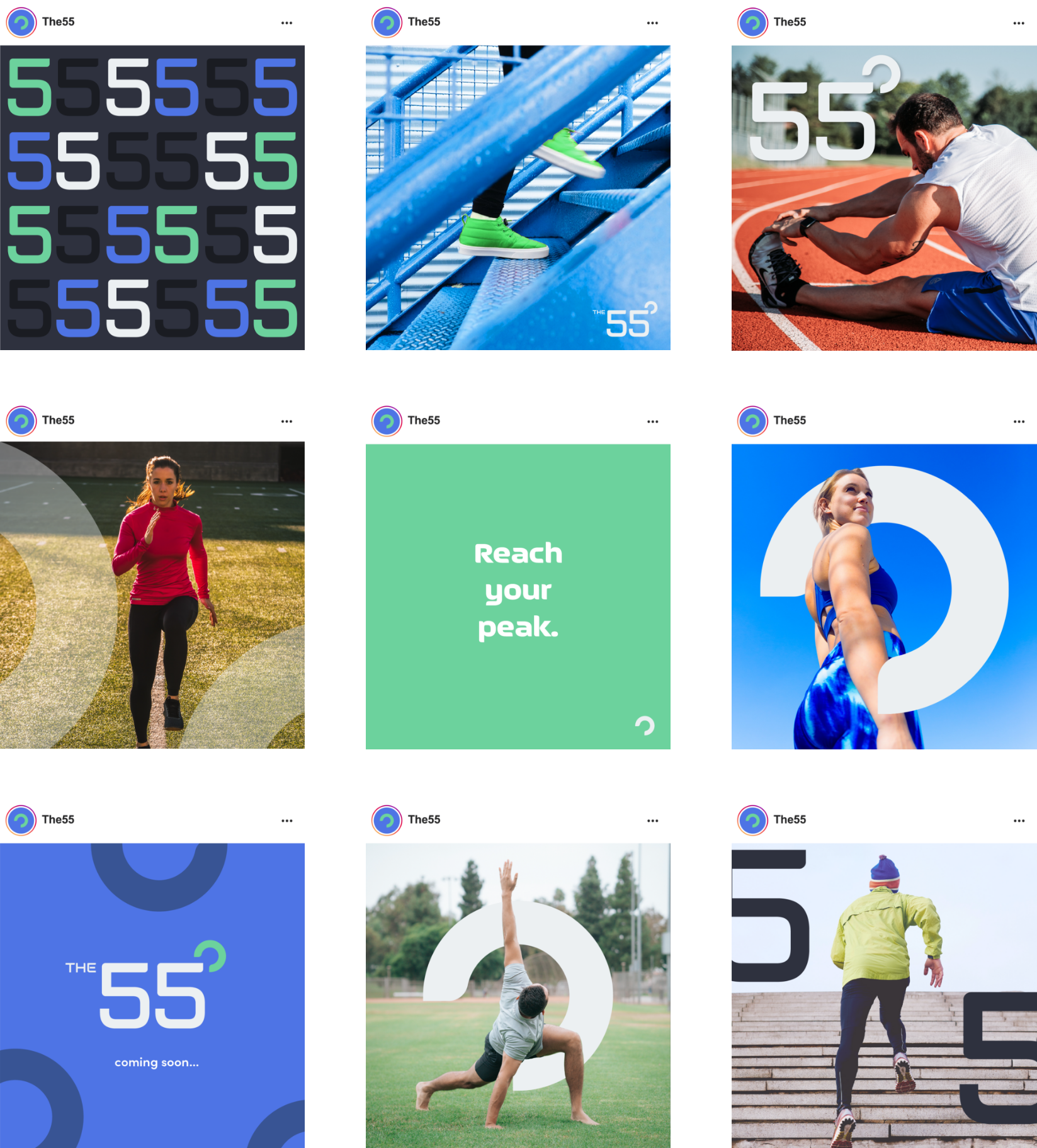
We transitioned The 55 into an all-encompassing brand using a brighter and more vibrant colour palette with a royal pastel blue as the primary colour. A clear and comprehensive tone of voice set out how the brand should communicate with its global audience, built around four brand values: quality, support, passion and strength.
New photography styles and social media templates were set, featuring a wide range of people to really reinforce the fact that The 55 is for everyone.
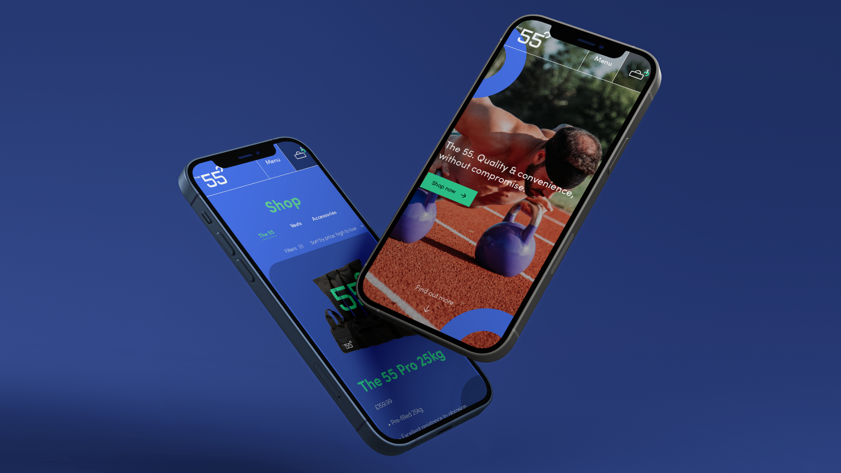

The brand relaunched at a challenging time for the fitness industry during Covid, but The 55 was created under adversity and a global pandemic wasn’t going to hamper them. The versatility of The 55 meant its customers could exercise at home or in their gardens during the pandemic, helping many people get through a really tough time.