Football rebrands – it’s so much more than a badge.
Topic
Sports Branding10 minute read read
No matter the industry, a rebrand will always be a topic of contention.
They’re risky, often controversial, and seldom universally liked. It’s a high stakes game and if a rebrand doesn’t land, it can be very difficult for a business to build the relationship back with their consumers. The stakes are raised tenfold when a football team decides it’s time for a change, especially when you add a die-hard global fanbase, media vultures, and sporting rivals, to the cacophony.
In this blog, we’ll look at some of the most talked about football rebrands in recent memory and discuss the motives and implications for clubs wanting to evolve to meet the demands of modern-day society in the crazy world that is football.
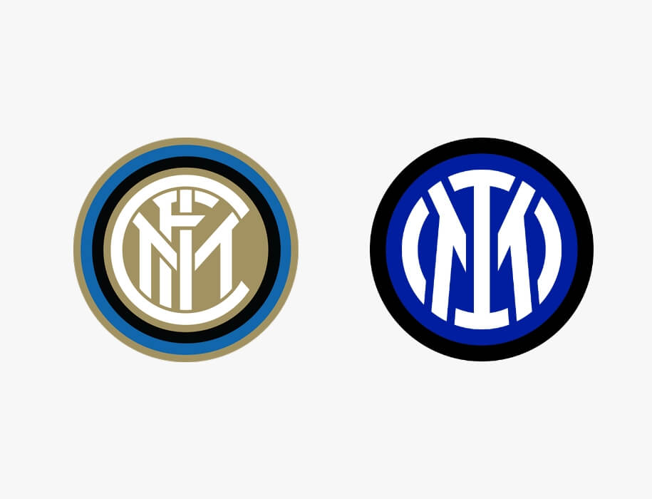
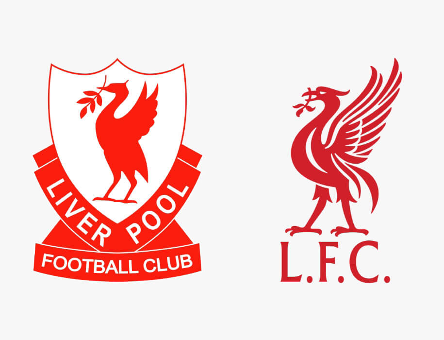
When rebranding, football clubs tend to go down one of three paths. The easiest route is to tweak the existing crest. Usually by simplifying what they already have, as seen with Inter’s recent rebrand. They cleaned up the old logo by making it more legible, while maintaining the interlocking typographic style that has become synonymous with the Nerazurri over many decades. Liverpool F.C. are another club to have done this by simply removing everything but the Liverbird.
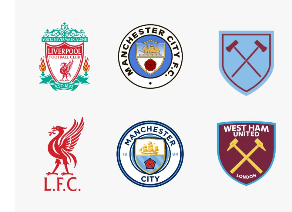
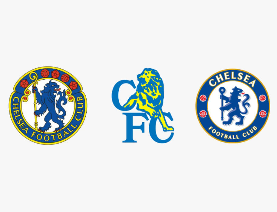
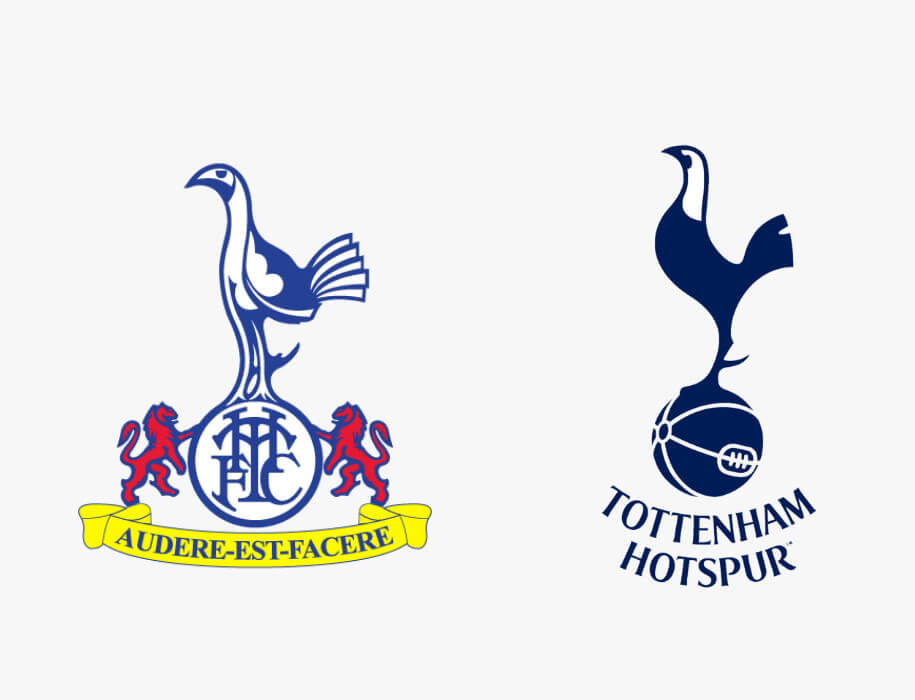
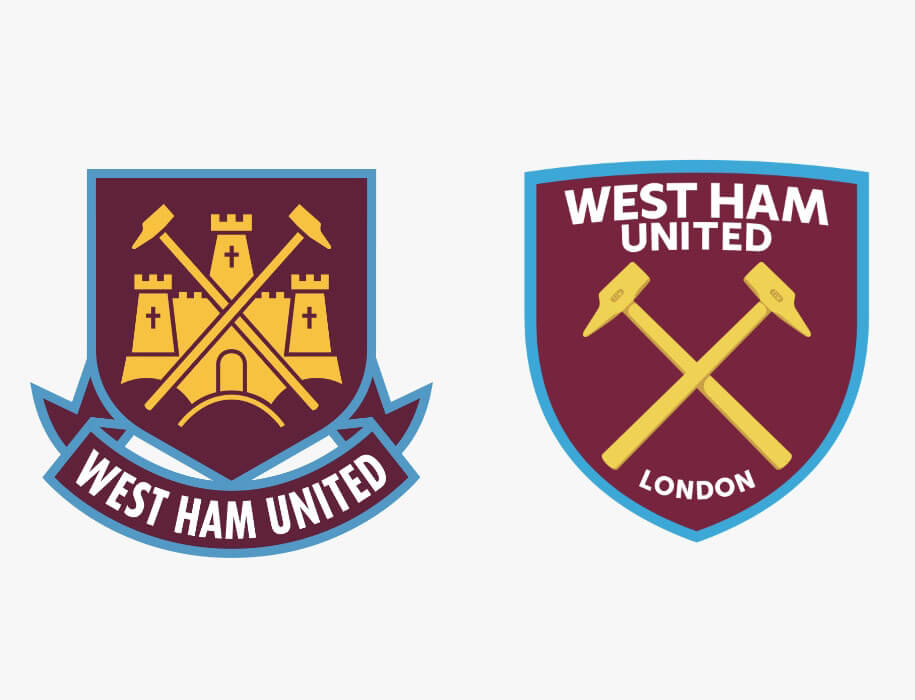
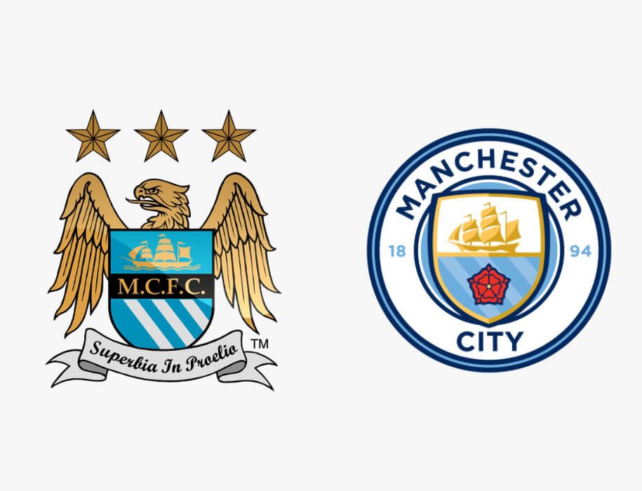
Alternatively, clubs can walk down memory lane and take inspiration from a past logo, just like Manchester City did in 2015 choosing to revive the crest they donned from 1972-1997, with some modern adjustments. West Ham did the same thing a year later, opting to revert to a similar design they used in the 1950’s and 1960’s, as did Chelsea in 2006, revisiting their circular crest from 1953.
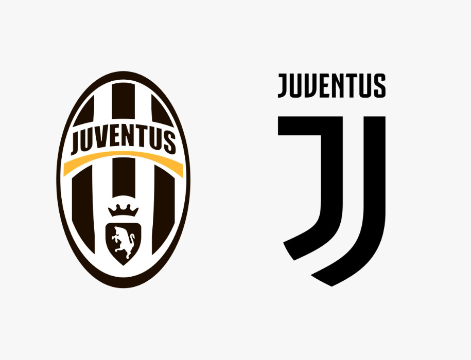
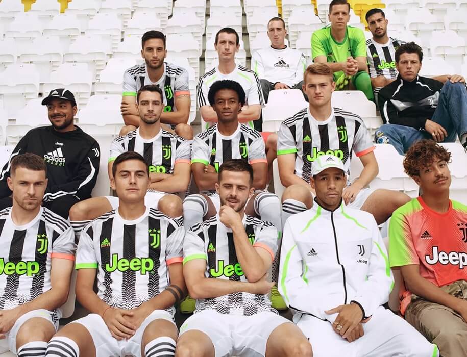
The minority dare to take the road less travelled however, risking everything by leading the club in a completely new direction to either escape the past, or attract a greater global audience. Juventus are the prime example of doing both. In 2017 The Old Lady ditched their black and white oval badge (which hadn’t really been altered since 1989) opting for a more contemporary and simplistic J design. While the launch was centred around “repositioning the club in the wider entertainment industry as a brand that is able to deliver lifestyle experiences”, it’s hard to ignore the corruption scandal that plagued the club in 2006. Couple that with the lack of European success in the last 25 years, it was clear that change was needed at Juventus.
The minority dare to take the road less travelled, risking everything by leading the club in a completely new direction to either escape the past,
or attract a greater global audience.
The rebrand opened the door for Juventus to blur the lines between football and fashion. With a sleek new logo and the acquisition of the most marketable player in the world Cristiano Ronaldo, they were able to tap into a younger market that wasn’t necessarily routed in football, expanding their appeal to America and Asia. It didn’t just stop there though. In 2019 Juventus collaborated with Palace, the London-based fashion brand to release a new kit and training range which was very well received.
The year before saw Paris Saint Germain do the same with Jordan, releasing a limited edition run of Air Jordan trainers. Now in their fourth year of the collaboration, the 21/22 PSG home shirt has been designed by the Jordan Brand bearing the ‘jumpman’ logo instead of the iconic Nike tick. It wouldn’t be surprising to see other clubs follow suit and carry-on mixing sport with fashion on and off the pitch. In fact, it’s been rumoured that Manchester Utd’s next kit supplier could be a fashion label with UNIQLO, Gap, and Tommy Hilfiger all in the running.

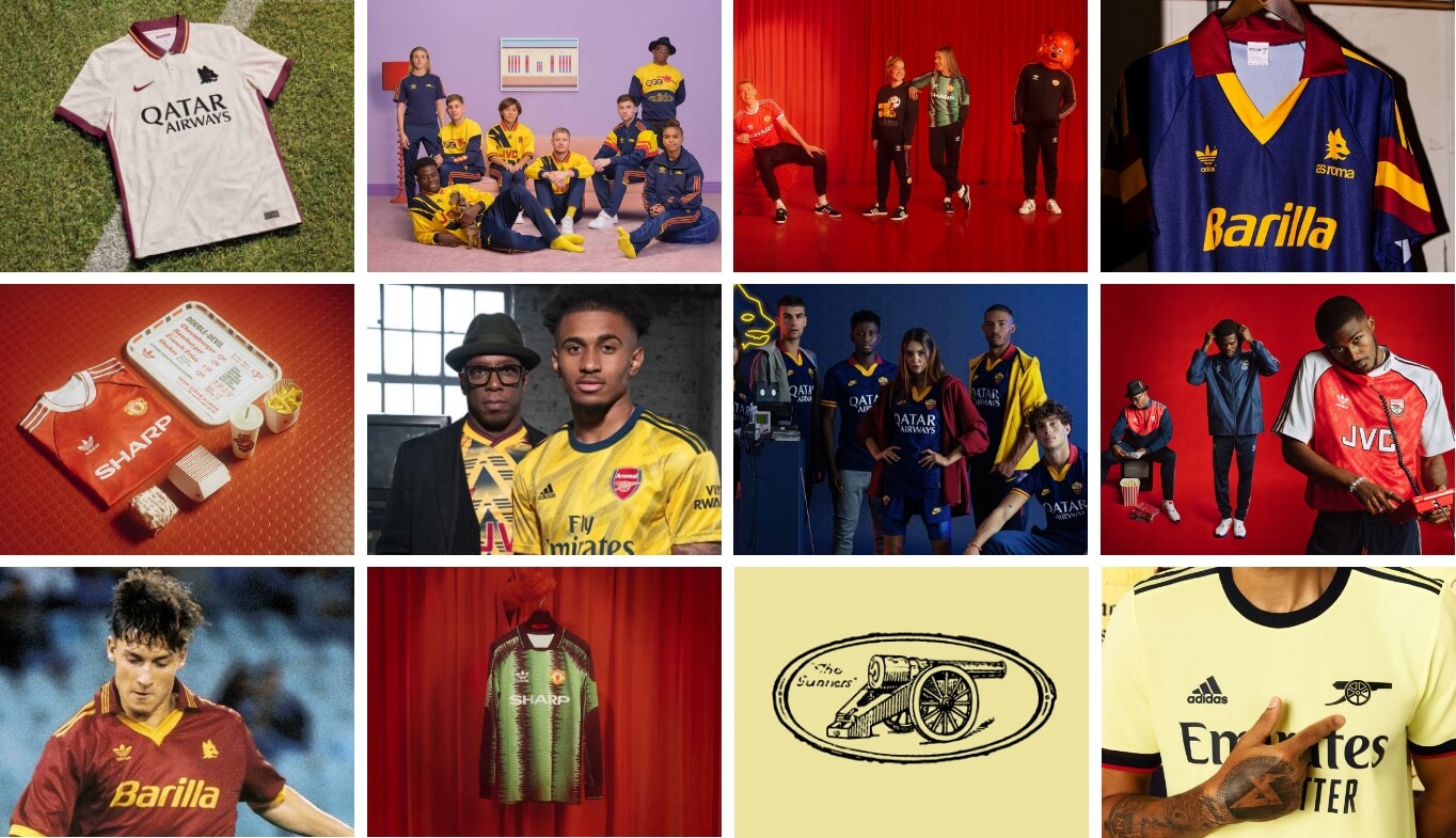
While teams like Juventus and PSG are transitioning into a new era with contemporary logos and kit collaborations, other teams are recognising the demand for vintage fashion culture and choosing to step back in time. While vintage fashion may be more popular with millennials than with any other generation the demand is still there and clubs are recognising this, albeit slightly later than expected. Many clubs have produced kits recently that are akin to famous designs worn back in the 90’s while others have created entire vintage clothing ranges.
Two teams that have absolutely nailed this in recent years are AS Roma and Arsenal. They even went one step further and changed their club crests on
certain shirts to really bang the drum about their proud heritage, without
explicitly rebranding.
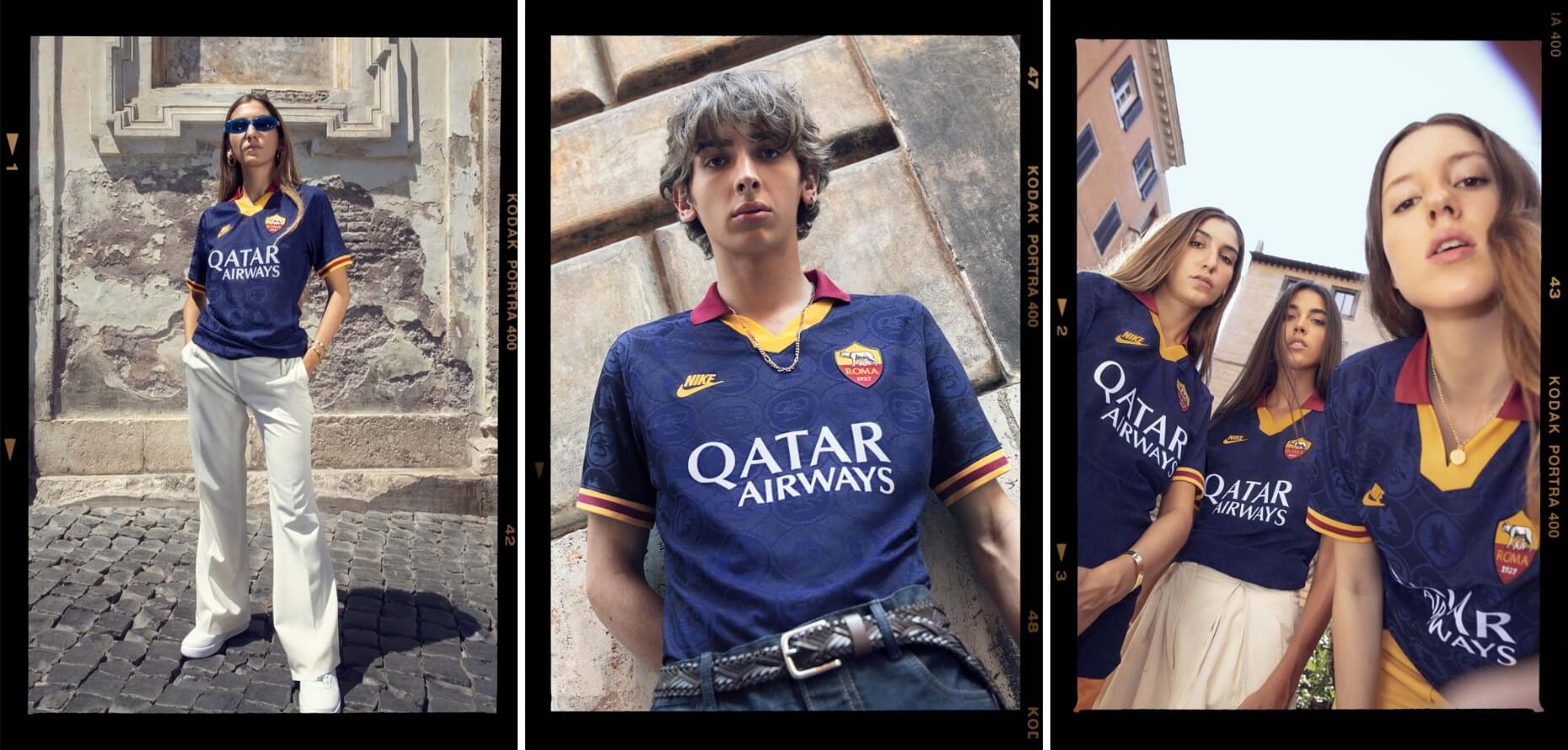
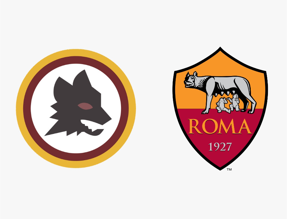
In the 20/21 season Roma reverted to their iconic wolfs head logo on their away shirt. Designed by Piero Gratton in 1978, the ‘Lupett’ helped push AS Roma to the forefront in brand and marketing in that era, becoming a cornerstone of the club’s identity. In the 19/20 season, they released their alternate shirt which paid tribute to a 90’s club classic. The shirt also included a subtle design print featuring elements of several classic Roma badges including the ‘Lupetto’.
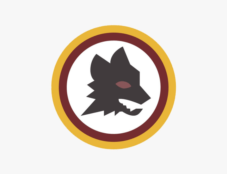
Designed by Piero Gratton in 1978, the ‘Lupetto’ helped push AS Roma to the forefront in brand and marketing in that era, becoming a cornerstone of the club’s identity.
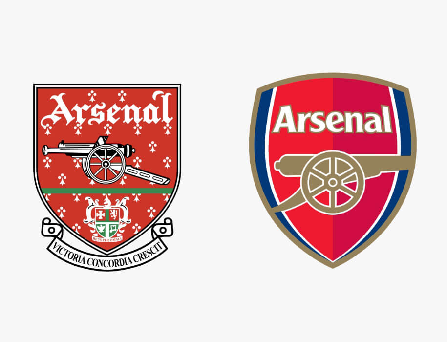
Arsenal has followed suit since Adidas became their kit supplier in 2019. Since then, they have produced many kits that hark back to the success they enjoyed in the 1990’s with some amazing designs. This season they changed their crest on their away shirt with the iconic cannon taking centre stage, like the one used in the mid 1920’s. Next season will see Arsenal once again exploit their heritage by taking a subtle design used in the club’s crest from 1949-2002 by turning it into a pattern for their third shirt.
Adidas have been quick to realise the success of the Arsenal vintage collection, releasing an entire retro range for Manchester United this month (May, 2022). In fact, Adidas are championing the vintage look more than any other kit supplier next season with both Arsenal and Manchester Utd’s 22/23 home shirts sporting classic collars, complete with retro patterns.
While these retro design and logo choices have been a huge hit with the fans of the respective clubs, not every branding decision in football lands quite so well.
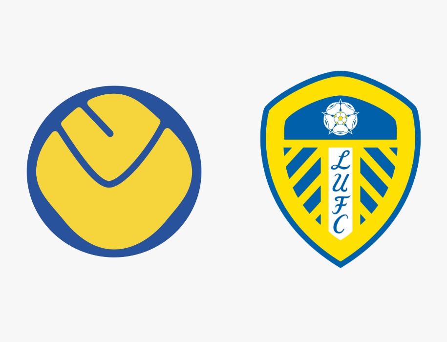
Exhibit A: Leeds United. In 2018, Leeds unveiled their new club crest to celebrate their centenary year. The new crest was the result of six months of research, with 10,000 people consulted. What followed was a huge backlash on social media. The fans also made their voice clear with a 77,000 strong petition to stop the launch of the new crest. The launch was halted in its tracks and to the delight of Leeds fans across the world, the new crest never became a reality.
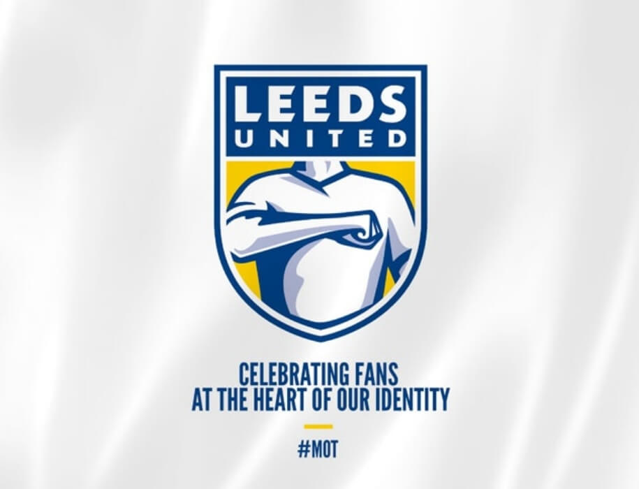
The launch was halted in its tracks and to the delight of Leeds fans across the world, the new crest never became a reality.
This isn’t the first-time clubs have had to listen to their fans though *cough European Super League cough*. Bayern Munich have not had blue on their home shirt since 2018 due to fan protests, with the Bavarian club opting for only red and white.
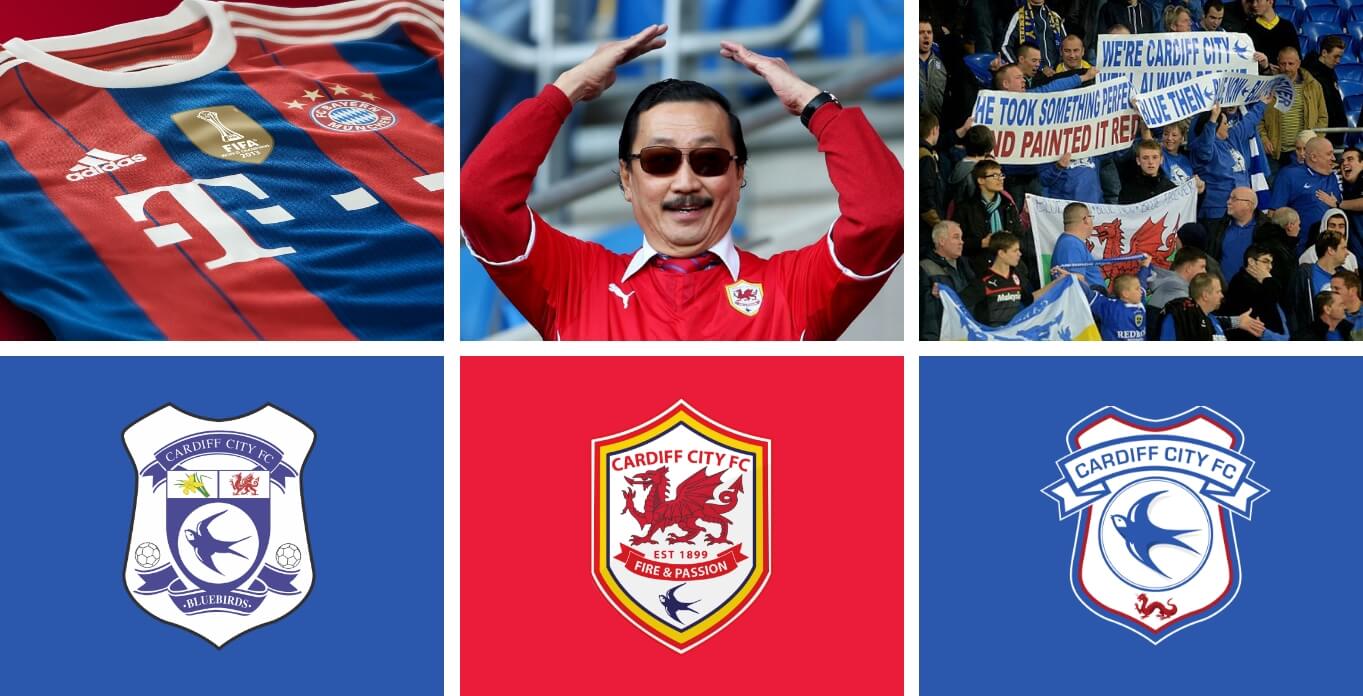
In contrast, the owners of Cardiff City sent shockwaves through their fan base by controversially changing the club’s main colour from blue to red in 2012 as well as replacing the blue bird with a dragon as the centrepiece in their crest. The Malaysian owner Vincent Tan believed the colour switch would bring Cardiff good fortune. Unfortunately, it only brought controversial headlines and disenchanted fans. While the Leeds United rebrand was over before it really began, the notorious red home kit and crest stuck around for 3 years at the frustration of the Cardiff City fans. Eventually they rebranded again in 2015, resorting to the historic blue with an updated crest featuring the blue bird once again.
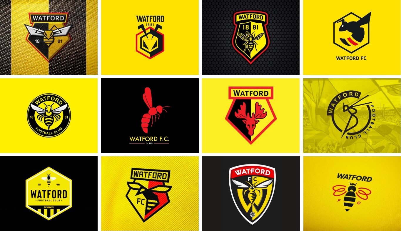
In 2019, Watford launched an open competition to design their new crest, with the design brief focused on the club’s nickname ‘the Hornets’. It was a competition that myself and 4,000 others entered with the prize of £10,000 for the winner. The entries competed against the existing club crest and the finalists were decided by a group of Watford F.C. stakeholders. In the end Watford chose to stick with their original crest, which made the whole thing rather redundant, and the hype fizzled out in a huge anti-climax for all involved. A bad day for creativity.
While some may argue that football is losing its soul and clubs are losing site of their heritage through recent rebrands, clubs must adapt to meet modern-day demands that are impacting football. One of the biggest factors is the number of channels the clubs have to communicate across. The decision to have a more simplistic logo is far more efficient when creating content across multi-media, selling a range of products and services, and building brand awareness on a global scale. Football clubs are brands, and brands must be instantly recognisable. Ultimately, the clubs that can meet these demands while not forgetting the heritage of the club as well as the fans will not go far wrong. As long as performances on the pitch match the rebrand off it.
Check out some more notable football rebrands below and click this link to view our latest work.
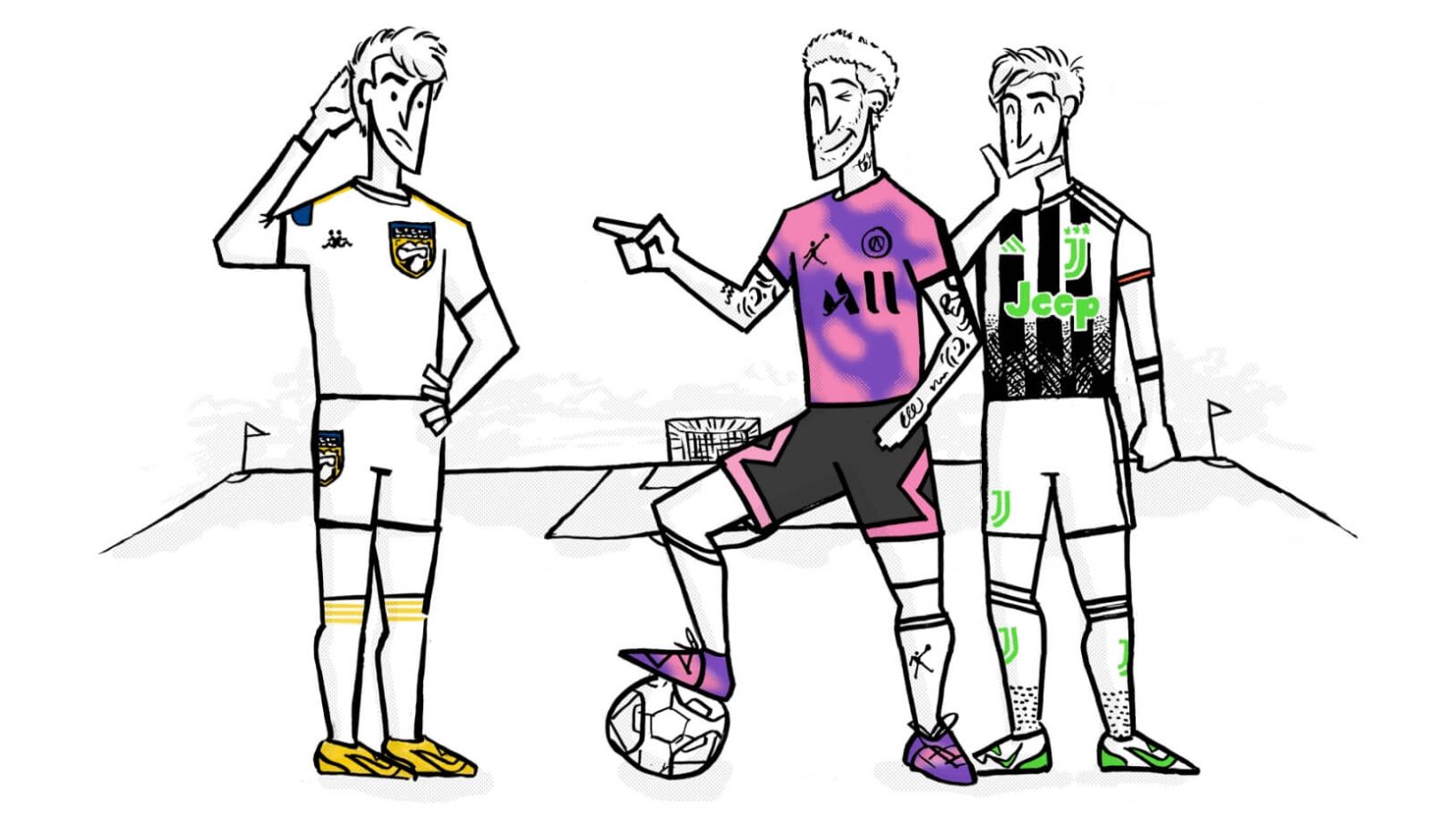
Some before & afters…
Other blogs
Category
InsightTopic
Marketing
4 mins read
Category
Agency NewsAwardsTopic
Award Win
1 min read