In a (Classic) Blue funk: Celebrating Pantone’s Colour of the Year 2020.
Topic
Industry Insight5 minute read read

It’s one of the most anticipated and exciting times of the year for our Interior Stylist Laura, with the unveiling of the Pantone colour that will inspire product and design trends for the coming year.
And 2020’s Pantone’s Colour of the Year for 2020 is…
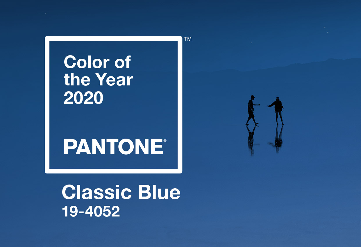
…’19-4052 Classic Blue’ – perhaps not the most romantic of names, but an inspired and considered choice by Pantone. This colour will influence graphic design, fashion and home interiors trends over the next year, and you can expect to see a lot more of this tranquil, oceanic hue.
Pantone describes Classic Blue as, ‘a timeless and enduring blue, elegant in its simplicity. Reminiscent of the sky at dusk, the reassuring qualities of this thought-provoking blue highlight our desire for a dependable and stable foundation on which to build as we cross the threshold into a new era. Imprinted in our psyches as a restful colour, it brings a sense of peace and tranquillity to the human spirit, offering refuge.’
For over 20 years, the Pantone Colour of the Year selection process has required thoughtful rumination and intense trend analysis. Pantone’s colour experts scour the globe looking for colour influences from upcoming films, new art collections, far flung destinations and people, as well as new technologies, social media, social issues and of course, all areas of design.
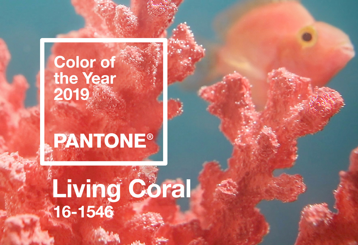
For the past two years, the Pantone Colour Institute has chosen bold, dominant colours – ‘Living Coral’ in 2019 and ‘Ultraviolet’ in 2018. This year’s choice of ‘Classic Blue’ is a clear departure from these vivid shades. As the name itself attests – it’s classic. Wholesome, elegant, confident and grounded, the colour infers a sense of stoic stability and places a focus on our planet and the increased need for global action on climate change. Classic Blue also nods to relaxation and comfort – a colour that we gravitate towards to feel settled and protected.
Blue is universally acknowledged as one of the most popular colours – frequently topping the list of the world’s favourites. Perhaps it’s because of its ubiquitous nature – we’re constantly within it, enveloped by sky and sea and all wrapped up in a protective blue bubble of safety and serenity.
The Little Book of Colour by Karen Haller describes blue as a psychological primary colour, one that affects our intellect and triggers mental responses. Light blue is likely to create feelings of peace and composure, whereas darker, more saturated blues promote focus and concentration.
Whilst trend and colour institutes like Pantone are here to inform us about what we’re likely to see on the high street, in magazines, adverts and across graphic design in the coming months – there’s no need to recycle the full contents of your wardrobe, strip all your walls or rush down to B&Q with a swatch list. These trends are a forecast, a guide – there to offer a bit of style inspiration when needed, but certainly not to be followed religiously.
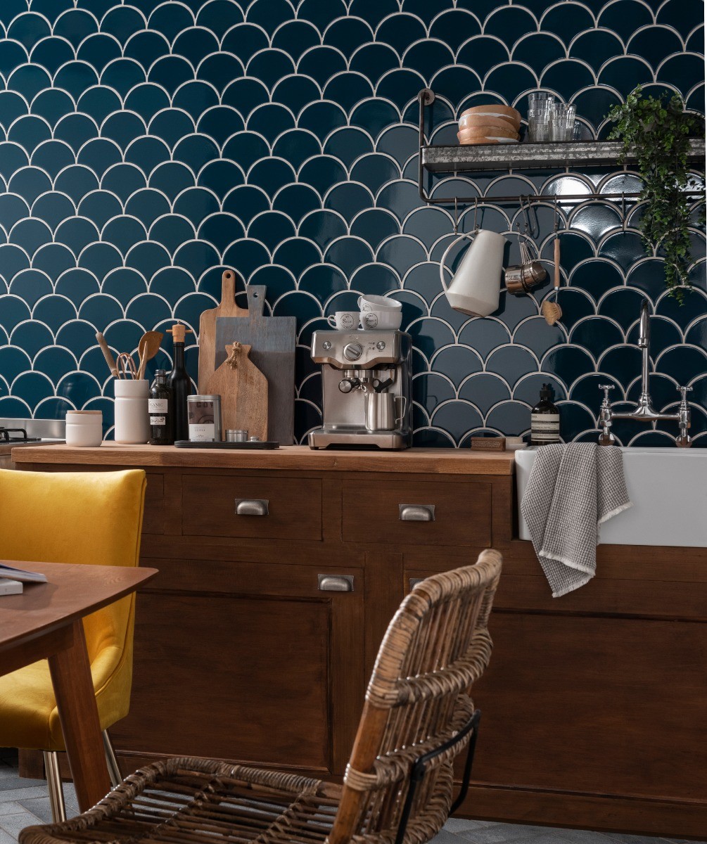
But if you do fancy a blue rinse throughout your home, you won’t have to look too far for ideas. Classic Blue is already hugely popular in interiors – Topps Tiles’ Tile of the Year, ‘Syren in Midnight Blue’, was released in September 2019 in a deep blue, scallop-shaped tile. We’ve also seen this rich blue in wall colours and as a popular choice for kitchen cupboards and bathroom tiles. It lends itself well to a study or office space, where quiet contemplation and reflection is needed.
To get your creative vibes flowing, I’ve put together a mood board of select pieces of furniture and accessories inspired by Pantone’s Classic Blue and brought it to life in CGI. The edit includes some of my favourite homeware items, which should hopefully give you some insight and inspiration as to what’s out there and how you might channel a similar look in your own home.
Furniture, Propping & Styling
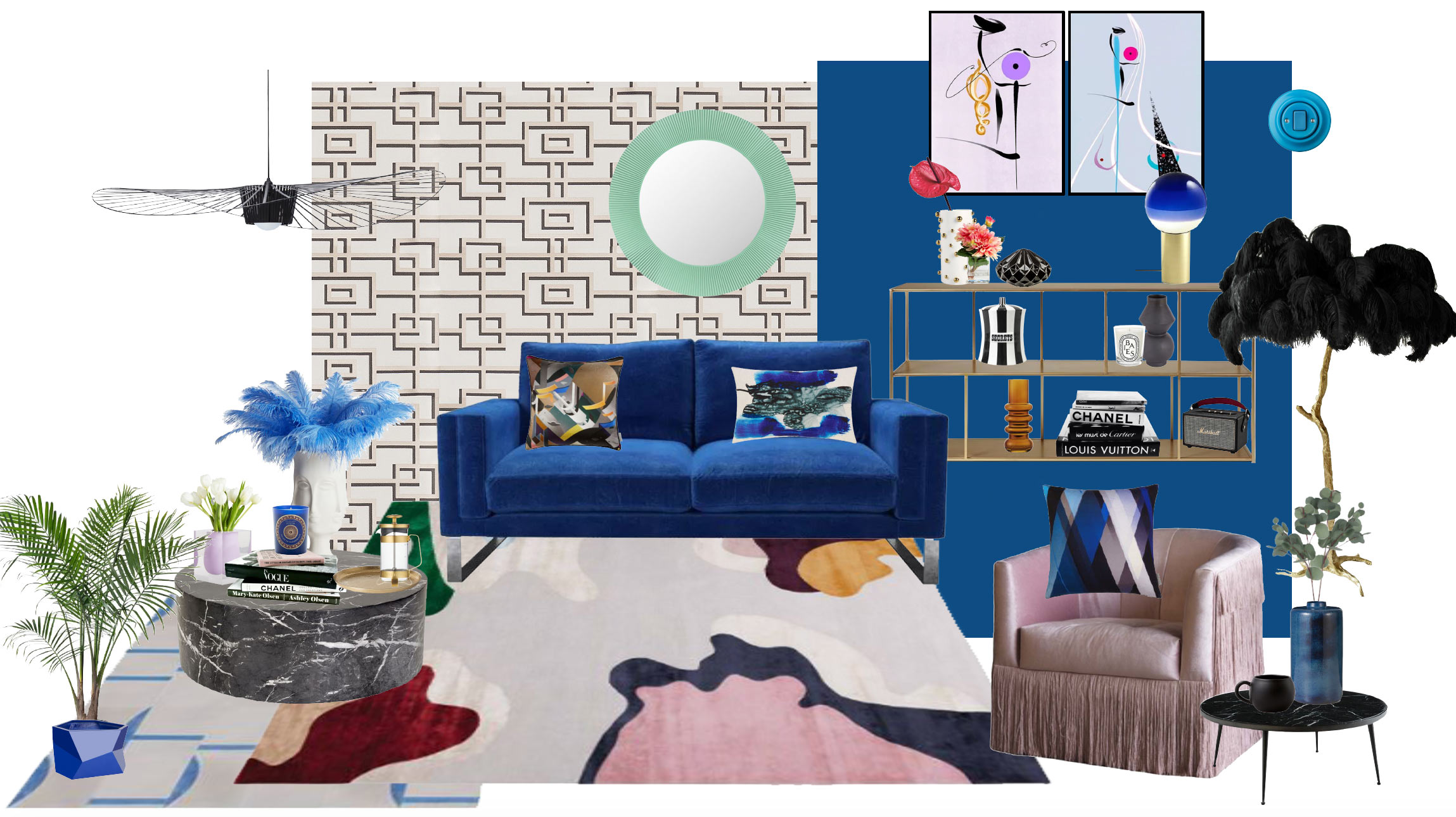
This look might not be for the faint of heart, but that’s exactly what CGI is all about, playing around fearlessly with bold colour and texture to create the look that’s lurking in the depths of your imagination, before committing to the scheme in real life.
If you’re wondering what Classic Blue can be paired with to create interesting colour combinations, try orangey-yellows for a bold, striking, complementary scheme; coral for hot drama; blush pinks and taupe for a calm vibe – or fresh mint green for an edgier feel.
CGI has given us the opportunity to understand how Classic Blue could work at the click of a button and enabled us to bring this electric edit of cerulean dreams into the real world. With CGI, the possibilities really are endless, and we can use it in a way that’s efficient, cost effective and saves significant amounts of money on sets. And here it is, the Pantone Colour of the Year 2020, Classic Blue, in all its CGI glory…
If you’d like to bring your own vision to life and see how your items could work within an interior setting, get in touch at laura@holdens.agency
In the meantime, check out this full shopping list of the items I used to create the CGI:
- Wall colour painted in Pantone Classic Blue – gloss effect
- Rheinsberg – Designers Guild wallpaper
- Blue Curve Stripe Design Tile – Bert and May
- Vertigo Pendant Light Large – Petite Friture – Nest
- Costello sofa in Cobalt – Sofa.com
- Fabulous Fringed Pink Velvet Armchair – Rockett St George
- Feather Floor Lamp – A Modern Grand Tour
- Aero Shelving Unit – Swoon Editions
- Tokki Black Marble Coffee Table – Habitat
- Framis Rug – Rug Company
- Mooi Cushion – Kit Miles
- Diagonal Gradient Blues Cushion – Kit Miles
- Blot Cushion – Tom Dixon
- Barista Co Cafetiere – Habitat
- Bel Air Scoop vase – Jonathan Adler
- Art work – from Bethany Perry Art Collection
- Blue Ostrich Plume Feathers – Jonathan Adler
- Dotted Vase – Amara
- Haalo Vase – Made
- Black Speaker – Marshall
- Jordi Canduras Dipping Light Lamp – Nest
- Nitor Ara Light Switch – Katy Paty
- All Saints Round Mirror – Aquamarine Green – Kartell – Amara
