Severance and its extraordinary impact on culture, advertising and design.
Topic
Culture10 min read

As the second season of Apple TV+’s Severance captivates audiences worldwide, the series has firmly established itself as a cultural phenomenon.
Notably, Severance has become Apple’s most-watched series ever, surpassing previous records held by Ted Lasso. The streaming platform experienced a remarkable 126% increase in new subscribers in January 2025 compared to December 2024, largely attributed to the show’s return.
Its unique blend of psychological intrigue and distinctive design has garnered critical acclaim and sparked widespread discussions across various creative industries and channels. So, why has Severance had such a significant cultural impact?
Aesthetic allure.
Severance masterfully crafts an atmosphere that is both mysterious and visually captivating. The show’s production design transforms mundane office settings into a time-bending landscape, featuring endless sterile white hallways, low ceilings and minimalist decor. This deliberate design choice creates an unsettling environment that resonates with viewers, offering a fresh perspective on the monotony of corporate life.
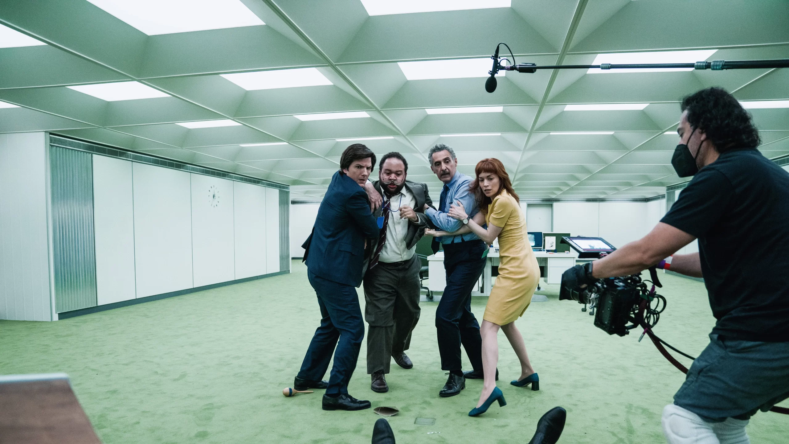
Set design is just one cog in the intricate machine that builds Severance‘s unsettling world. No matter how small, every detail is meticulously crafted to enhance the show’s storytelling. Some of these elements are so subtle they almost slip past unnoticed, especially when your brain is busy deciphering whether you’re watching ‘Innie Mark’ or ‘Outie Mark’.
From the first frame, the show starts playing subconscious mind games, right down to the title font, which is identical to Apple’s own. A deliberate choice that blurs the line between our reality and Lumon’s in a layer of meta-commentary we could dissect for hours.
The world-building extends far beyond the walls of the Macrodata Refinement department. An entire branding ecosystem exists within Lumon, from vending machine snacks to letterheads, business cards and even balloons. Most of these props only get a fleeting moment on screen. Yet, they all contribute to the immersive, suffocating nature of the show. You have to wonder if Lumon has its own set of brand guidelines.
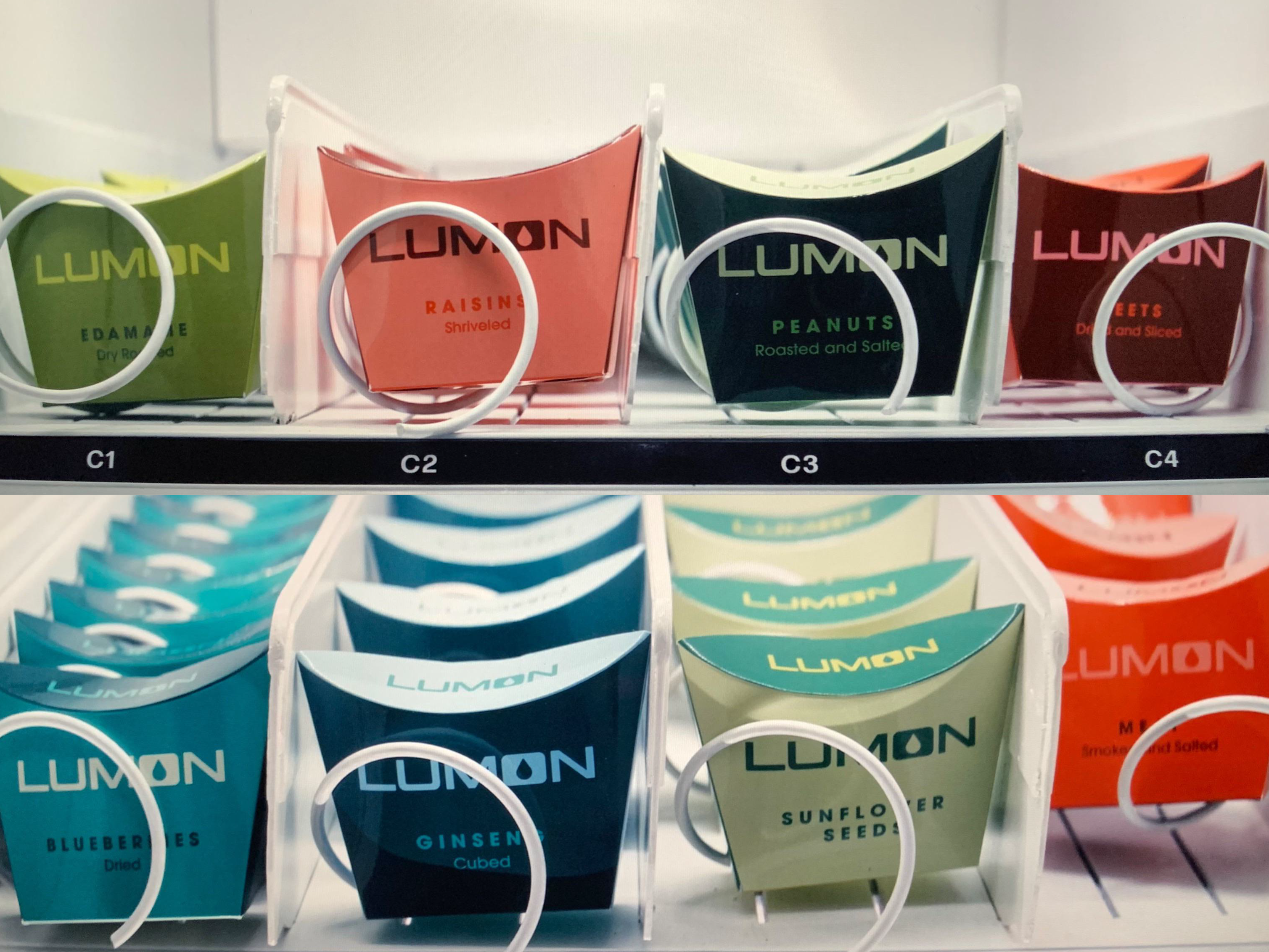
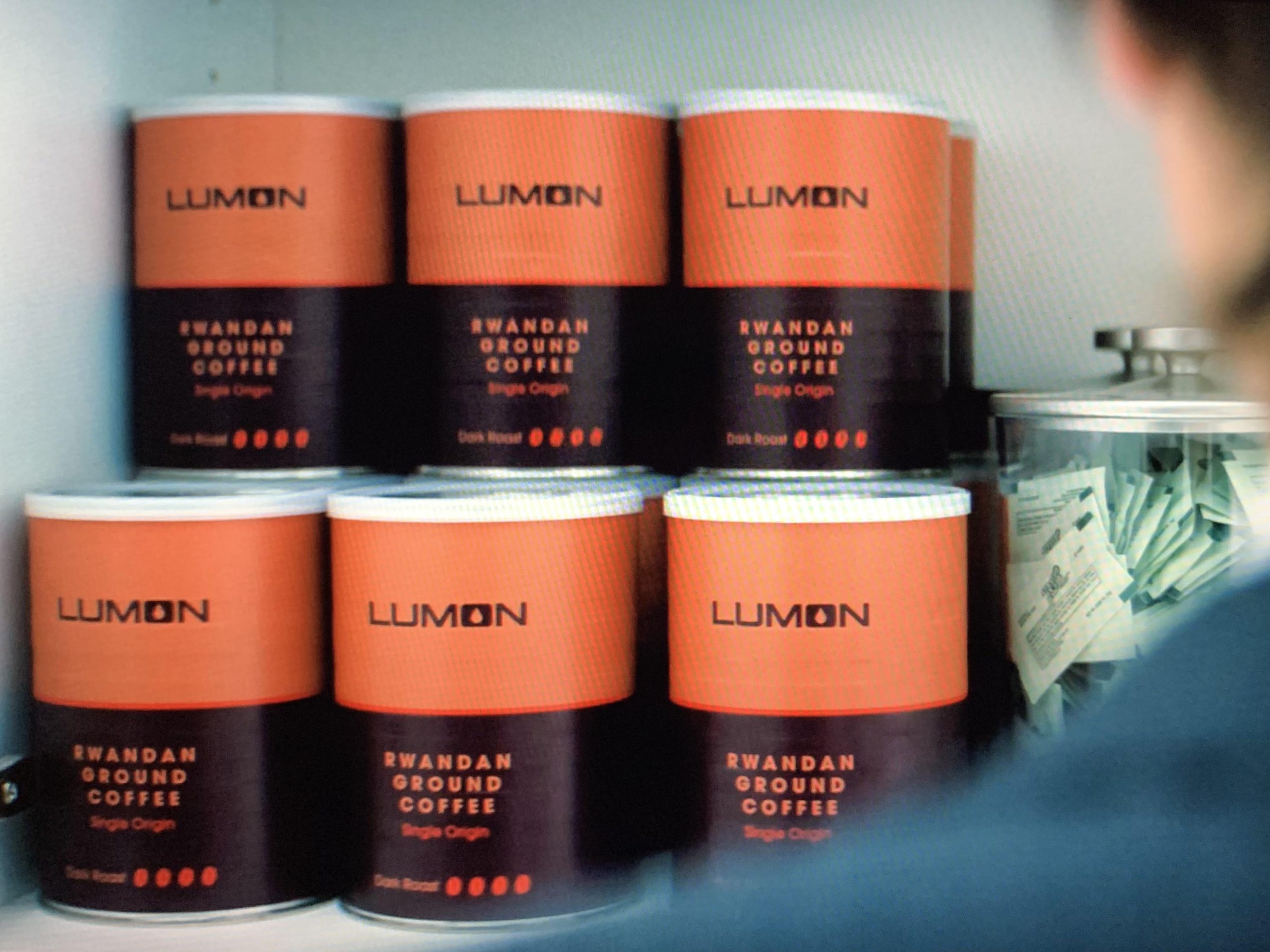
Then there’s the use of colour, which is as strategic as it is striking. Each scene is carefully curated to feature only three or four colours at a time, stripping away unnecessary visual noise. Cool, corporate tones dominate the severed floor, reinforcing the sense of control and order until Helly R’s bright red hair disrupts the palette, a defiant splash of rebellion in a world designed to suppress individuality. Outside Lumon, the tones shift to muted, desaturated hues, a visual reflection of Mark’s grief and emotional detachment.
This disciplined approach to colour does more than create a striking aesthetic; it helps declutter the visual storytelling, making it easier for the audience to absorb key messages. Severance is already a mind-bending experience, the last thing we need is a sensory overload of colours scrambling our signals even further.
Fan creativity.
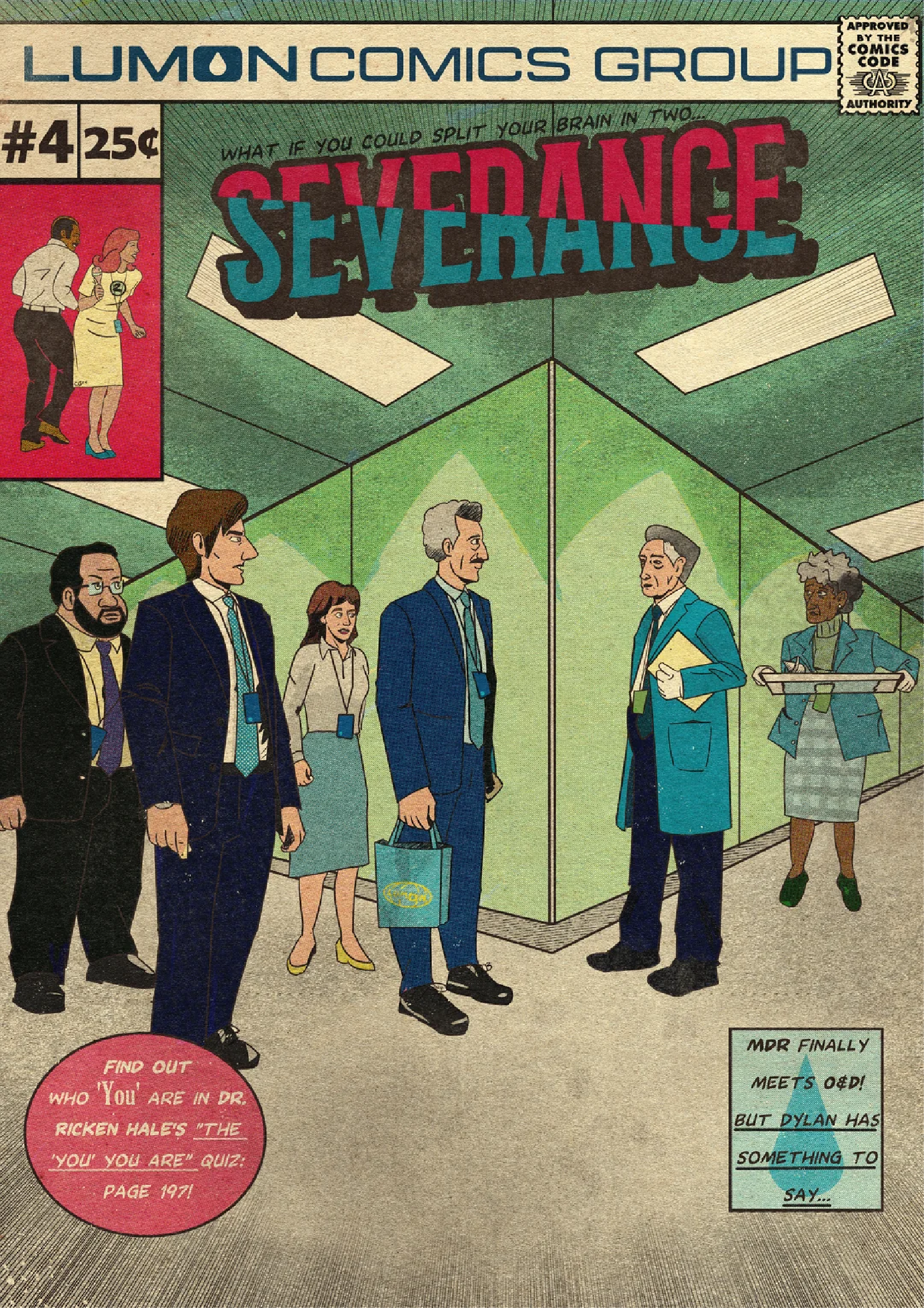
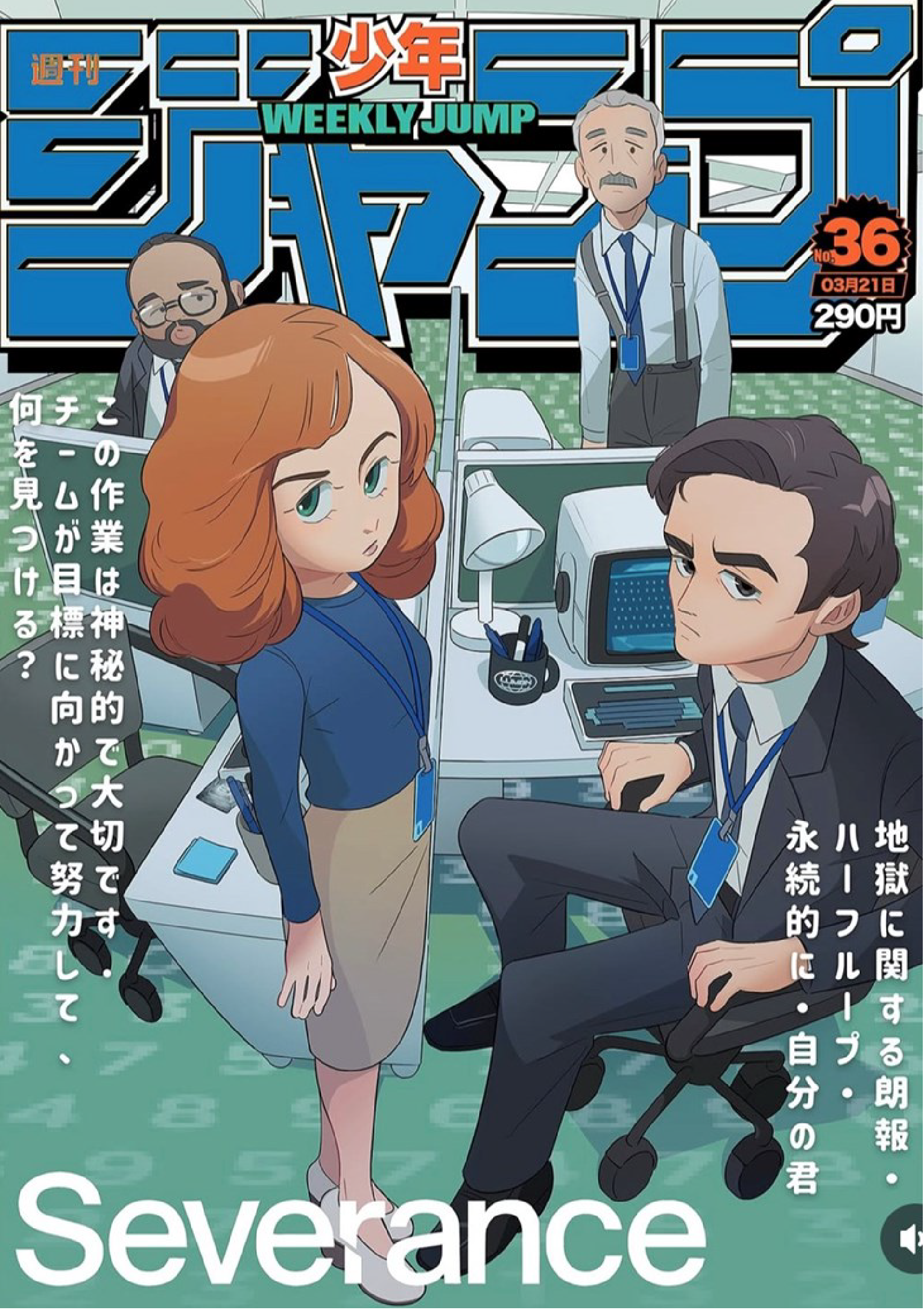
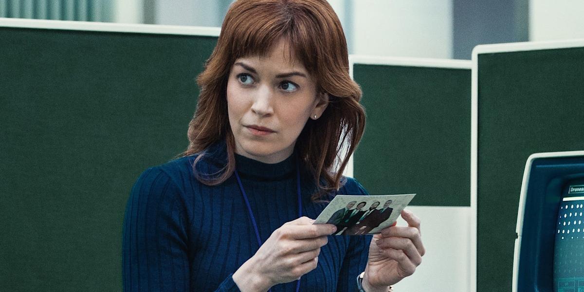
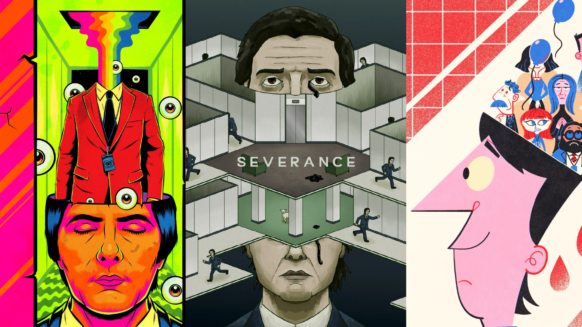
The enigmatic nature of Severance has ignited the imaginations of fans globally. Artists from diverse backgrounds have produced an array of fan art, showcasing the show’s profound influence. Platforms like Pinterest and Instagram are replete with interpretations, ranging from minimalist posters to intricate illustrations. At the same time, TikTok has become the hub for fan theories and details audiences might have missed, with influencers scrutinising every last second of each episode.
Brands aligning.
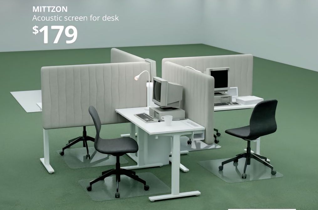
Recognising the show’s cultural resonance, brands have integrated Severance themes into their marketing strategies. For instance, IKEA launched a campaign promoting office furniture and supplies that echo the series’ distinctive aesthetic, effectively bridging the gap between fiction and functional design.
Immersive marketing.
The marketing strategies for Severance have been as innovative and thought-provoking as the series itself, effectively transcending traditional advertising methods through immersive experiences and out-of-home (OOH) advertising.
In anticipation of Season 2, Apple TV+ orchestrated a striking activation inside New York City’s Grand Central Terminal. In January, commuters were met with a surreal scene with all four lead actors working in a transparent, cube-shaped office setup. This live performance art installation drew significant attention on social media, sparking conversations among passersby and building hype for season 2 online.
In March, London commuters were treated to an unexpected and immersive experience as part of Severance’s ongoing (and outgoing) marketing efforts. A striking installation near Tower Bridge featured a sea of blue balloons, each adorned with the face of Mark S. This surreal scene mirrored the show’s enigmatic themes while making it impossible to miss at the same time.
Adding to the spectacle, cast members, including Adam Scott, Britt Lower, Tramell Tillman, Zach Cherry and Gwendoline Christie, made surprise appearances, interacting with fans and further blurring the lines between the show’s fictional world and reality. The event celebrated the series’ renewal for a third season and served as a testament to the show’s growing cultural impact.
The ripple effect.
Severance exemplifies how innovative storytelling, combined with meticulous design and direction, can transcend traditional media boundaries. Its influence permeates various facets of culture, inspiring creativity and strategic collaborations and solidifying its status as a seminal work in contemporary television.
References
Image 1: Raft Penguin @penguinraftshop
Image 2: Anjohink @anjohink
Image 3: This is Blase Studio https://www.thisisblase.studio @thisisblase
Image 4: Ewerton Lua @ewerton.lua
Image 5: Hannah Jurgens https://www.hannahjurgens.com @wetmonsoon
Other blogs
Category
Agency NewsTopic
New Client Win
1 min read