The importance of brand still reigns supreme, even for the King.
Topic
The new royal cypher5 mins read
While we wait with anticipation to see what kind of king Charles will be following the sad death of Queen Elizabeth II, we finally have sight of his new royal cypher. So with all the talk of the importance of personal branding (LinkedIn, we’re looking at you), we thought it would be a good idea to get our creative team’s honest opinions on the new King’s brand. Is it the crowning glory of all personal brands or frankly design treason? Let’s see. No pressure.
Charles’ new royal cypher follows the tradition of every monarch since Queen Victoria. Monarchs have used their initials alongside the crown to identify themselves as sovereign since the early Tudor period, but it was Victoria that decided to put her unique spin on things and create her own distinct version. You could even argue she was ahead of her time when it comes to the importance of personal branding.
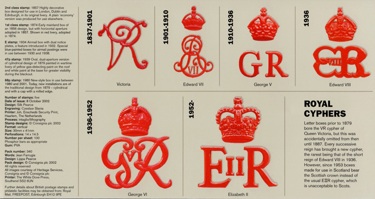
The monarch’s cypher is possibly the most widely used and recognised personal brand, or brand full stop, throughout the UK. It’s seen almost everywhere, from bank notes, stamps and postboxes to public buildings and uniforms for the military and police. As far as client briefs go, it’s a momentous but daunting task, with the monarch having ultimate sign-off (“no, YOU tell Charles he only has two rounds of amends”). The responsibility for creating it falls to the College of Arms, which some might say is the world’s oldest ‘design studio’ established in 1484.
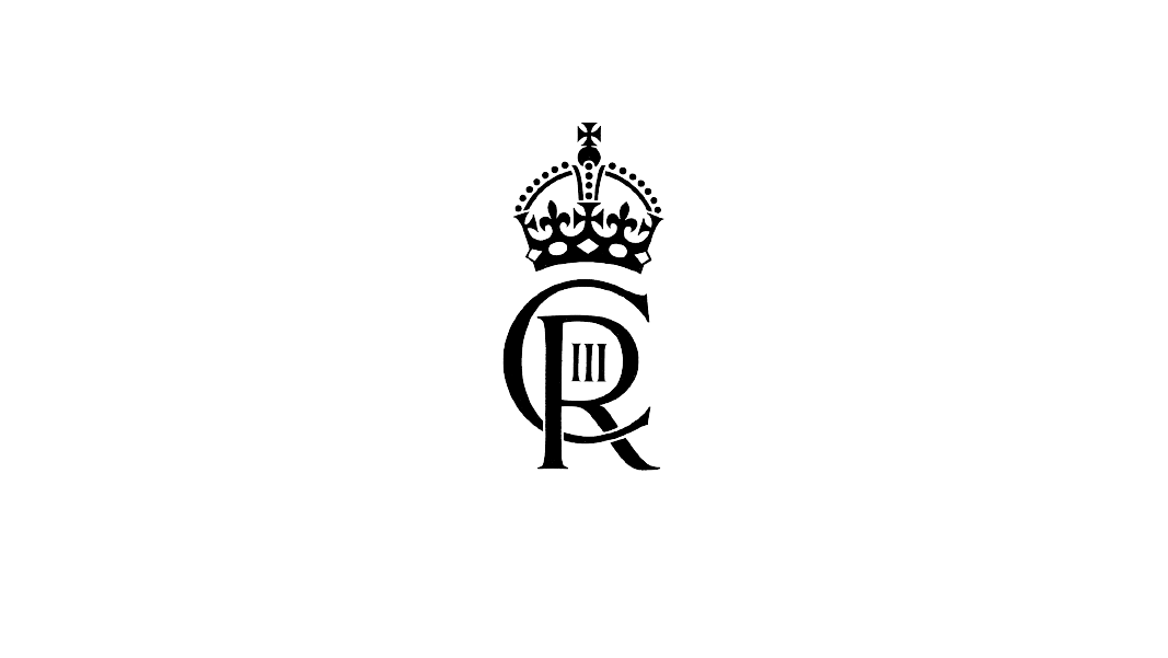
We first saw a monogram version of Charles’ new cypher this week when it was used to frank letters from the Buckingham Palace post room. It combines his initial “C” with “R” for Rex (Latin for king) and III to designate him as the third King Charles, topped with St Edward’s crown. It’s very much in keeping with Elizabeth’s before him, but what do our creative team think?
David, Social Media Manager & Content Creator:
Is there another brand in existence that has to change not out of choice, but necessity? For me, that’s the most interesting part. Imagine if Apple had to rebrand when Steve Jobs died. It’s not really a problem that most brands have to consider, which is what makes the monarch’s royal cypher so unique.
King Charles’ new cypher seems to blend the previous two together with the interconnecting letters and positioning of the numbers akin to George VI, while the font is very similar to Elizabeth’s.
Elizabeth’s cypher really stood the test of time, surviving the unprecedented evolution of communications over the last 50 years. The importance of legibility has become even more important today due to the prevalence of digital communications such as social media and this huge societal shift will no doubt have influenced King Charles’ cypher.
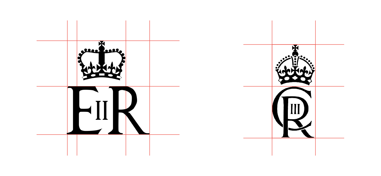
As you can see, the new cypher fits perfectly into a rectangular block, whereas Elizabeth’s didn’t have such a balanced alignment. I’m sure this was a deliberate choice to accommodate the full range of digital and printed communications the new cypher will appear on.
I would be surprised if the royal family strayed away from this design for future monarchs, with concepts for Prince William’s and Prince George’s cyphers probably already in the works. The importance of brand still reigns supreme, even for the most famous family in the world, and that identity must remain. Even beyond death.
Luke Ranfield, Designer:
The new royal cypher maintains its heritage and follows the trend of minor modernisation seen throughout previous iterations of the mark. The crown is simplified but still maintains the intricate details fit for a king.
The contrast of the initials appears to put the mark in an awkward stage between traditional and modern. I think this is possibly down to a fear of really pushing the boundaries of tradition and firmly taking the royal family into a bold new era.
The choice of a modern serif, while still trying to link the characters together, makes the mark feel unbalanced. I feel this layout choice would have been better complemented with a more ornate font choice to strengthen the regal theme.
In summary, Charles’ new cypher seems like a small baby step towards a full revamp, almost like the awkward teenage years of a truly modern monarchy’s personal brand. With all that being said, I do like the direction this cypher is taking and it’s exciting to see where it could go next.
Daniel Thompson, Creative Lead:
On the spectrum of logo or monogram design, ranging from the hyper-overanalysed and multilayer marks to… well that just looks lovely, I wonder if we have a case of the latter with this new royal cypher.
Delving into the details, I do like the sharper serifs on this new cypher, along with its balance and how they have threaded the C through the R and placed the III in the counter of the R (I did have to grab Type Matters by a friend of the studio Jim Williams to remind myself of that typographic term).
It’s definitely possible the design team considered things like legibility, readability and yes, the domination of horizontal orientation for the world of social, but how up-to-date King Charles is on these current design trends I’m not so sure.
Having spent many months at this point agonising over logos and monograms to infuse them with meaning and purpose, it still delights and annoys me in equal measure that just finding a simple, clever or beautiful way to combine two letters and some numerals can be enough to win over a client – or in this case, a king.
Other blogs

Category
InsightTopic
Marketing
4 mins read
Category
Agency NewsAwardsTopic
Award Win
1 min read