Why ‘nothing’ has changed: the importance of minimal rebrands.
Topic
Branding5 min read
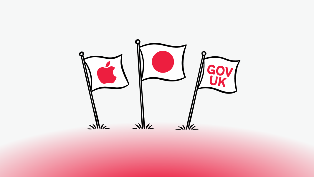
When we first wrote about the rise of minimal rebrands, we opened with that meme about Japan’s flag “redesign” in 1999. A white rectangle. A red circle. Before and after. Spot the difference.
It’s a classic meme that still makes the rounds, resurfacing every time a global brand dares to adjust a pixel. But here’s the truth: Japan didn’t rebrand. It standardised.
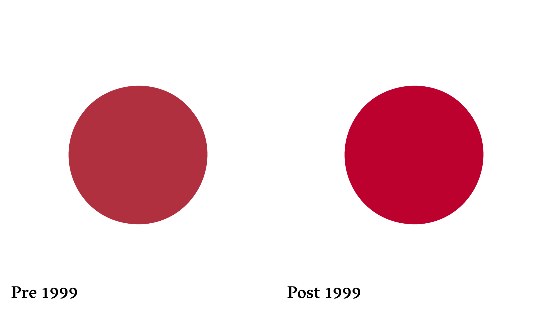
In 1999, the government legally defined the flag’s proportions, centred the red disc perfectly, and chose an exact shade of crimson. The old version from 1870 was a little off-centre and not legally recognised as the national flag. The change wasn’t aesthetic vanity – it was about clarity, consistency, and symbolism.
So while social media is quick to mock brands for their “lazy” makeovers, most of these updates are rooted in the same logic. The work might look small, but the thinking behind it is anything but.
When less really is more.
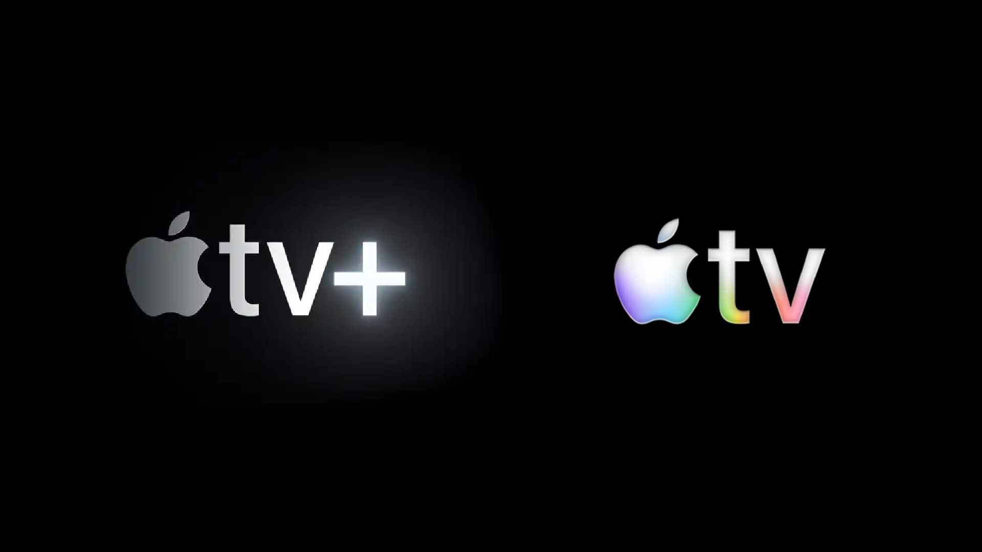
Take Apple’s recent switch from Apple TV+ to Apple TV. It’s not just a cleaner logo or a new gradient. It’s a response to real-world usage. Who actually called it Apple TV+? Nobody. Everyone just called it Apple TV. So Apple did the simplest, smartest thing possible: they listened. It’s branding boiled down to common sense. When the world already agrees on what to call you, don’t fight it. Embrace it.
The GOV.UK saga.
Then there’s the UK Government’s GOV.UK rebrand, which recently sparked outrage for its supposed £500,000 price tag. Half a million quid for what looked like a recentred dot change? Cue the online outrage, headlines, and memes.
But again, that figure isn’t for a shiny new logo. It’s for something far more substantial. It’s a complete overhaul of a national visual system used across thousands of departments, platforms, and services. The design work itself is only the tip of the iceberg. The real cost lies in implementation, standardisation, and ensuring every part of government communication speaks the same visual language.

It’s not vanity. It’s infrastructure. And when you think about how much confusion and inconsistency costs in public services, investing in a unified identity starts to make a lot more sense.
Standardisation, not decoration.
Whether it’s Japan defining its flag, Apple streamlining its naming, or GOV.UK consolidating a fragmented system, the goal isn’t to look different. It’s to be consistent, clear, and coherent.
A good rebrand doesn’t just change how something looks, it defines how it’s used, perceived, and protected.
At Holdens, we live by that philosophy. We help brands consolidate and standardise their identity through detailed brand guidelines that spell out your strategy, tone of voice, and visual system in granular detail.
Consistency is key. The last thing you want is your brand falling into the wrong hands or being used in a way that undoes all the hard work that’s gone into building it. We protect your brand like it’s our own, developing guidelines that lay down the law on logo usage and design best practice, as well as creating a brand strategy across every touchpoint.
If you’re ready to tighten things up and make sure your brand is saying the right things in the right ways, get in touch.
Other blogs
Category
Content MarketingDigital MarketingInsightTopic
AI, SEO, GEO, and AEO
4 min read
Category
Agency NewsTopic
Brand Activation
2 min read