You say it best when you say nothing at all – campaigns don’t always need copy to be heard
Topic
OOH Campaigns5 min read
Imagine being a brand so well known that you’re instantly recognised simply by a shape, a sound or even a colour. No catchy headline drawing you in, no familiar strapline, just the cold, hard control of brand recognition. It’s a rare luxury and something only the biggest brands can exploit. But that doesn’t mean their campaigns are any less creative. In fact, the most creative ads are usually the simplest. The ones that make you go, “Why didn’t I think of that?”. So, while the big brands can enjoy the privilege of simplicity from decades of brand building, finding that brilliant yet simple idea doesn’t get any easier.
This blog explores how brands use their global recognition to create the most simplistic ad campaigns without so much as a slogan to help them.
British Airways
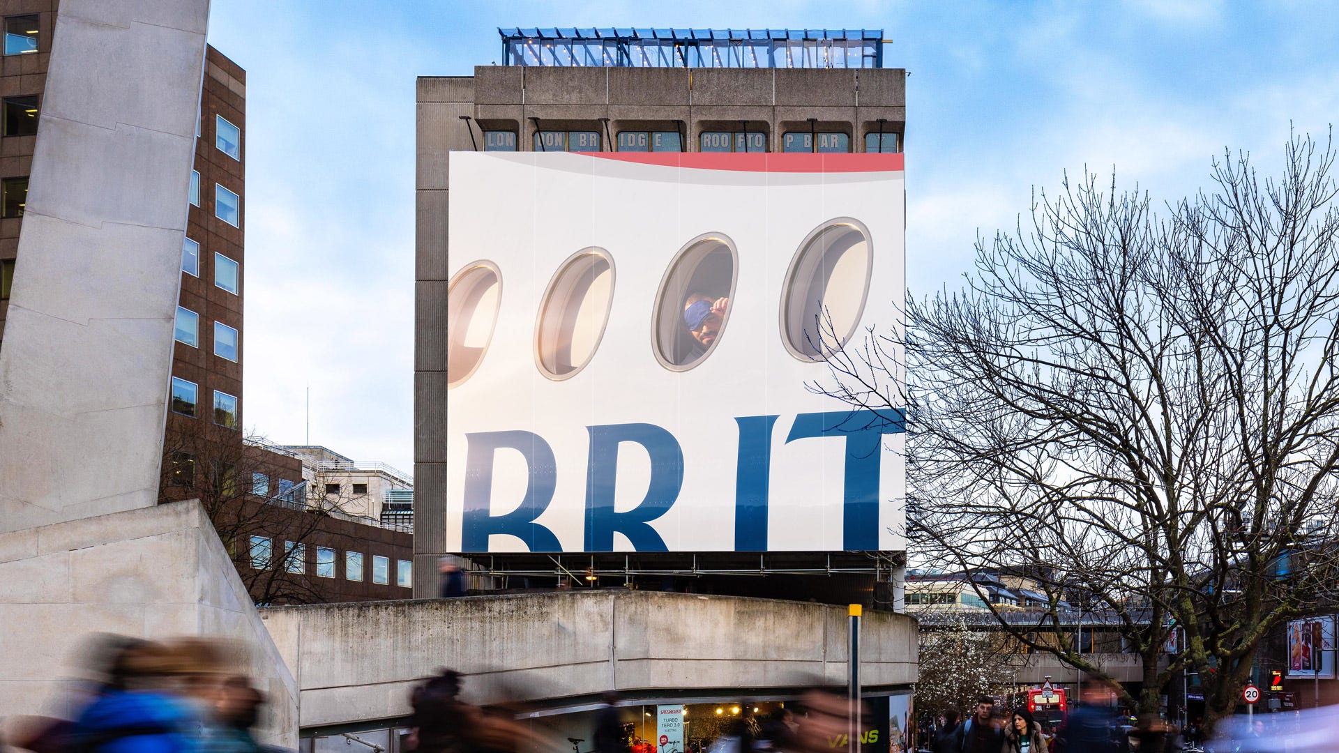
The latest campaign from British Airways features variations of tightly cropped visuals, each showing a passenger gazing out of a plane window. With over 300 ad placements across London, Edinburgh, Cardiff and Manchester, the branding is so subtle that even the logo appears incomplete. Yet, the brand’s familiarity ensures instant recognition.
Tesco
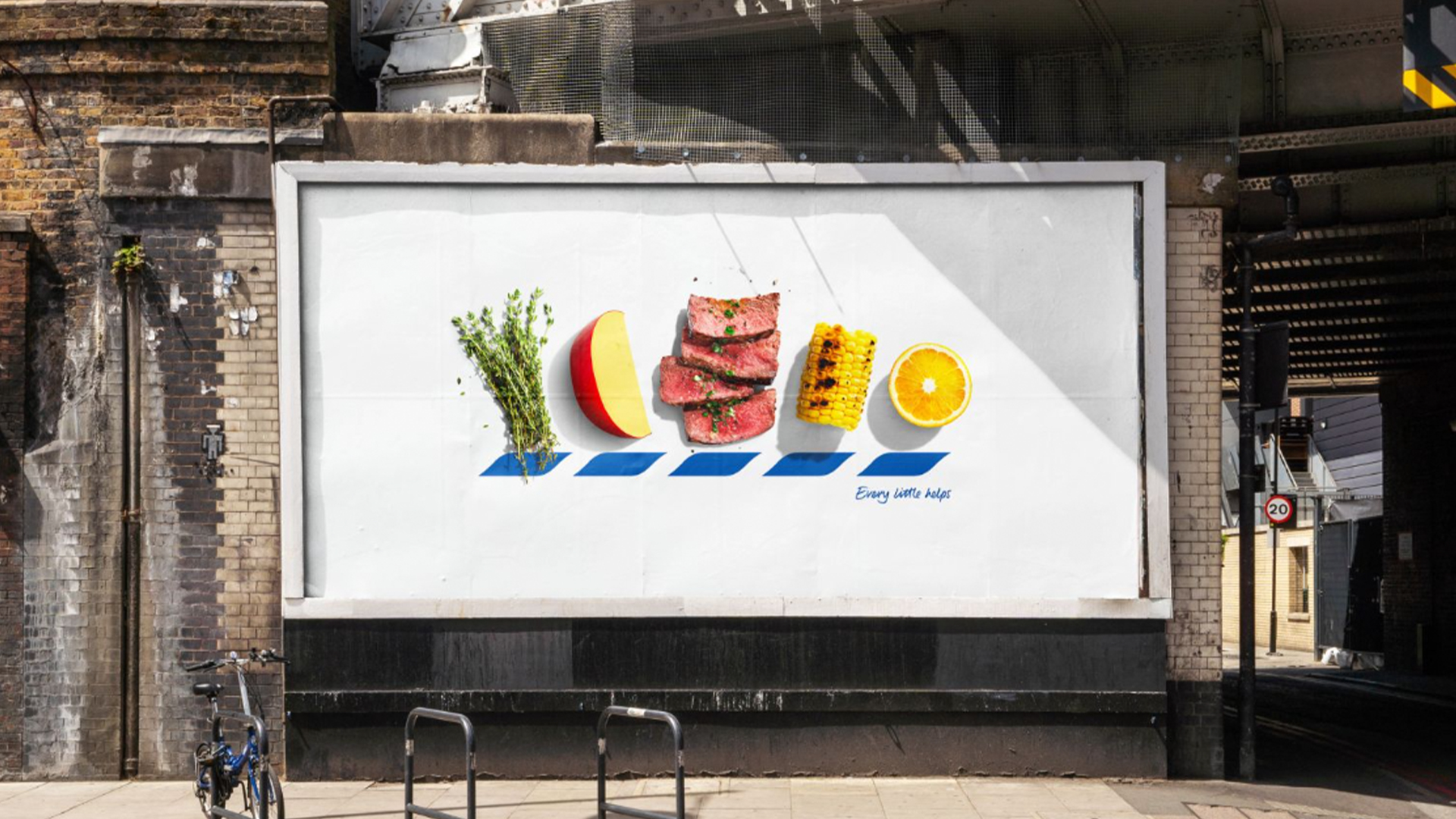
Last October, Tesco deconstructed its visual identity, replacing the letters T, E, S, C and O with food photography while keeping their iconic dashed lines underneath. The brand’s substantial equity in the UK ensured it remained recognisable to passersby, allowing them to instantly connect with the supermarket.
Heinz
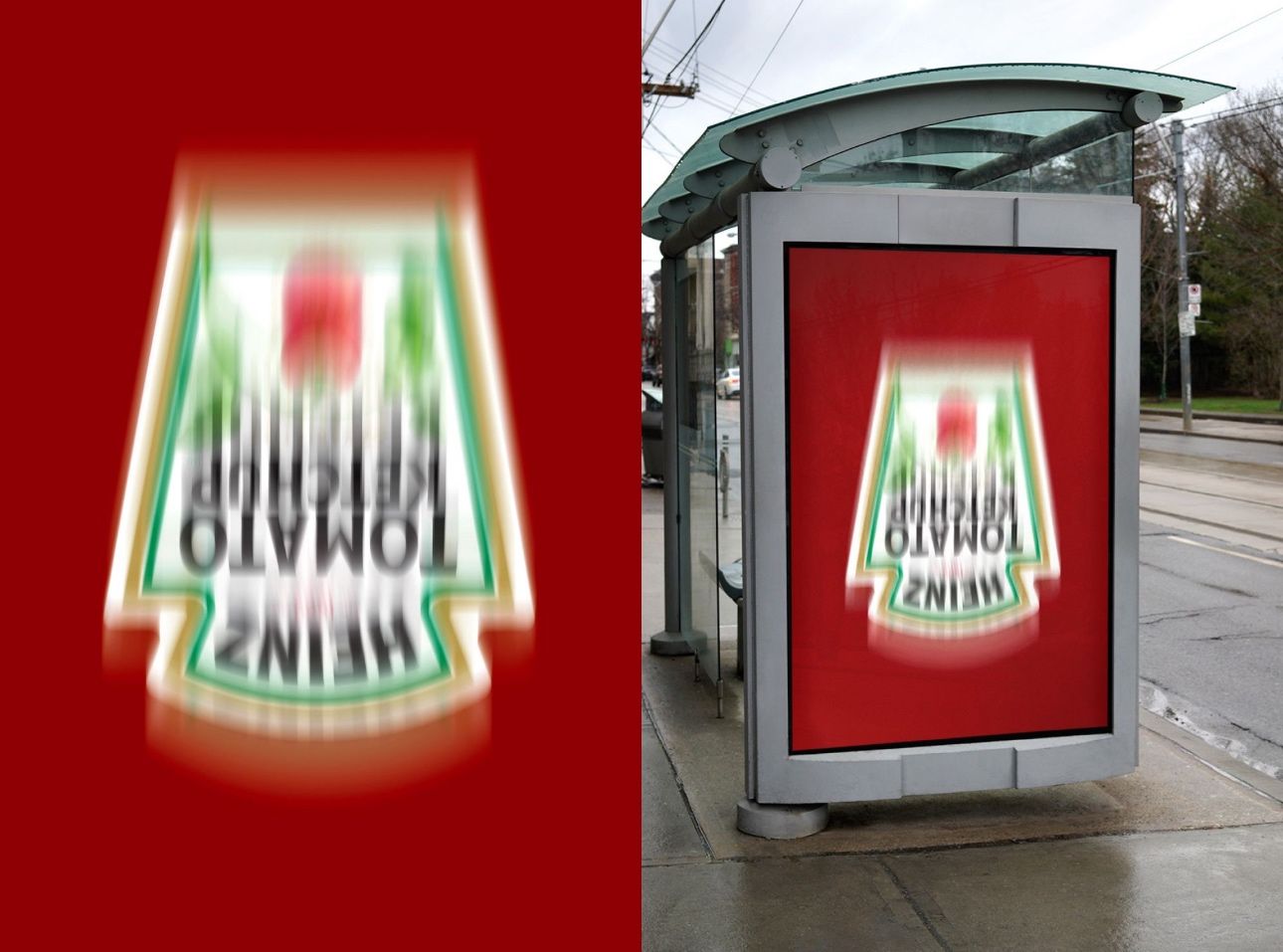
Last year, Heinz launched a campaign that played on consumer behaviour. Who hasn’t flipped the infamous bottle and vigorously shaken it up and down until the last drop of the crimson condiment has been obtained? Heinz seemed to break every rule in the book with this ad, blurring, bending and rotating its logo. It does beg the question of whether younger audiences understood this ad, with most of Heinz’s bottles being squeezable these days.
Cornetto
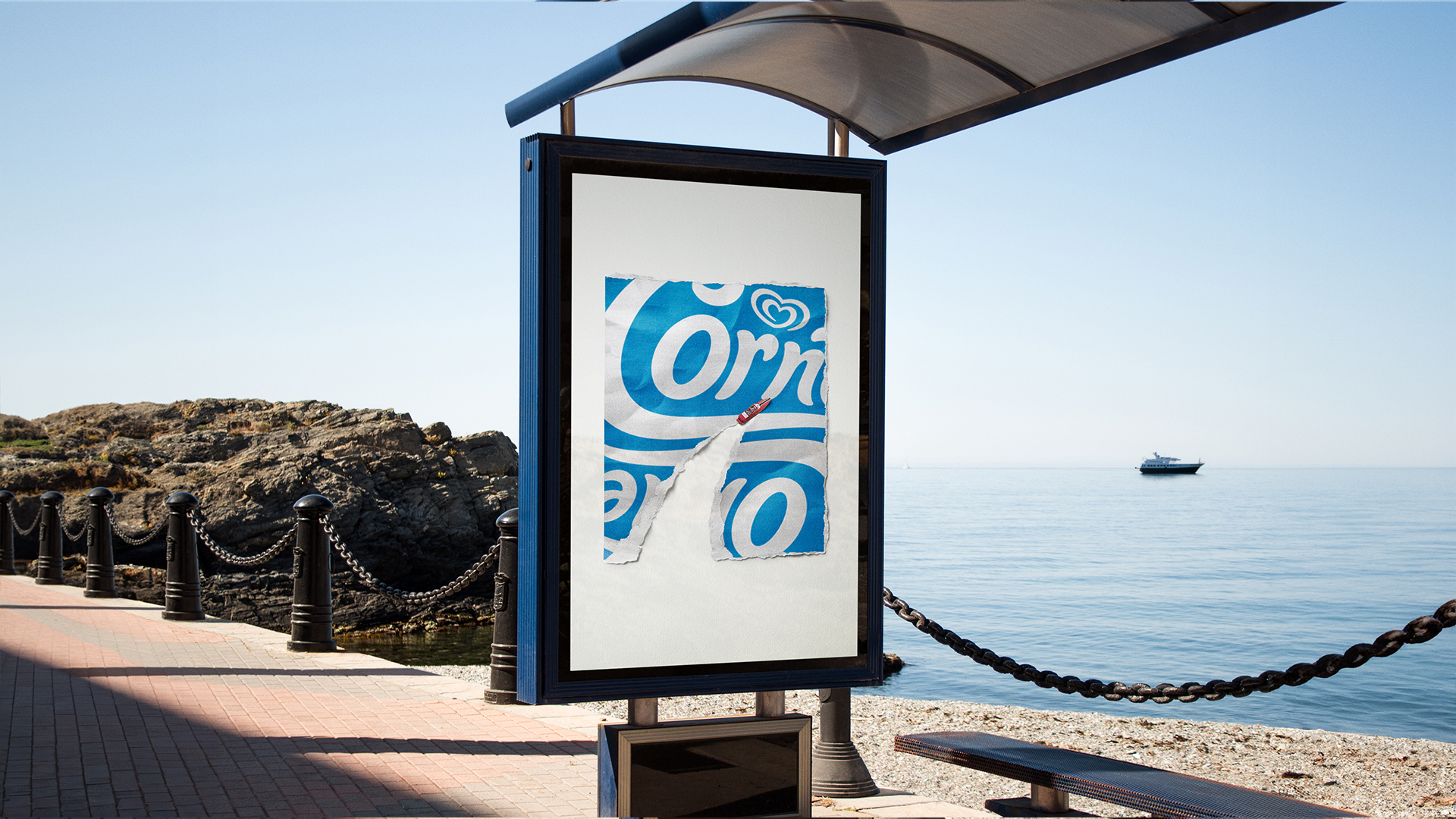

One of my favourite ads of last year came from the kings of ice cream, Cornetto. By combining the iconic wrapper with all the representative elements of summer, Cornetto captured the spirit of the season through beautifully handcrafted collages.
Muller
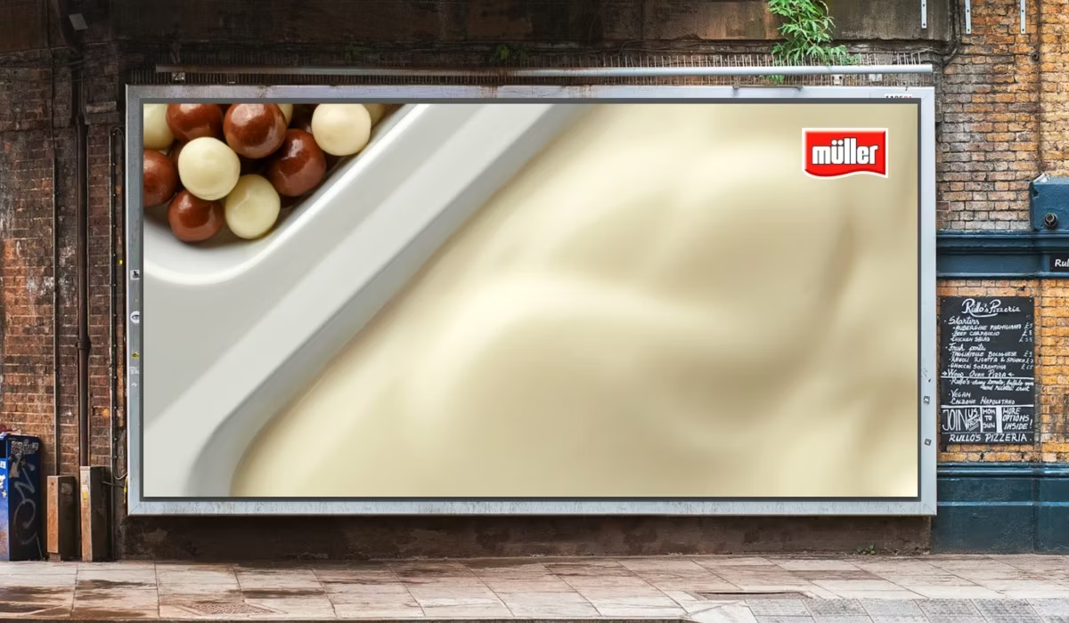
Just like its product, Muller found the perfect balance between simplicity and originality last year with its OOH ad campaign. A close-up of the iconic twin yoghurt pot is all that’s needed to create an emotional reaction in anyone who sees it, igniting memories that may have been forgotten.
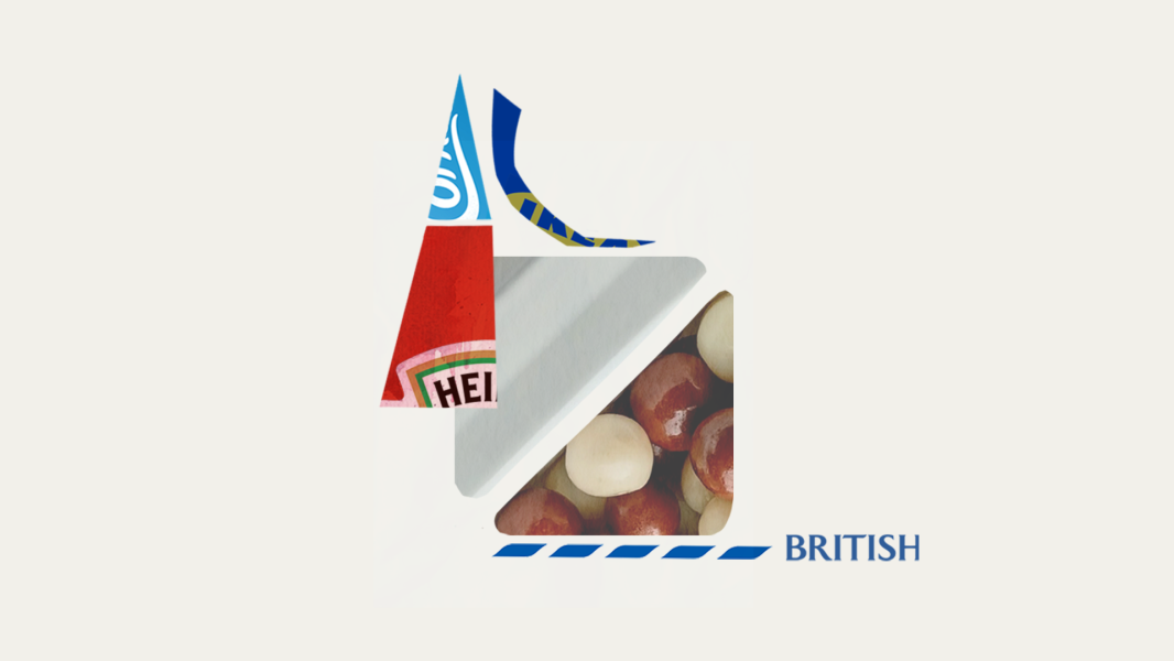
IKEA
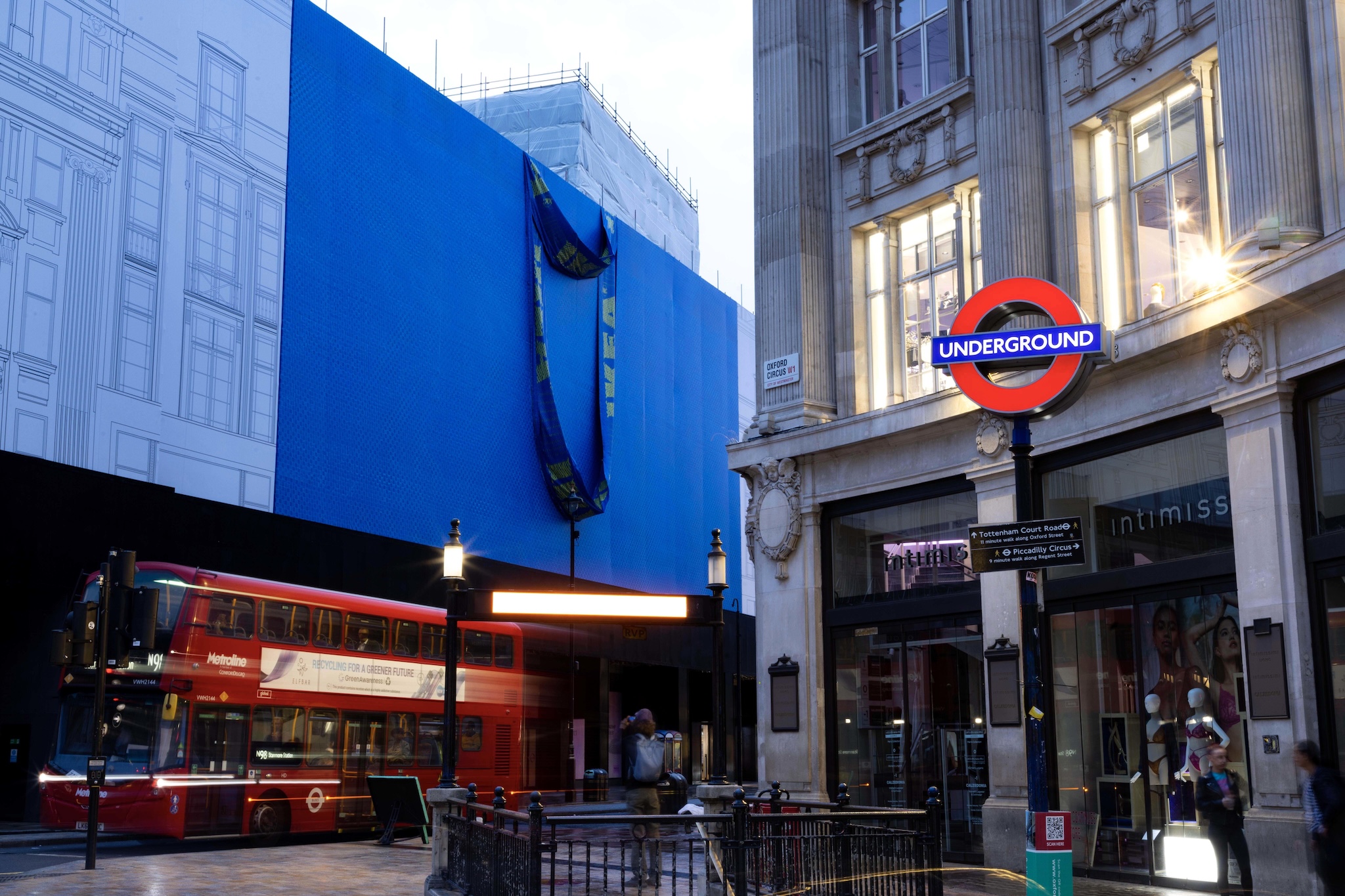
Okay, this isn’t technically an ad campaign, but we still love it. While the IKEA London store was being built, our flat pack friends covered the shop front with a giant blue bag, something that (along with meatballs) is synonymous with the Swedish brand.
Well folks, there you have it. All these campaigns prove that when a brand has banked enough credit, simplicity becomes its greatest strength. Stripping away headlines, straplines and even logos, brands can rely on nothing but the power of association to make an impact. While not every brand can rely on brand recognition alone, these ads serve as a reminder that the most effective ads don’t always need to shout to be heard.
Find out how we can be the difference between your ads being heard and lost in the crowd by looking at our latest case studies or getting in touch for a chat.
Other blogs
Category
Content MarketingDigital MarketingInsightTopic
AI, SEO, GEO, and AEO
4 min read
Category
Agency NewsTopic
Brand Activation
2 min read