Atlas
Mapping out a new brand identity and website for Atlas.
Client
Atlas
Industry
Healthcare
Services
Brand DNA
Brand Identity
Website
Atlas is a full-service radiology diagnostics specialist founded and led by radiologists with over 30 years of experience. It’s unique mixed model approach means it can provide a complete end-to-end radiology solution combining on-site and remote support to meet customer’s individual needs. They came to us to develop a brand and website that would effectively communicate their services to new clients and team members.


Our journey with Atlas began with brand workshops, where we had the opportunity to get under the skin and understand their vision and values. This collaborative process paved the way for the development of a new brand strategy. In its messaging and visual identity, Atlas’s willingness to stand out from competitors really resonated with us and guided our approach.
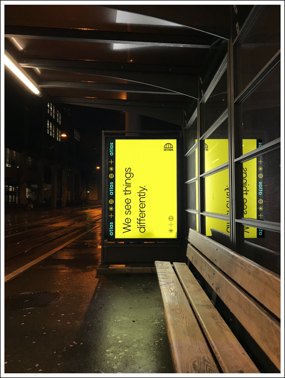
After establishing its brand vision and mission, it was clear Atlas had every intention to be disruptive, something that was embodied in a new strapline: “We see things differently”.
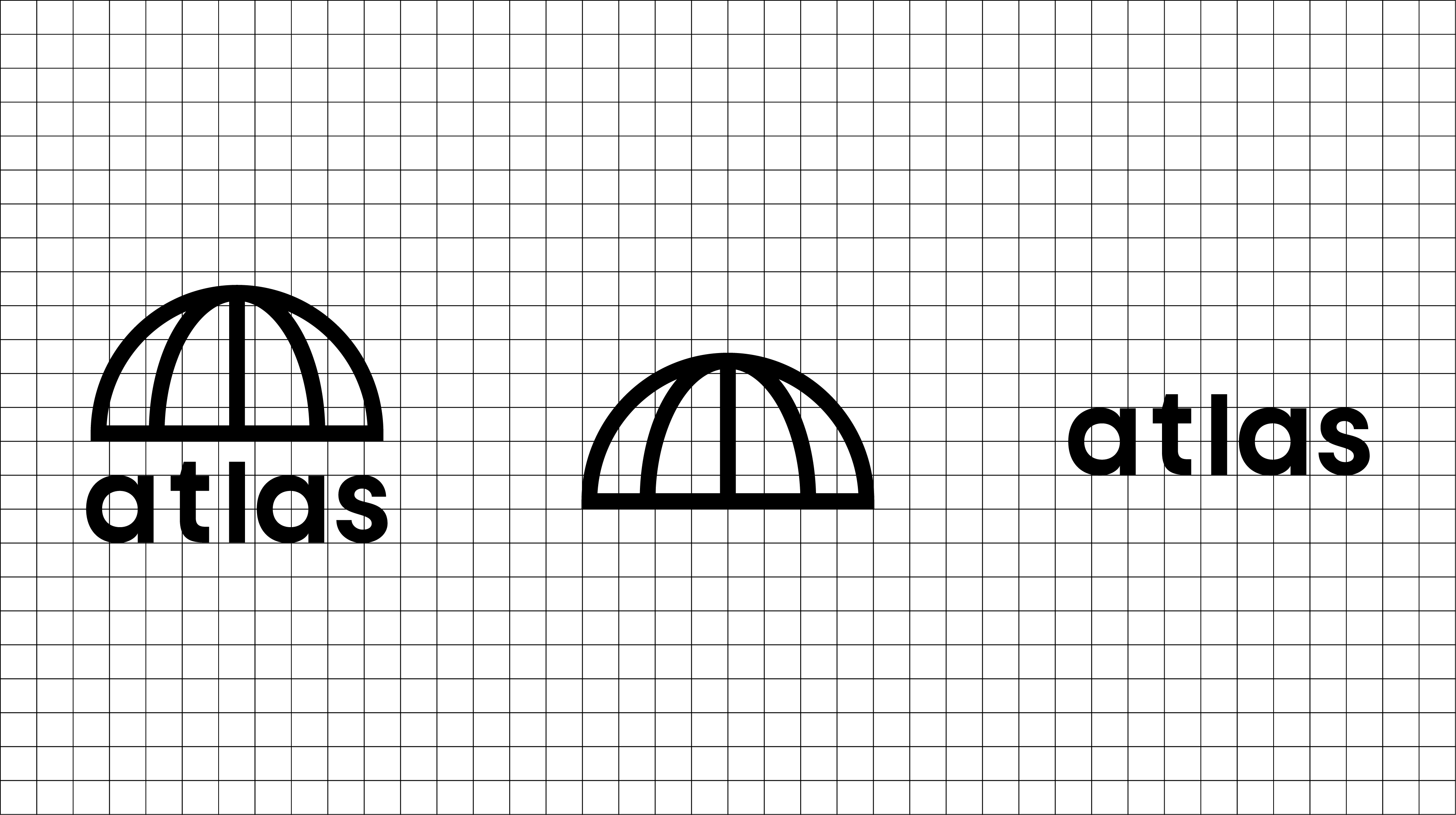
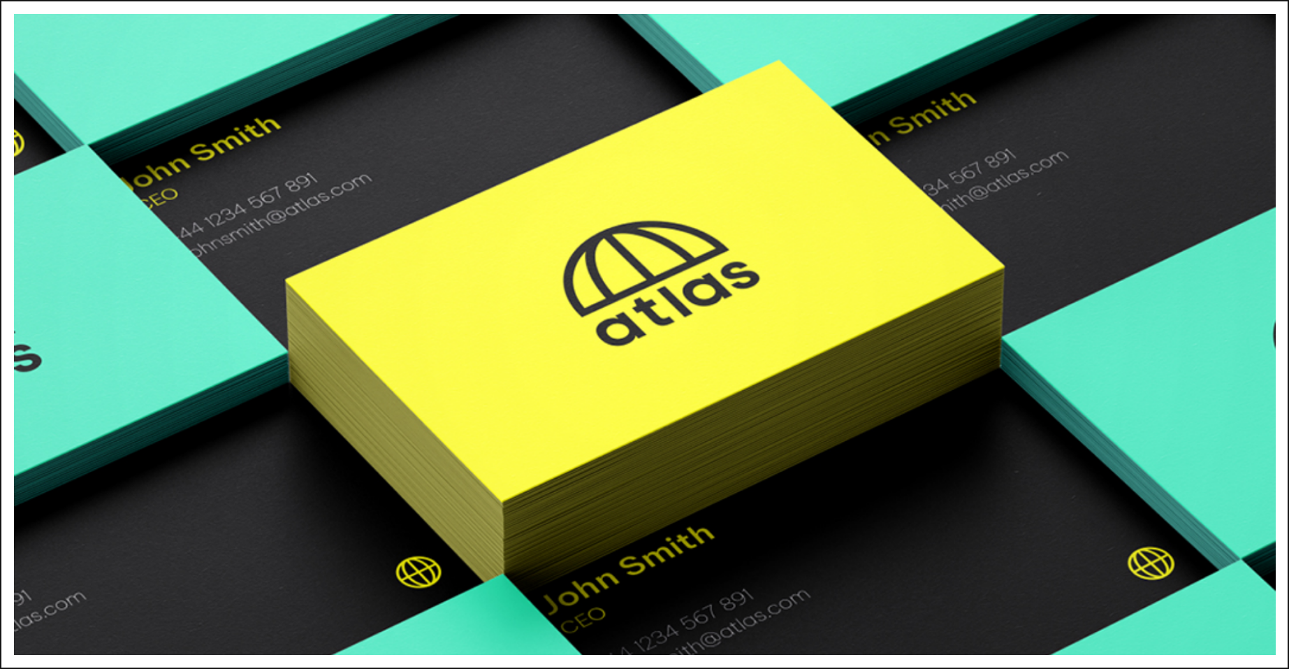
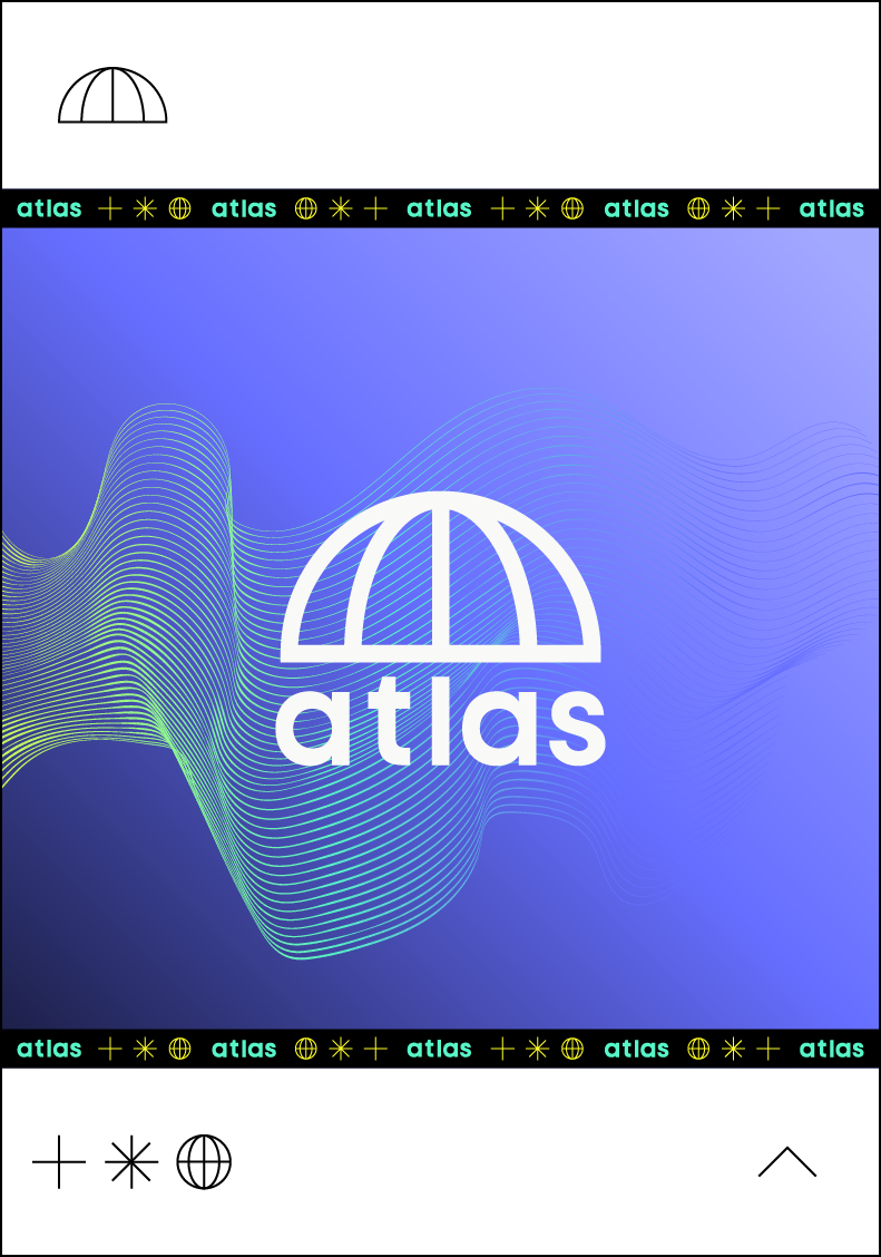
The logo mark is heavily rooted in the name and the values Atlas represents. To the naked eye, the logo is half of a globe, a nod to the collection of maps known as an atlas and the desire to map out the way and become pioneers of the radiology industry.
Less obvious is the umbrella hidden within the logo, created by the letter L, which aligns with the middle of the globe. This symbolises the wide range of services and care provided by the team at Atlas.
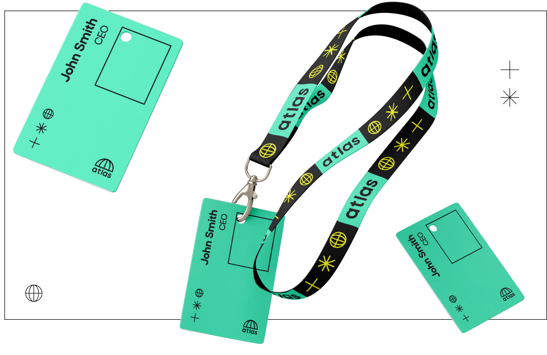
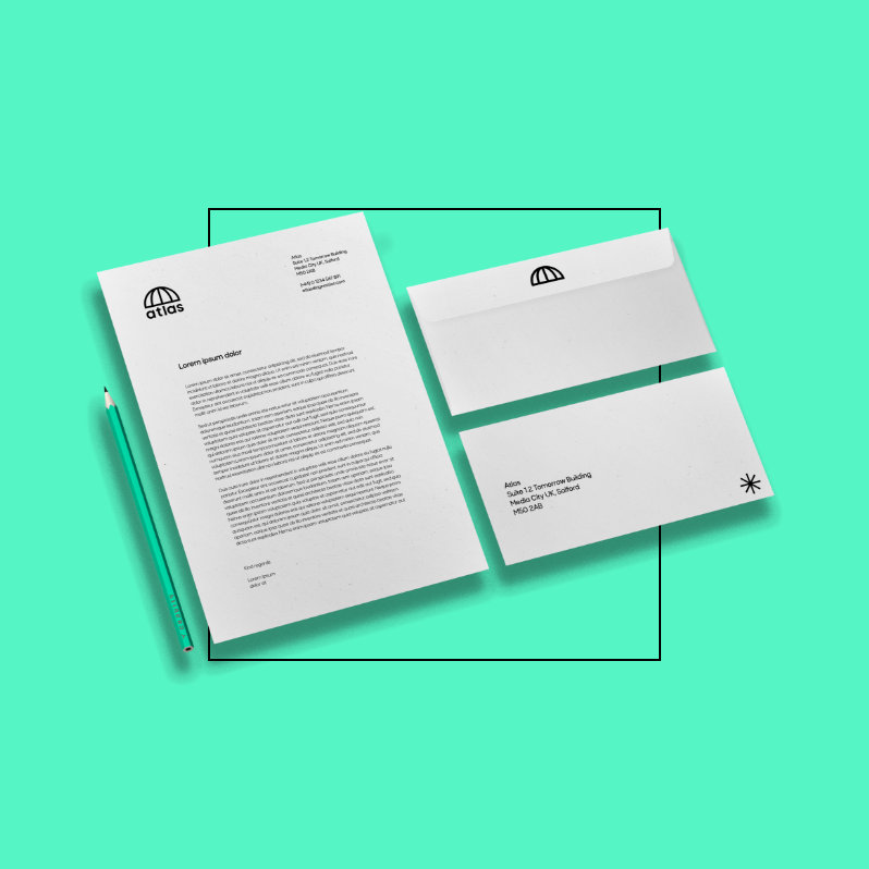
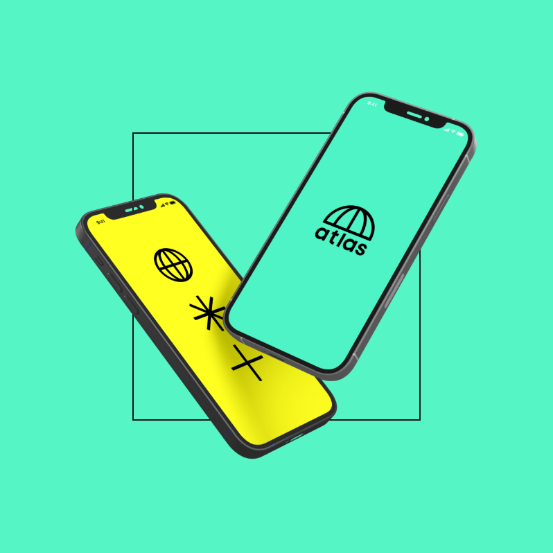
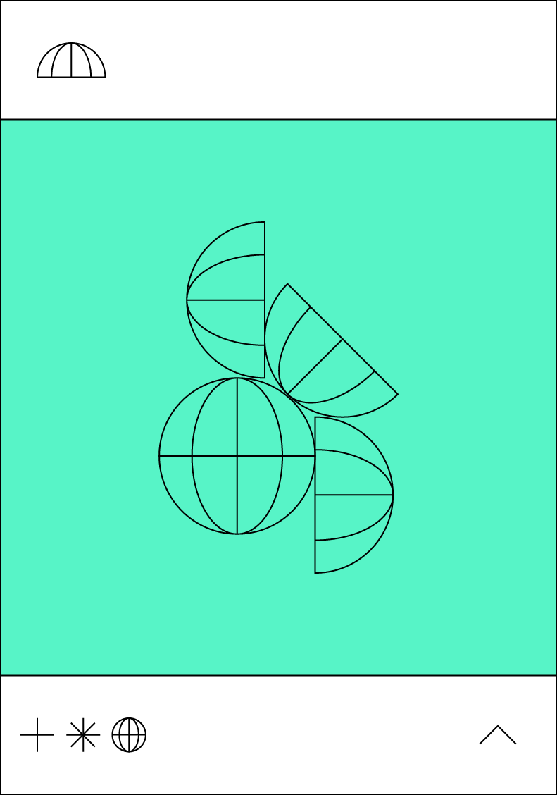
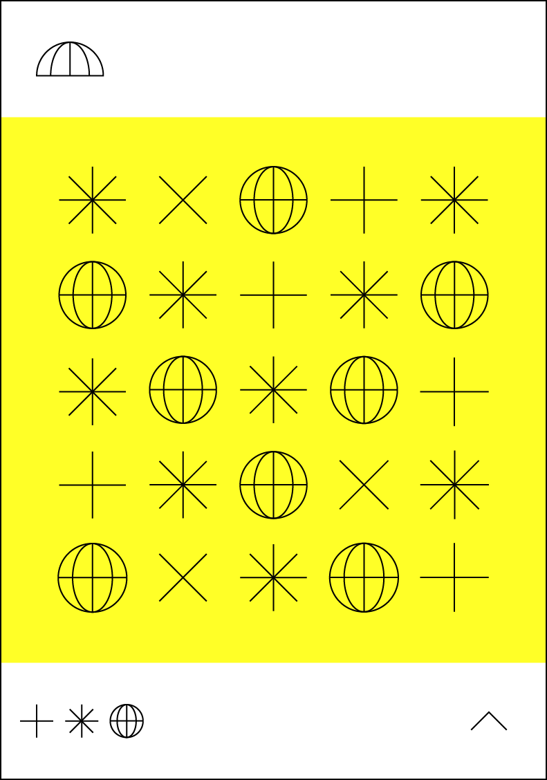
The new brand identity visually represented Atlas’s unique positioning. The use of mint greens, electric yellows and deep blues set them apart from competitors. We introduced a suite of icons that not only added depth to the brand but also served as useful indicators in website design. These icons were inspired by the industry and the services Atlas provides, further reinforcing their new identity.



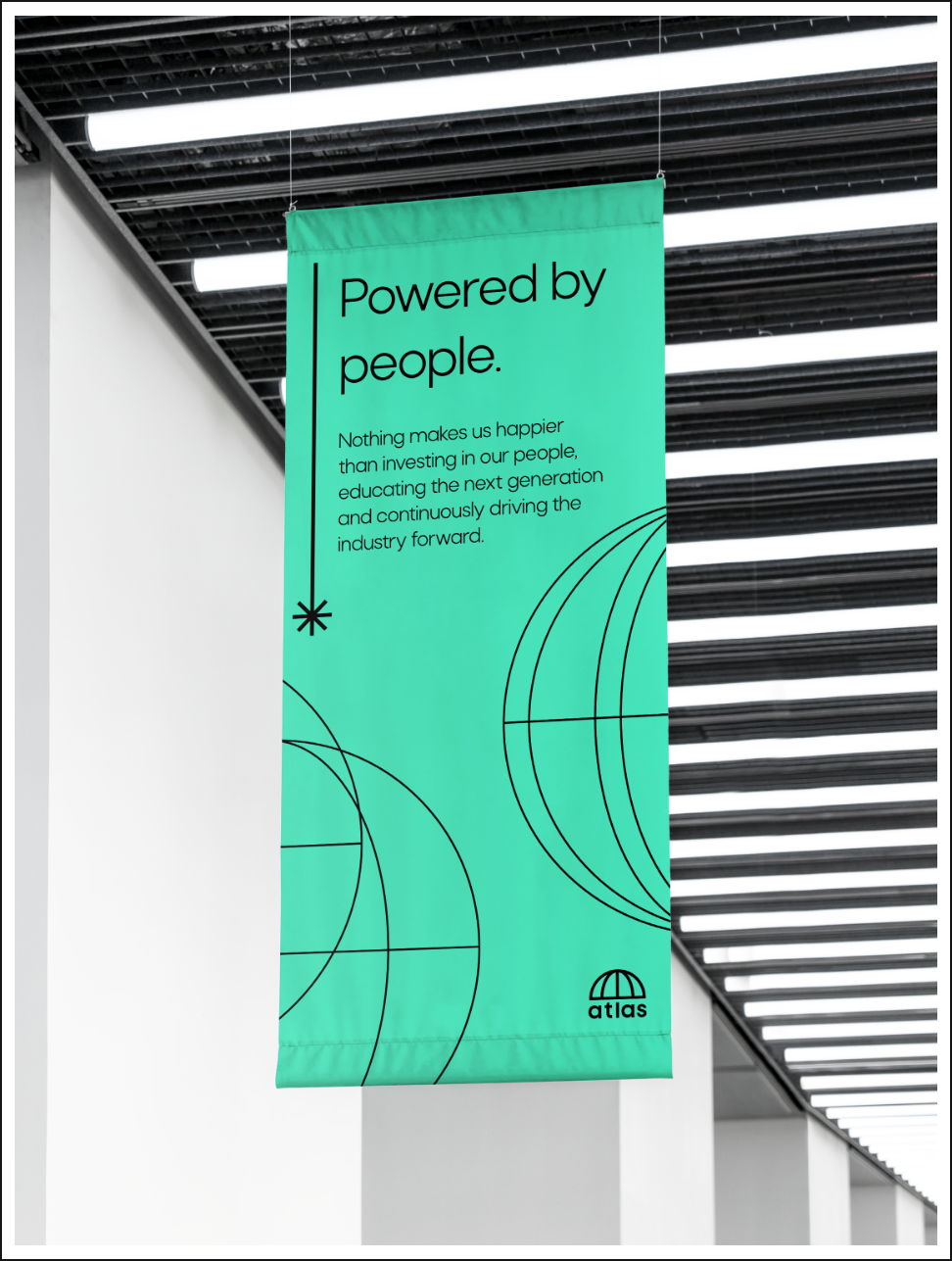

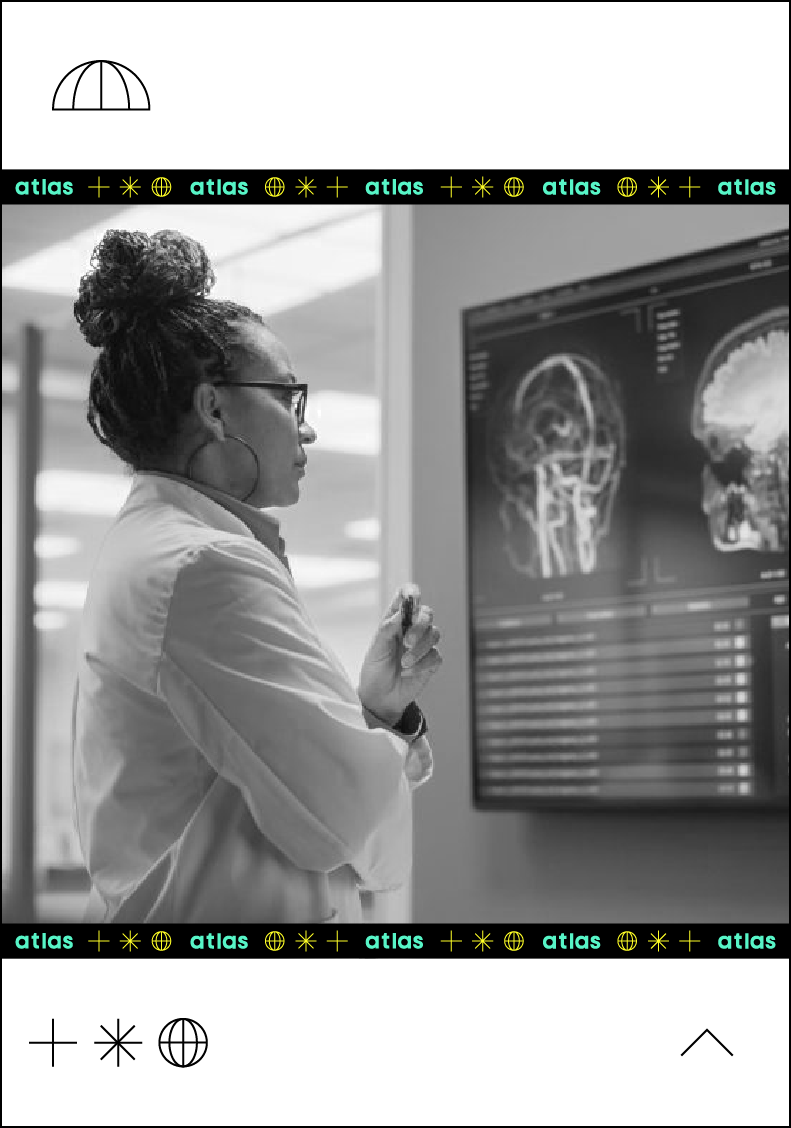
Atlas loved the new brand and signed it off instantly after we presented it to them. The next step was translating that into a sleek new website. The biggest challenge was creating a simple website with limited imagery that still conveyed the complex industry that Atlas works in. We did this with dynamic graphic elements that alluded to X-ray photography and the shapes and textures associated with it.
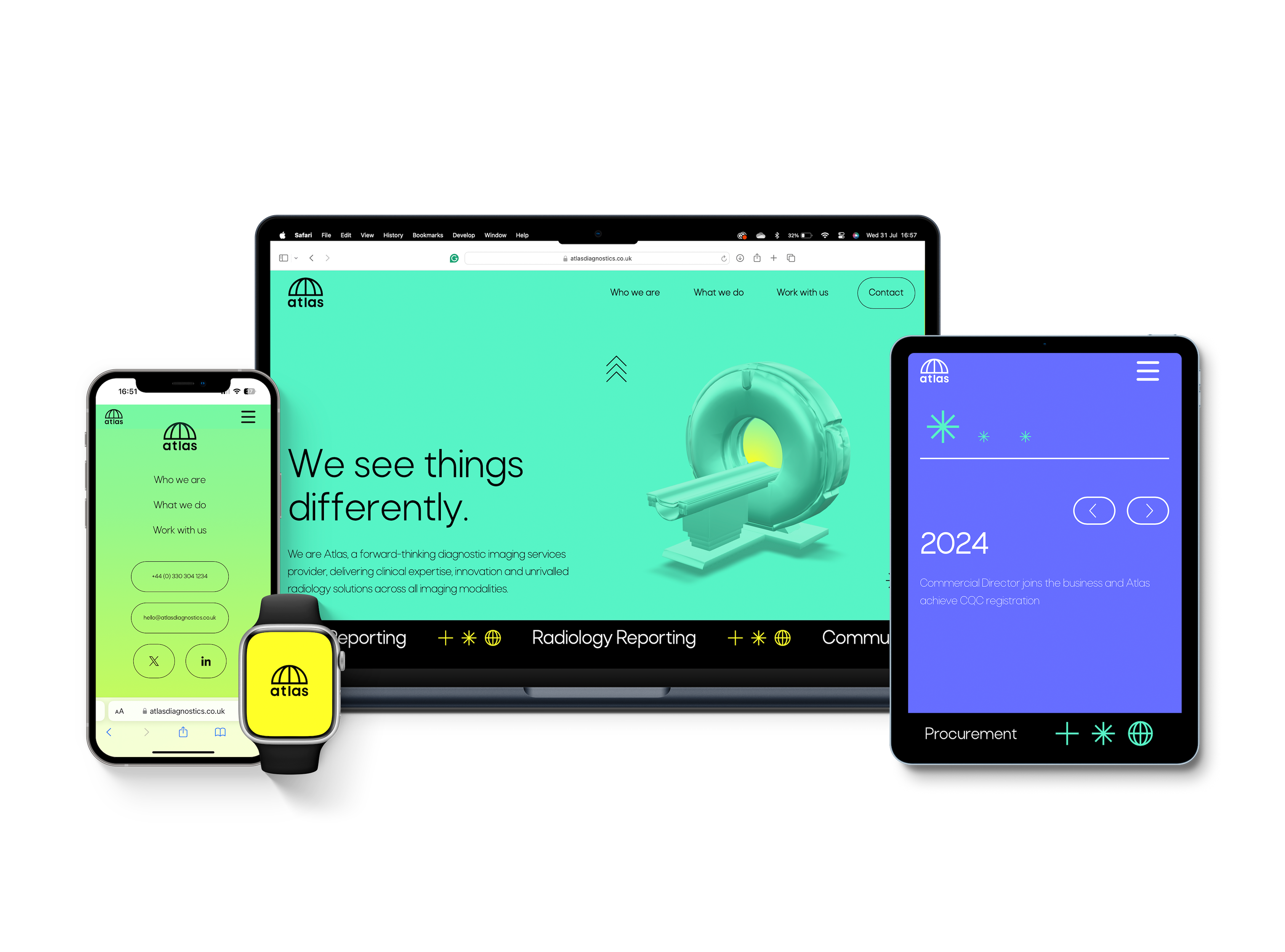


Since we started working with Atlas, they have been fearless in stepping away from the norm, walking the path less travelled and boldly looking to the future for the company and the wider radiology industry. With a vibrant new brand and engaging new website, we’ve enabled Atlas to be seen by the world so they can continue to see things differently.