Lama Fulfilment
Delivering a fresh rebrand for logistics gurus Lama.


Client
Lama Fulfilment
Industry
Fulfilment & Logistics
Technology & Innovation
Services
Brand Strategy
Brand Identity
Brand Development
Brand Guidelines
Website
Illustration & Motion Graphics
Lama Fulfilment is a start-up third-party fulfilment company from a team with more than 20 years of industry experience. Working in both the D2C and B2B space, they integrate their client’s website with their own in-house technology, enabling them to take care of the entire fulfilment process from start to finish.
While Lama’s mission is to provide an excellent and unique service to its customers, it had no way of effectively marketing itself. We were brought on board to develop a new name, positioning, identity and website to help take the brand to market.

As the list was whittled down, it was clear one name stood out – Lama.
First of all, we created an extensive list of potential new names with a rationale for each. As the list was whittled down, it was clear one name was standing out from the rest – Lama.
The thinking behind Lama came from our research into pack animals. Llamas are commonly used to carry goods, which we felt worked well as it directly connects with the company’s logistics focus. In Tibetan culture, a lama is also an honorific title given to a spiritual leader teaching fulfilment. This supported the idea that Lama is an industry leader in fulfilment and logistics, guiding the way for others.
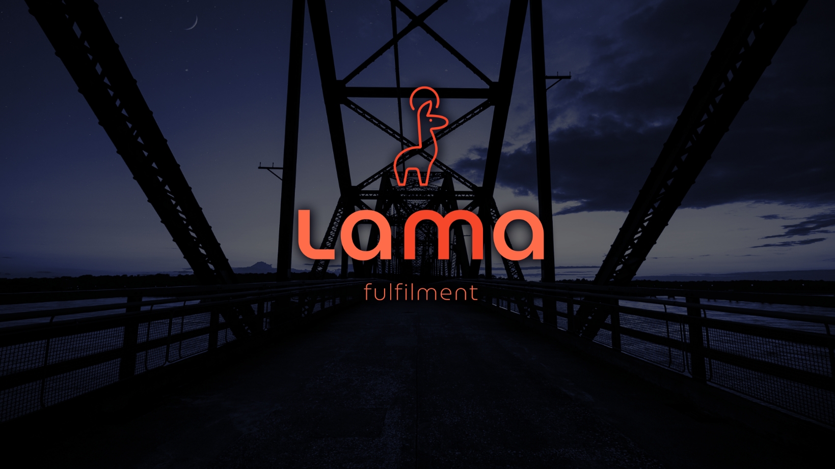
The logo directly draws inspiration from these two concepts, using a simple line drawing of a llama with an enlightenment symbol above its head. We intentionally made the logo simple and clear to represent the fulfilment process Lama offers to its customers.
This simple approach also allowed for flexibility throughout the brand rollout and communications. We developed an authentic brand positioning that the Lama team can get behind including mission and vision, personality, and tone of voice, as well as a catchy strapline – Leave it to Lama.


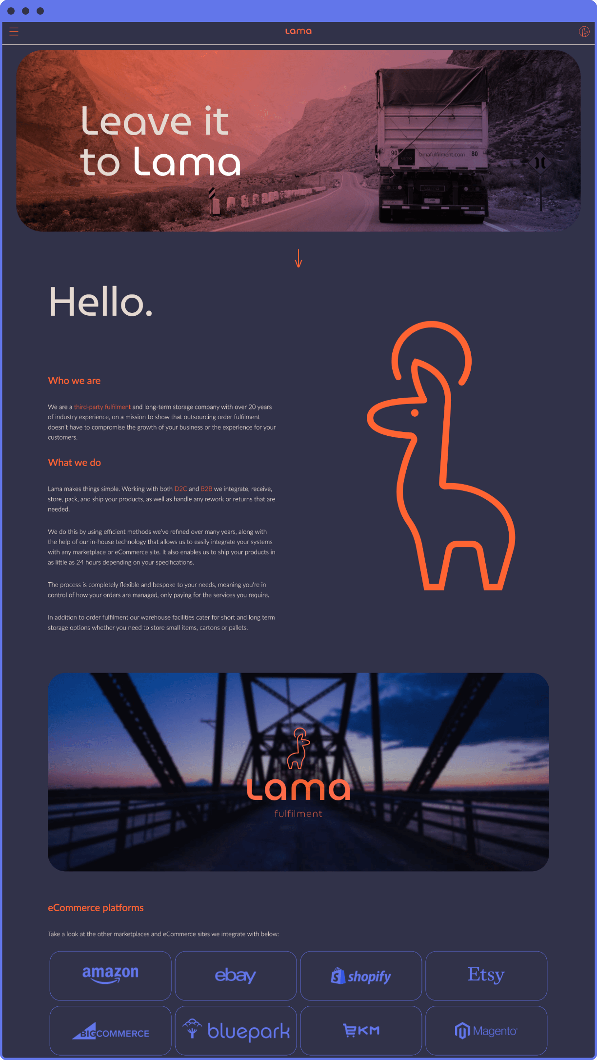
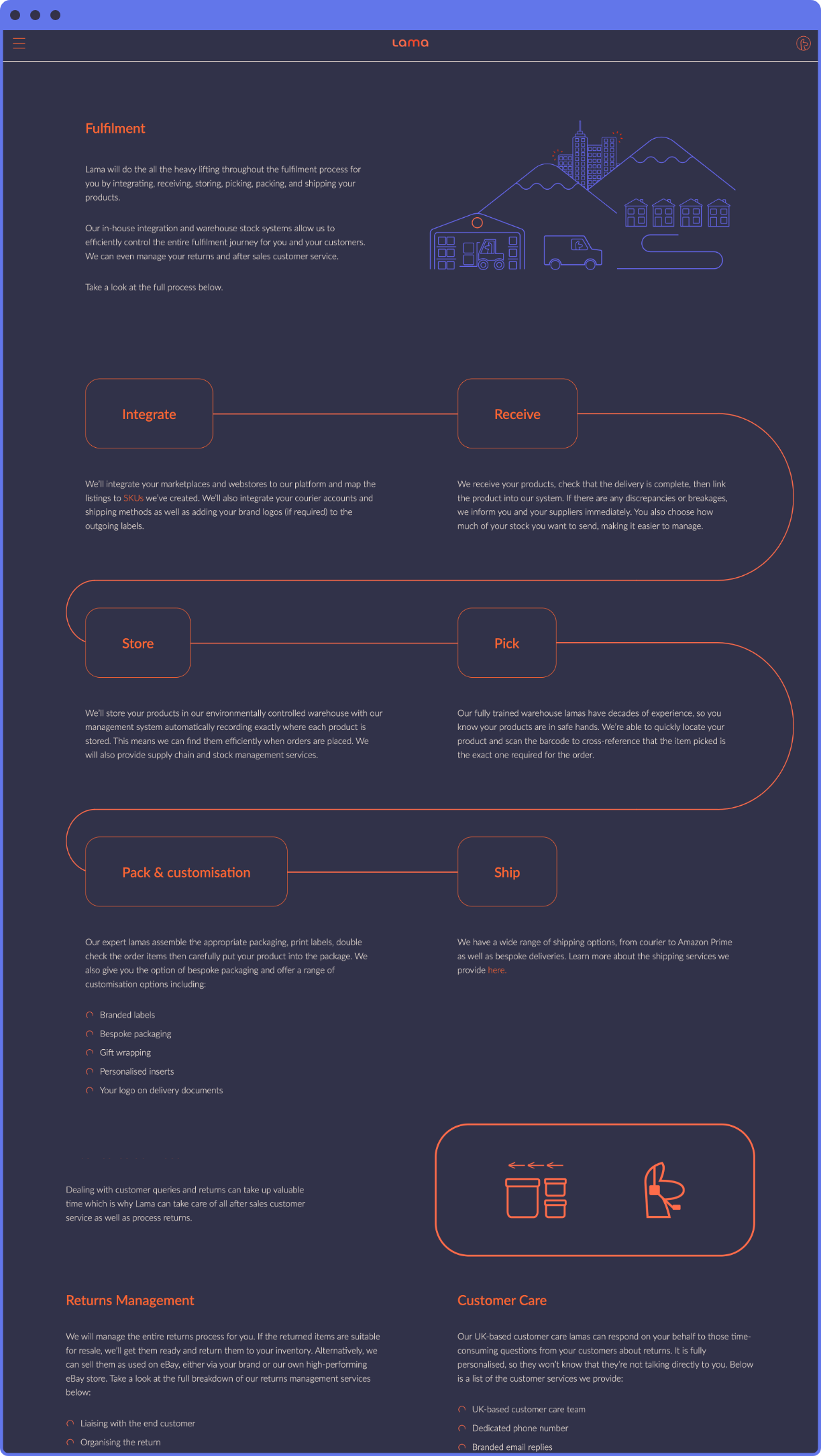
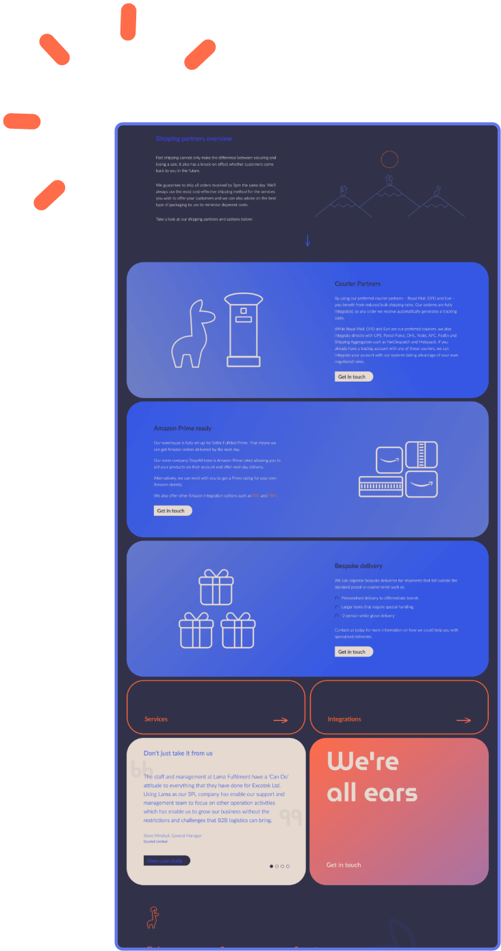
We translated the brand seamlessly into a fresh new website, maintaining simplicity and space wherever we could.
With the name and logo complete, we started to expand on the brand identity and explore possible ways to express its personality without overcomplicating it. A playful yet trustworthy colour palette accompanied the brand using bright but not overpowering oranges and blues.
A simple typeface was incorporated, as well as a display font that compliments the logo by matching its curved and straight edges. A full set of brand guidelines were produced to ensure consistency remained long after we finished working with them.
We translated the brand seamlessly into a fresh new website, maintaining simplicity and space wherever we could as we felt it was such a key detail.
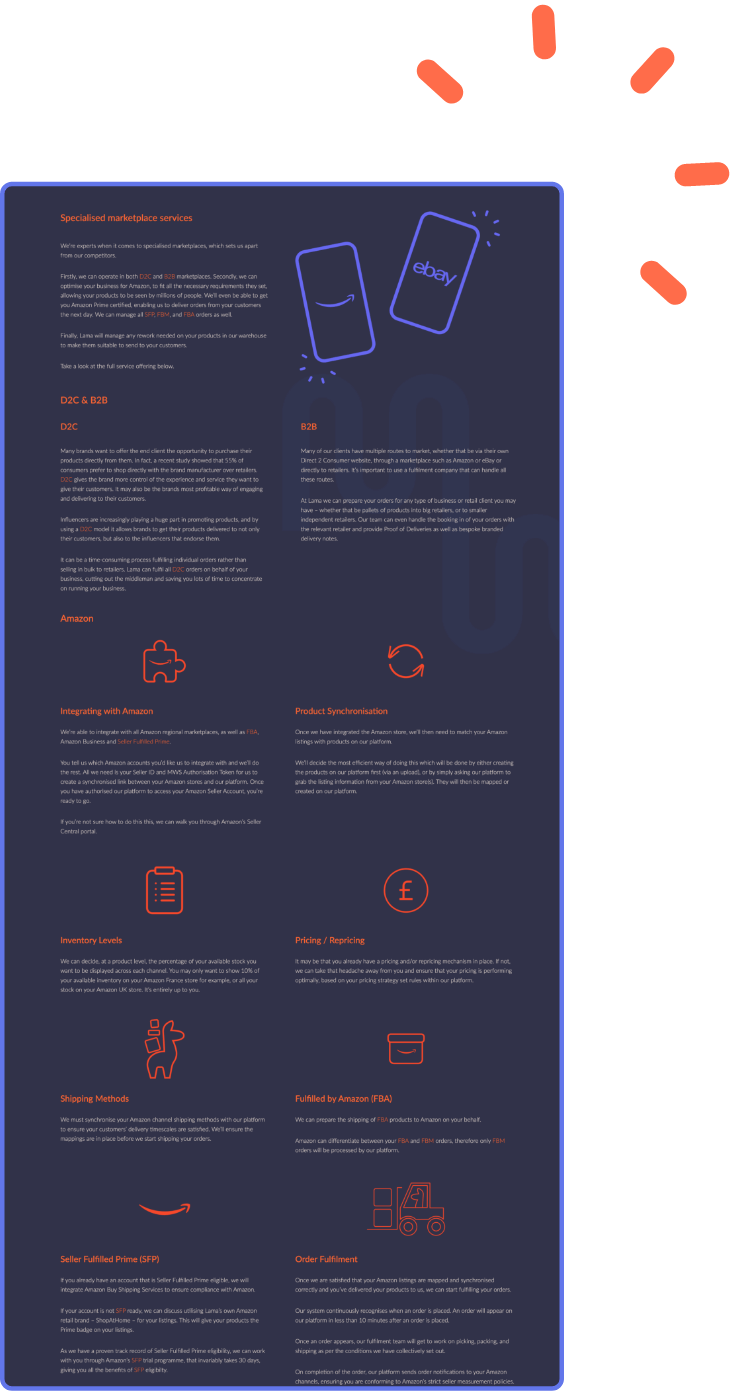
We created a suite of icons and illustrations that help to signify important information.
Information overload is an easy trap to fall into when writing copy for a complex industry such as fulfilment. This was something we really wanted to stay away from, so we developed a few ideas that would help prevent this. Most important of all, we simplified the website copy, writing to the point in the shortest way possible while maintaining a friendly and calm tone of voice.
We also created a suite of icons and illustrations that help to signify important information, as well as incorporating a glossary to the FAQ page. This meant the website wasn’t saturated with definitions and explanations, improving the user journey and experience to no end.





Lama is a fulfilment company like no other and the same goes for its team, so it’s safe to say we loved working on this one from start to finish. The brand and website we’ve created for them truly reflect their industry expertise and one-of-a-kind personality, setting Lama up perfectly for the exciting journey it’s about to embark on.