Onward
Uniting one organisation as Onward.
Client
Onward
Industry
Property & Placemaking
Services
Brand Development
Brand Strategy
Brand Identity
Brand Guidelines

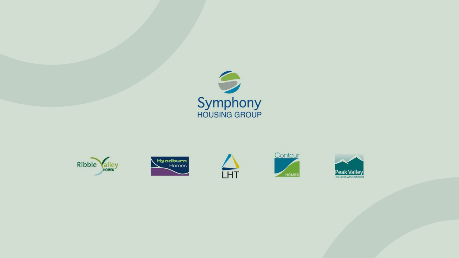
Symphony Housing Group was the largest group of housing associations in the North West, made up of five individual organisations delivering quality, affordable housing in all corners of the region. Symphony came to us with a challenge – to create a new brand identity that would bring all of the housing associations together under one name and one vision for the very first time. It would turn out to be one of the most challenging and rewarding rebrands yet.
Bring all of the housing associations together under one name and one vision.
The idea behind the merger was to unite the housing associations under a single banner, allowing the group to invest more in its homes and neighbourhoods, improve services by providing greater uniformity and consistency and make a greater contribution to the sustainable regeneration of communities throughout the North West.
But with different identities, personalities and ways of working, how could we bring them together without losing what makes them unique?
We ran some key stakeholder workshops at our studio.
Before we even began considering coming up with new names or putting pen to paper, we ran some key stakeholder workshops at our studio with each of the individual housing associations to really get under the skin of their organisations and find out what makes them tick.
This was our chance to understand how they do things and what makes them different. Not only that, we were keen to hear what they thought being part of a collective under the same brand identity would mean for them and their tenants.

We researched, workshopped and stress-tested name after name.
Next, we hit the road to deliver a series of roadshow events at each of the housing associations’ head offices around the region to talk to them about the importance of branding and why we were embarking on the process of bringing them all together under one new brand identity. These roadshow events were open to everyone, not just senior management, in order to make everyone feel part of the process. It also gave them the opportunity to ask questions of us and understand a bit more about what the rebrand meant. Taking all our insights on board, we began the creative process in earnest, starting with the name.
Unlike some brands, the name in this case would need to serve many purposes. Not only would it have to reflect the group’s overall mission and values, but it would also have to act as a rallying call to unite the housing associations and create some affinity with their bold collective vision for the future. Crucially, it had to resonate with tenants. With the brief on the board, we researched, workshopped and stress-tested name after name, before landing on Onward.
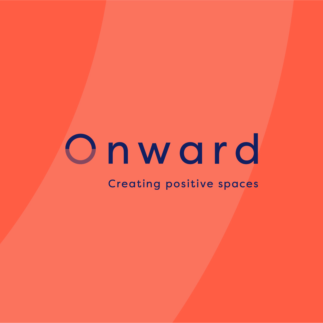
Onward means “to continue moving in a forward direction”. It encapsulates the group’s core reason for being, which is to continually improve the quality of affordable housing throughout the North West. The word nods to a point ahead on the horizon or in the future but suggests the journey is ongoing and never-ending. As far as rallying cries go, it couldn’t be better. And as for resonating with residents, we felt the name Onward had great scope for self-interpretation. In many ways, an Onward home enables people to move forwards in life, whatever that means for them and their own individual circumstances.
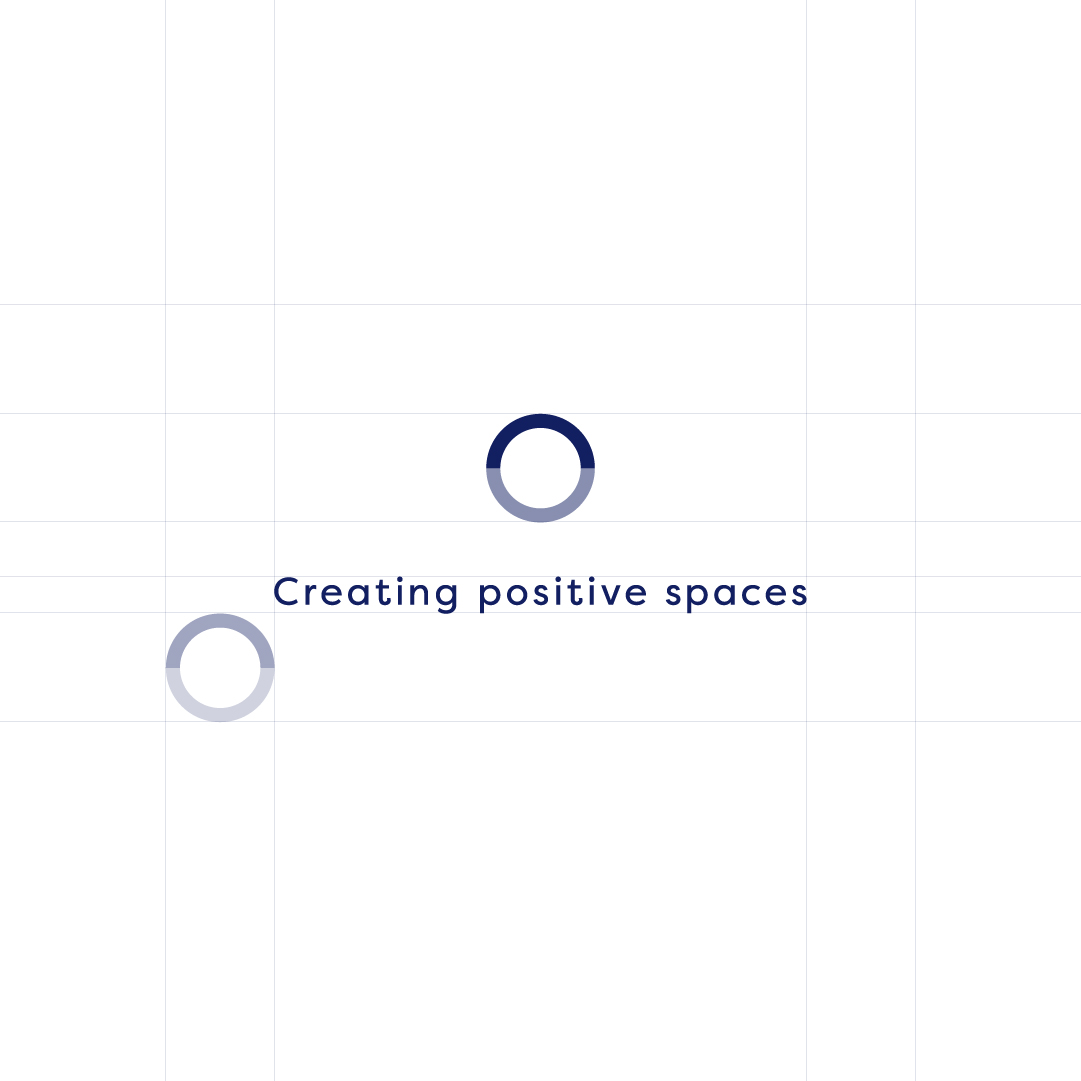
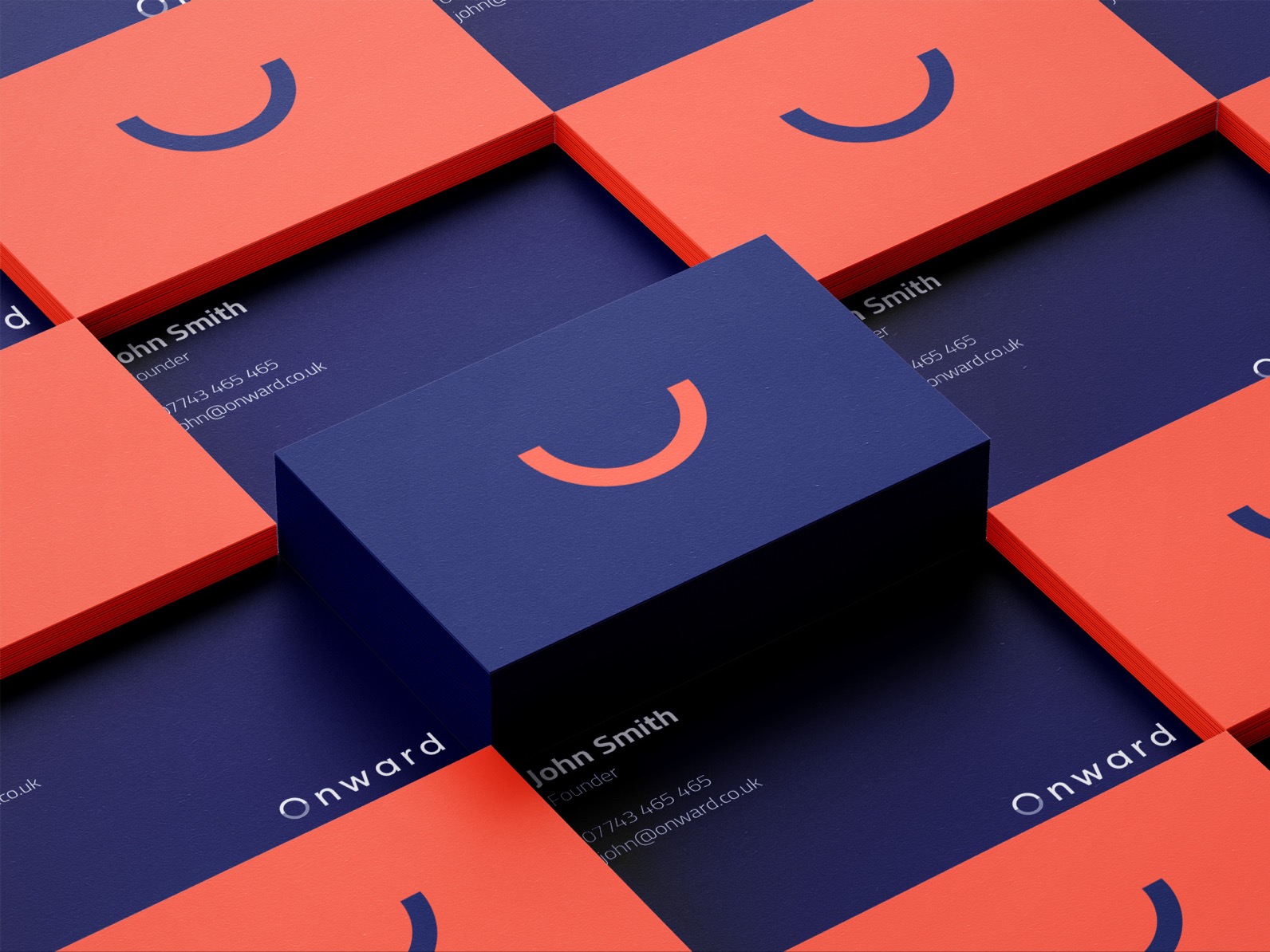
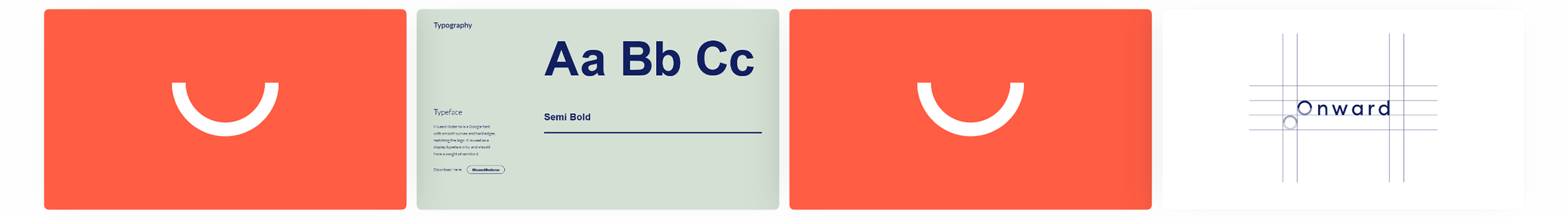
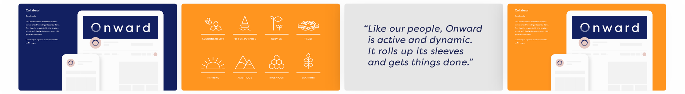
After presenting the name and getting everyone on the same page, we turned our attention to the brand’s visual identity. We created a clean and simple logo using a modern sans-serif typeface that helped to reinforce the group’s organisational shift and forward-thinking vision. For the logomark, we opted for just the O on its own to signify the unity and togetherness of the new Onward. The two halves of the O are in different shades, with half lighter than the other, as a way of conveying continual motion and also to give the brand flexibility to use the lower half on its own as a smile device across marketing and comms.
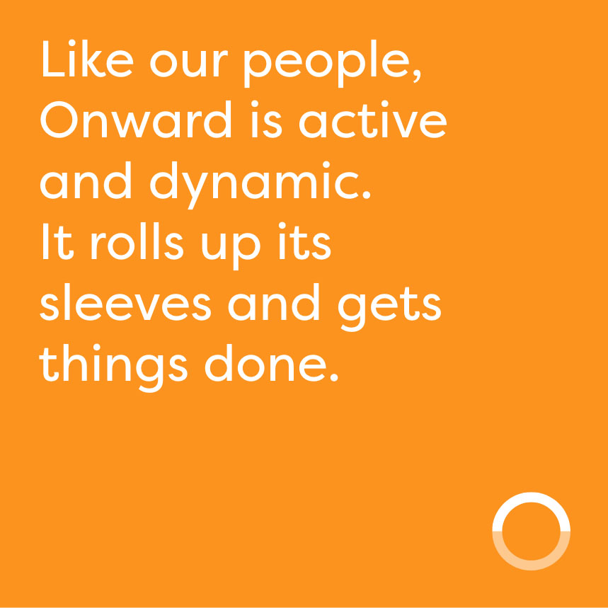
The new brand marks a significant step forward for Onward.
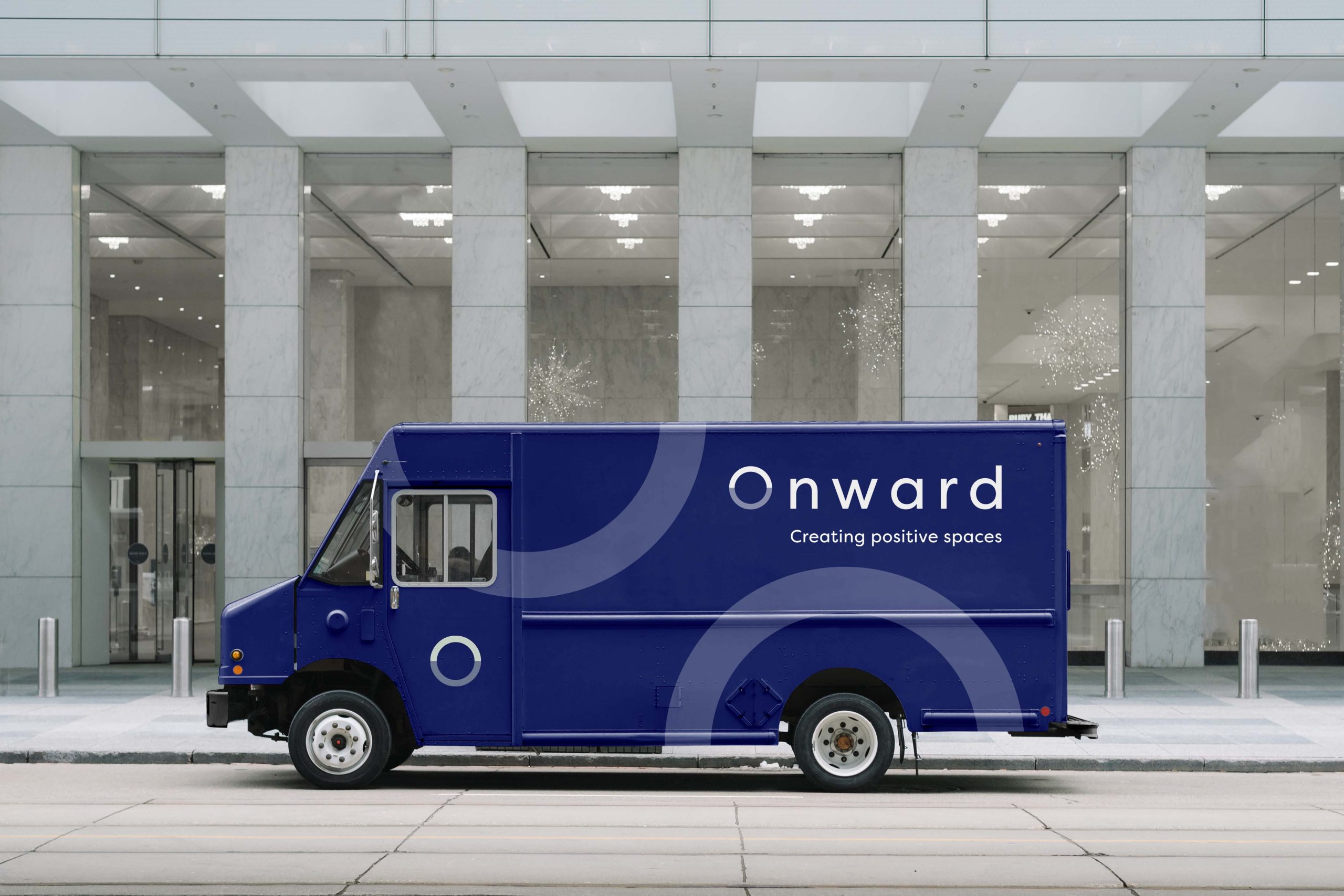

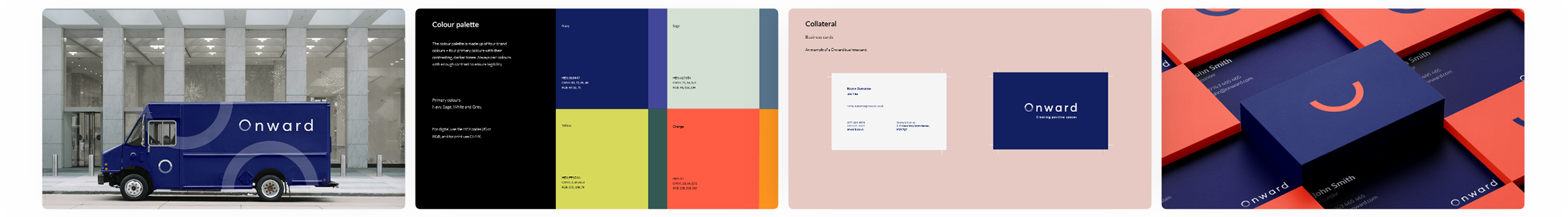
Finally, the brand’s visual identity was given colour with a refreshing palette of blues, greens and greys. These colours hark back to nature and open spaces, imbuing a sense of peace and tranquillity that Onward is keen to instil in its homes. The shades of blue especially are also representative of trust and quality, again a key feeling the group wanted to get across to new and existing tenants. Overall, the new brand marks a significant step forward for Onward and puts clear daylight between them and other housing associations in the region still suffering from outdated and uninspiring brand identities.
Armed with its new brand and a unifying vision for the future, Onward is all set to embark on its journey as one stronger organisation and continue creating positive spaces for everyone.