The Loch Ness Centre
A monster rebrand and website for the Loch Ness Centre.

Client
Continuum Attractions
Industry
Travel & Tourism
Leisure & Hospitality
Services
Branding
Brand Strategy
Brand Guidelines
Ecommerce Website
The Loch Ness Centre & Exhibition has been open to the public for more than 40 years, taking visitors through a series of exhibitions inside the old hotel where the first modern sighting of the Monster was reported. But with an exciting £1.5m refurbishment set to transform it into a world-class immersive experience, the Centre’s new operators, Continuum Attractions, felt it needed a fresh new brand that was truly worthy of a legend known the world over.
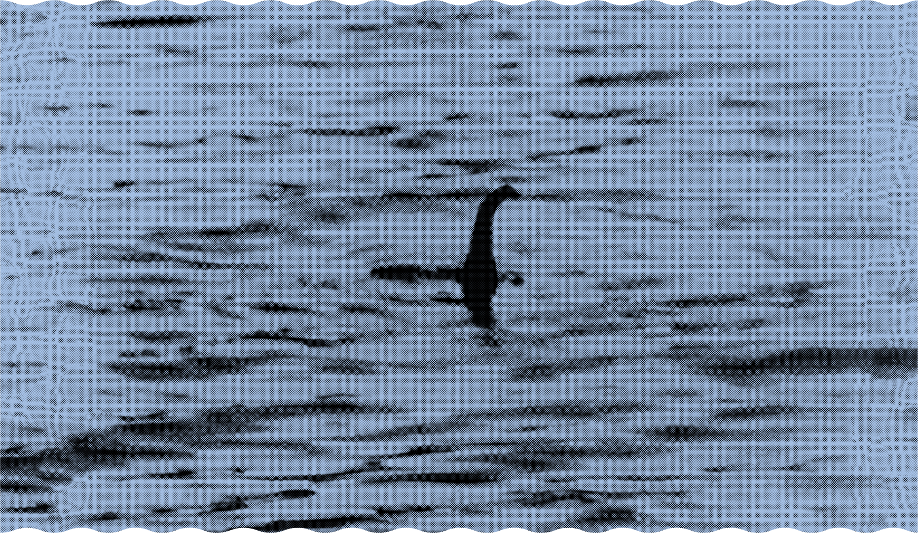
Our first challenge was reinterpreting what the Loch Ness Centre and Monster stood for in 2023, building on everything that’s made it so successful to date and exploring how to make it feel new and different. Research, workshops and interviews made it clear that among all the myths and legends, the heart of the brand was founded on real people, real places and real stories. Not only that, the story continues to be told as thousands of people go in search of Nessie every year.
Using the insights we’d gathered, we articulated a comprehensive brand strategy for the newly-named Loch Ness Centre with a clear mission, vision and values and a succinct summary of the brand’s positioning, personality, image and tone of voice. This was underpinned by a strategic brand idea – “the legend lives on” – that will serve as a platform for all of the brand’s communications and campaigns going forward.


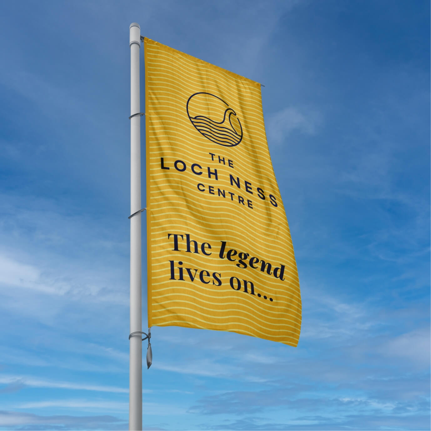

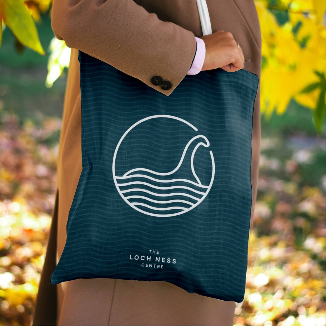

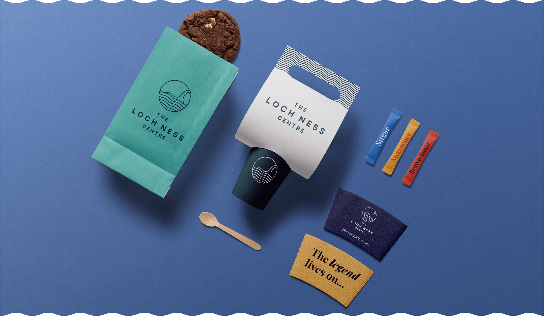
The main challenge with the new visual brand identity was creating something that felt completely fresh but still had a nod to its roots. The client was keen not to lose the essence of the original brand, so the new logo mark still retains a representation of the Monster but uses softer lines and opts for more pronounced geometric waves outlined in a bold circle to give it a stamp-like feel.
Overall, the new logo mark is much more refined and simple to ensure it works effectively across all communications, including digital. To demonstrate this, we produced extensive brand guidelines to show how the new brand can be used in every medium, from signage, stationery and merchandise to outdoor advertising and social media, as well as simple guidance on how the brand should and shouldn’t be used to protect it at all costs.
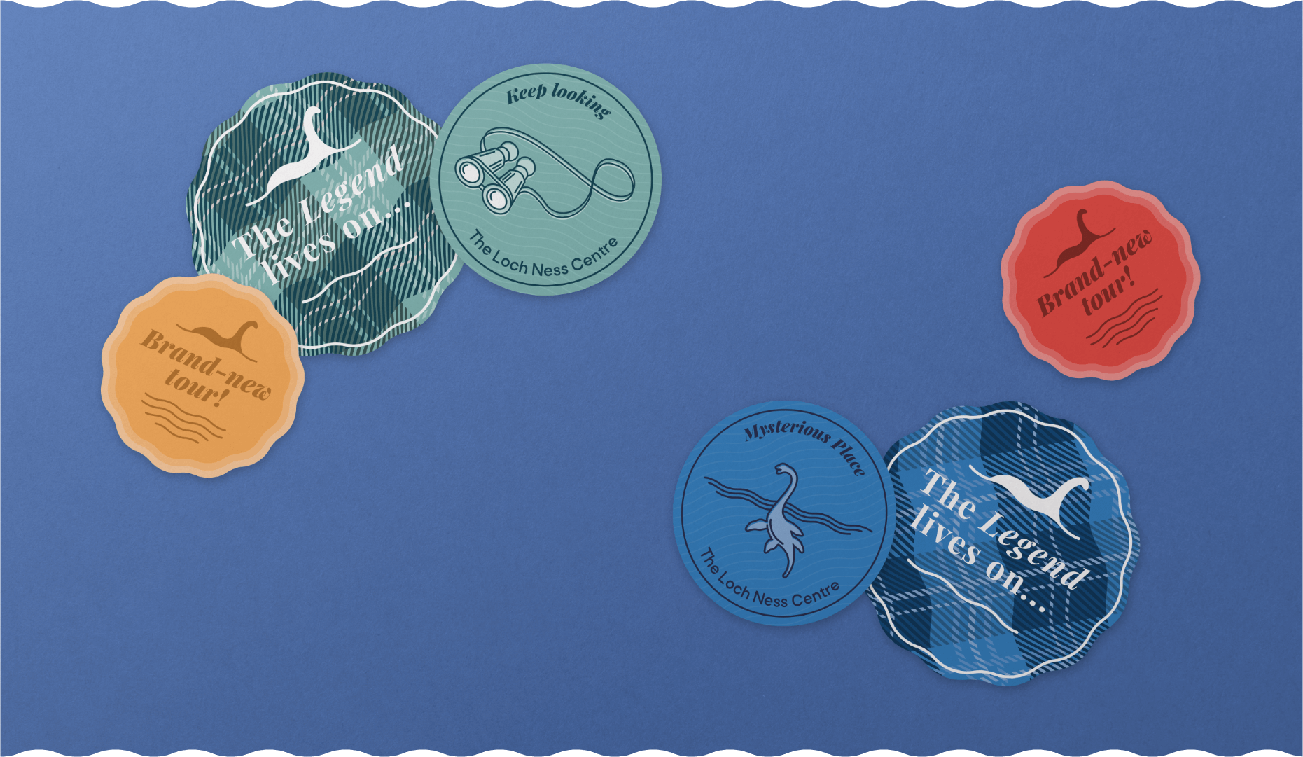
Central to the brand’s visual identity was a brighter colour palette that takes its inspiration from Loch Ness’ official tartan and the area’s natural beauty, as well as dynamic geometric wave patterns that reflect the waves on the lake but also the lines embroidered within the tartan material. This was really brought to life on the attraction’s new e-commerce website, which we designed and built ahead of the Centre’s relaunch.


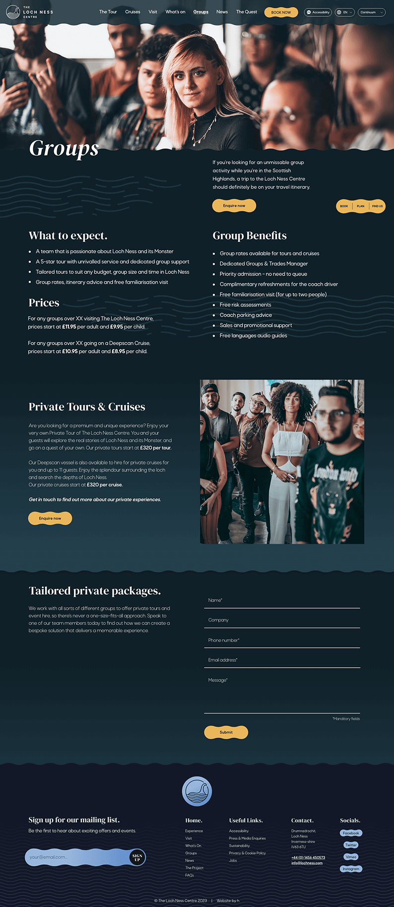
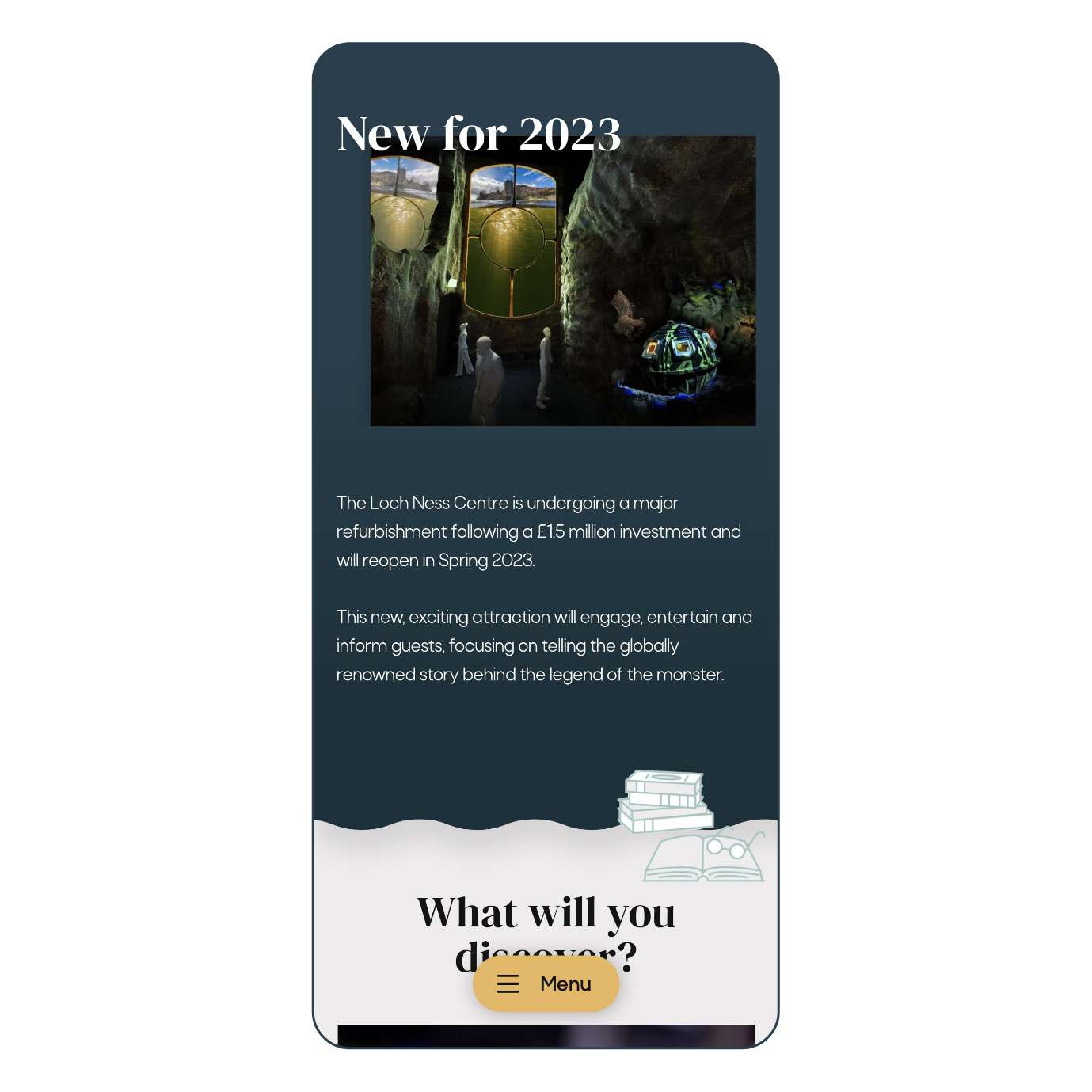
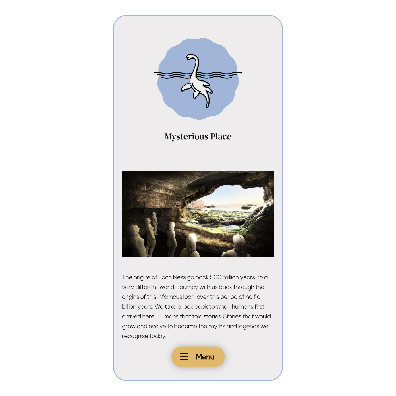
Through collaborative site mapping and UX research, we knew the new website had to not only give people an idea of what the new experience was all about but also do an effective job of leading them to book tickets. We achieved this using a mix of CGIs, photography and live-action video, animation and branded illustrations, giving visitors a sense of what to expect when they step foot inside the attraction.





It’s not every day you get the chance to take on the rebrand of an iconic brand that’s known all around the world. With its new look and home online, the Loch Ness Centre is now set to become the number one visitor attraction in the Scottish Highlands.