As far as rebranding projects go, this one was pretty big. Man Met’s Students’ Union has more than 35,000 members across both its Manchester and Cheshire campuses. The challenge of the brief was to create an immediate and memorable brand identity, brand communications tool kit, as well as a cool new space for students from all walks of life to really make their own.
Making students smile with The Union Man Met’s rebrand.
It was a time of transformation at the Manchester Metropolitan University Students’ Union as they opened the doors on a brand new £10m home in the city centre. We came along to make sure they opened with a smile.
Client:
Manchester Metropolitan University
Sector:
Education
Capabilities:
Brand Expression
Watch the brand story video
Play video
Pause video
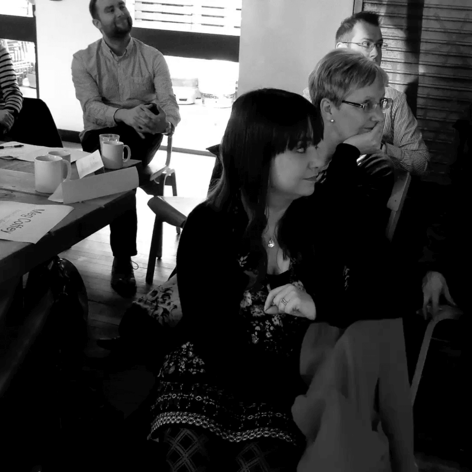
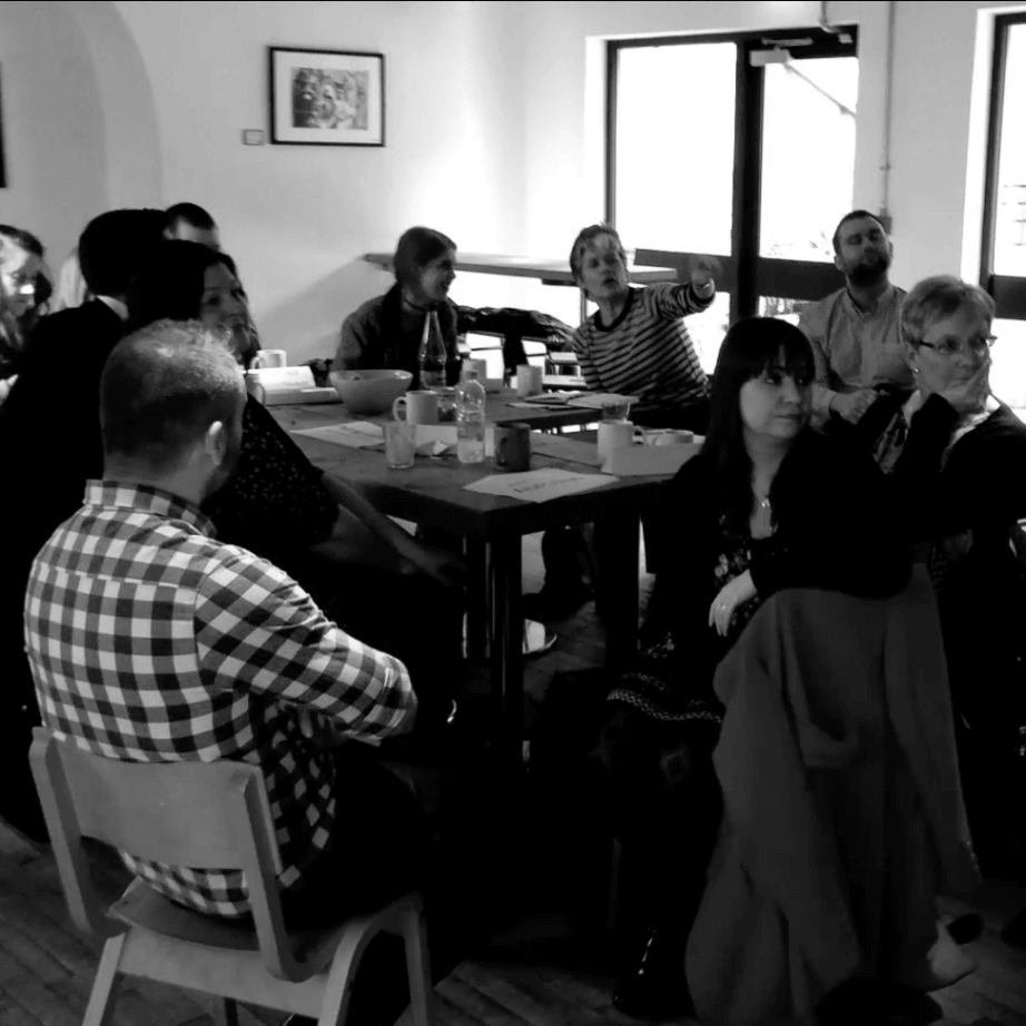
We kicked things off with an immersion process, which consisted of a series of workshops with staff and students alike. With everyone together in one room, we got under the skin of the brand and teased out what it meant to them through fun and interactive exercises. It became clear that students of today need dynamic SU spaces that excite and engage them. This candid feedback really helped to shape the creative process that followed.
The challenge of the brief was to create an immediate and memorable brand identity.
We developed a comprehensive set of 65-page brand guidelines that encouraged play.
Our mantra is that in order to come up with a great idea, you need lots of them, and that’s where our creative process started. After getting a feel for the people and the place, we got all our ideas down on paper and sifted through them to find the gems. Then we set about developing a select few until we found the one that had the most legs. Or in this case, faces.
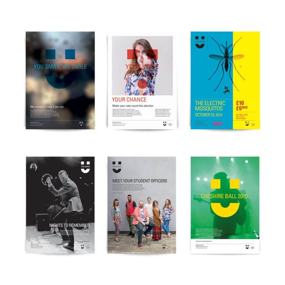
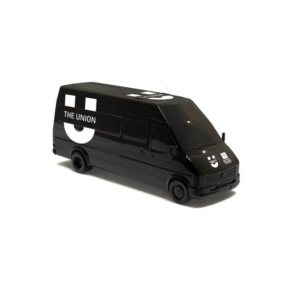
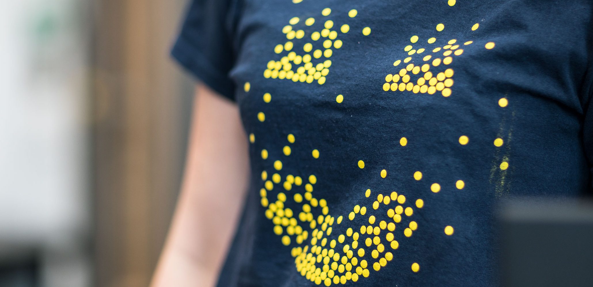
The creative journey led us to the ‘smiley’. Immediately inviting, it breaks the barriers of typefaces and languages, speaking to each of the SU’s diverse audiences and enabling them to express themselves. We developed a comprehensive set of 65-page brand guidelines that encouraged play while still protecting the brand we’d created. In fact, staff and students are still taking advantage of these guidelines today to create an endless range of posters and social content.
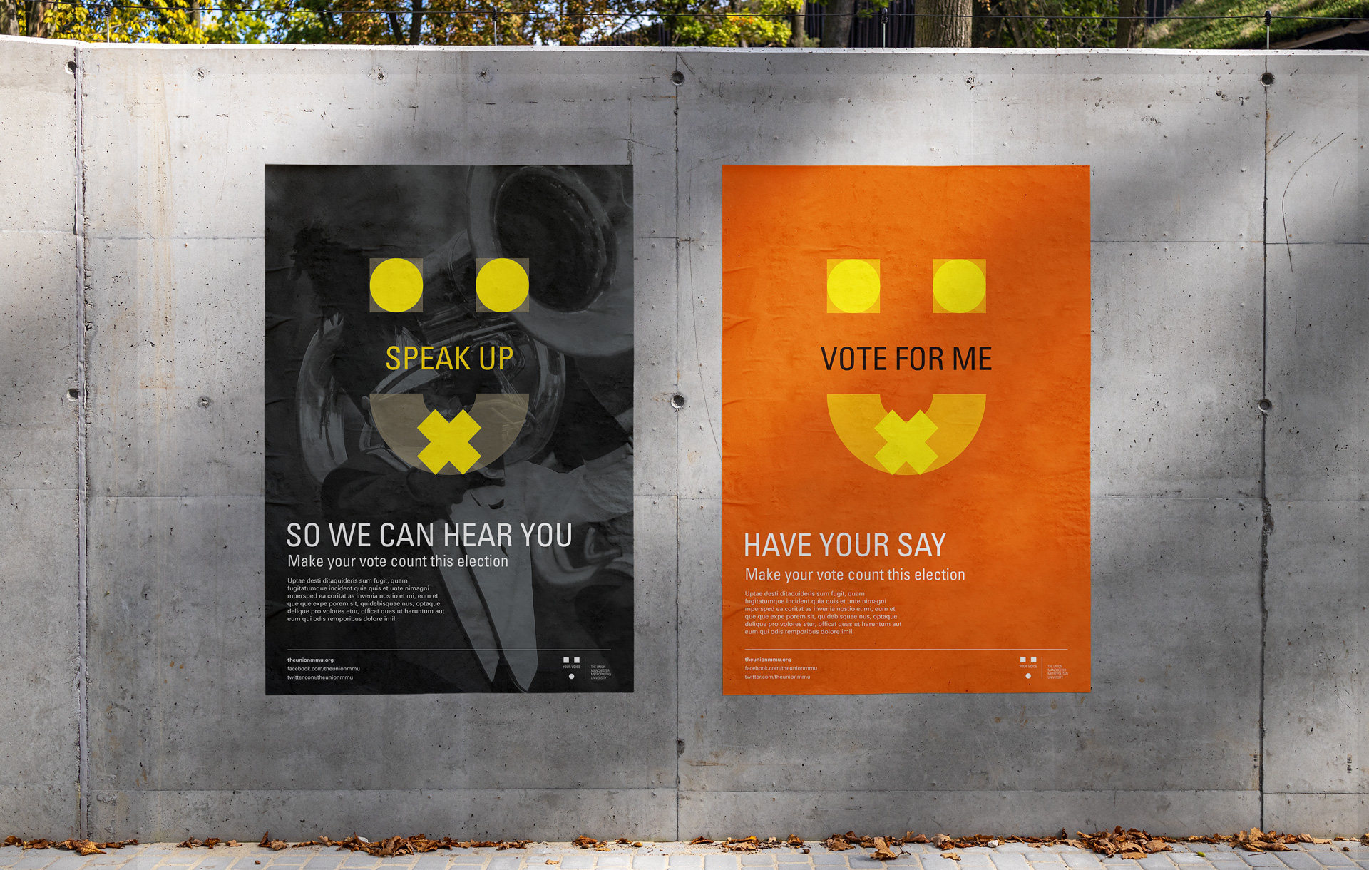
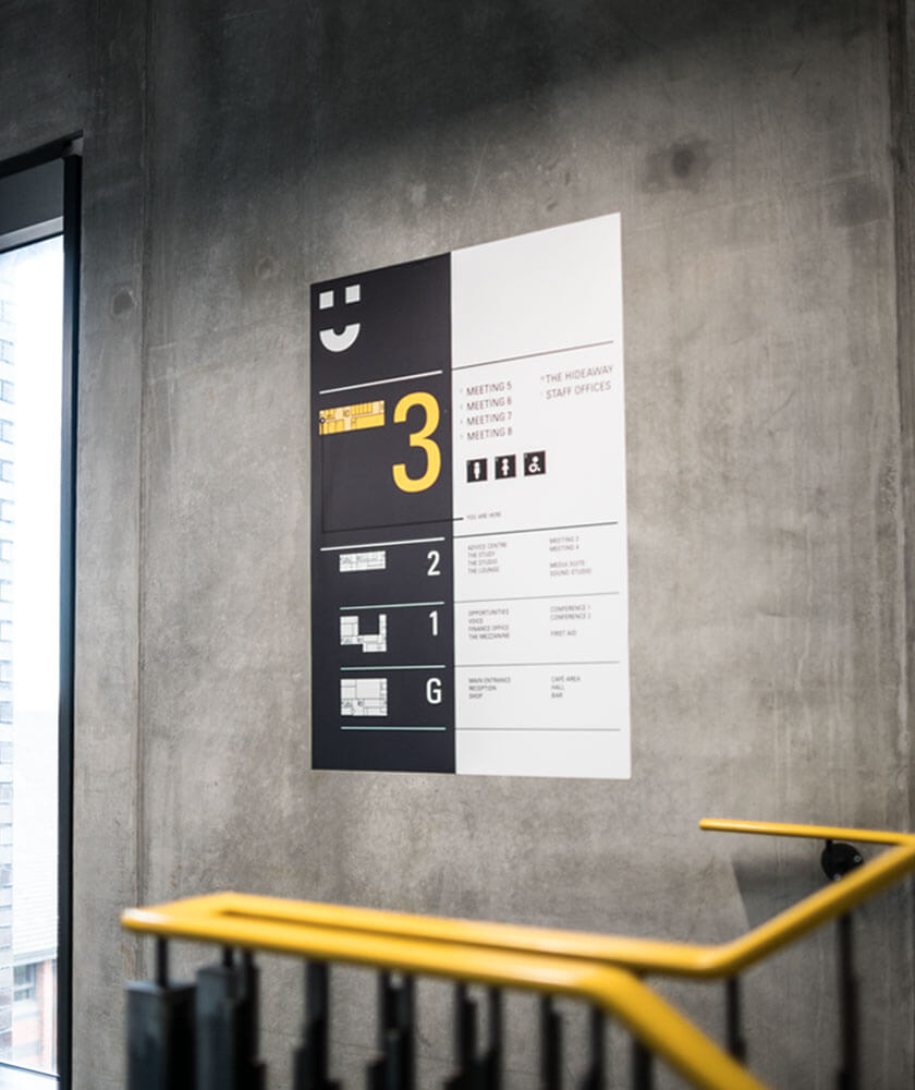
Finally, we took the rebrand from digital to physical, designing the wayfinding system and three key commercial interior spaces (The Bar, Hall and Shop) of the new £10m SU building.
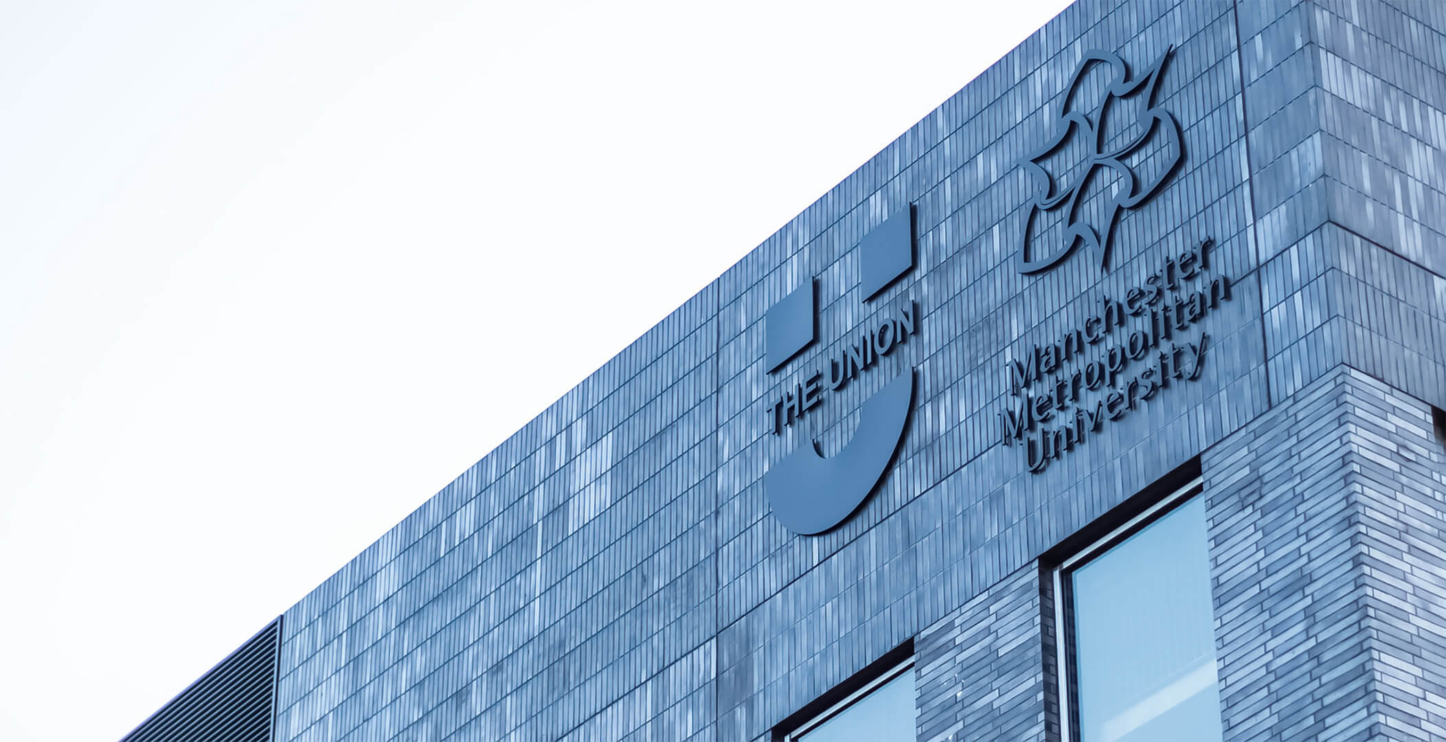
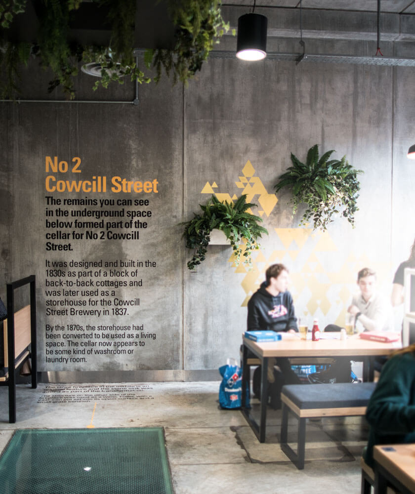
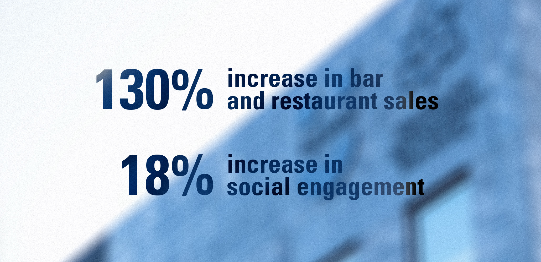
The brand relaunch was a real success, with students loving their new brand identity and SU space. After the relaunch, bar and restaurant sales were up by a staggering 130% and engagement between students and the SU on social was at an all-time high. I think it’s safe to say they were smiling from ear to ear.

We saw a number of agencies, but we found a perfect partner in Holdens. The immersion process into our brand challenges were thorough and insightful.
When we were presented with the creative solution, one word sprung to mind. Genius!
Matt Robinson
Chief Executive
MMU Students' Union

Let's make impact
Every great brand starts with a conversation. Tell us where you are, where you want to be, and we'll help you get there.


I've got an idea